I redesigned the flag of Massachusetts in 2022 with consultation from NAVA (North American Vexillological Association) members as part of their ongoing Flag Design Gauntlet meetings.
The Current Design
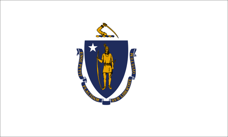
The current flag of Massachusetts is a typical American-style seal-on-a-bedsheet design, and as a result it is convoluted, unmemorable and uninspiring. In 2020, the flag came under scrutiny because the symbolism had links to colonial violence against indigenous Americans. In July 2020, the state senate voted unanimously to look into redesigning the state seal and flag. There is ongoing pressure with many towns endorsing a redesign of the flag. Therefore, here is my proposal.
My Proposals
I have two proposals:
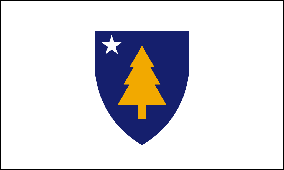
- The shield concept is based on the current flag for local familiarity and recognition. It was most preferred by the NAVA members from Massachusetts.
- The Sons of Liberty concept is based on the flag of the Sons of Liberty, the group who instigated the Boston Tea Party. It was ranked number 1 in a public poll of all Massachusetts flag redesigns.
For a quick summary, the gallery of designs is below. For an extensive read, scroll down and expand each section to see more details for each flag, including high-resolution graphics, commentary, mock-ups, construction sheets and vector file downloads.

Massachusetts Flag Designs
Explanation
First off, this design is simple enough to be remembered by a child, yet distinctive enough to be identified at a distance. It is directly based on the current flag to aid recognition, establish continuity and promote acceptance among the public. The NAVA members from Massachusetts noted that their state’s residents are quite attached to the colours and shapes in the current design and would resonate with a similar flag.
This design’s central feature is the pine tree, a symbol of the New England region, shipbuilding, peace and brotherhood. This symbol has been in use for hundreds of years by indigenous people (featured on the Hiawatha Belt), English colonists (featured on coinage) and independent Americans (featured on flags and coinage).
The blue shield and white star are carried over from the current flag. The shield represents the long history of the state. The star represents Massachusetts’ status as a US state by reflecting the stars on the American national flag.
Gold represents prosperity. White represents peace, the coastline and snow. Blue represents the sea, maritime history, the official nickname “The Bay State” and the Blue Hills, after which the state is indirectly named. The scheme has been retained from the current flag.
Mock-ups
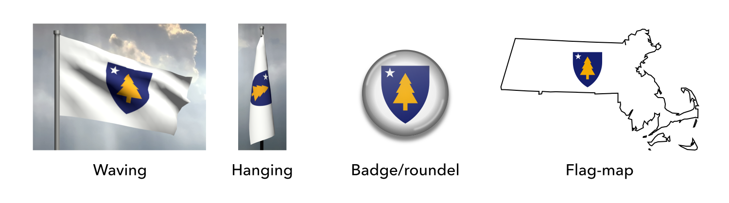
Mock-ups of the proposed flag of Massachusetts (shield concept)
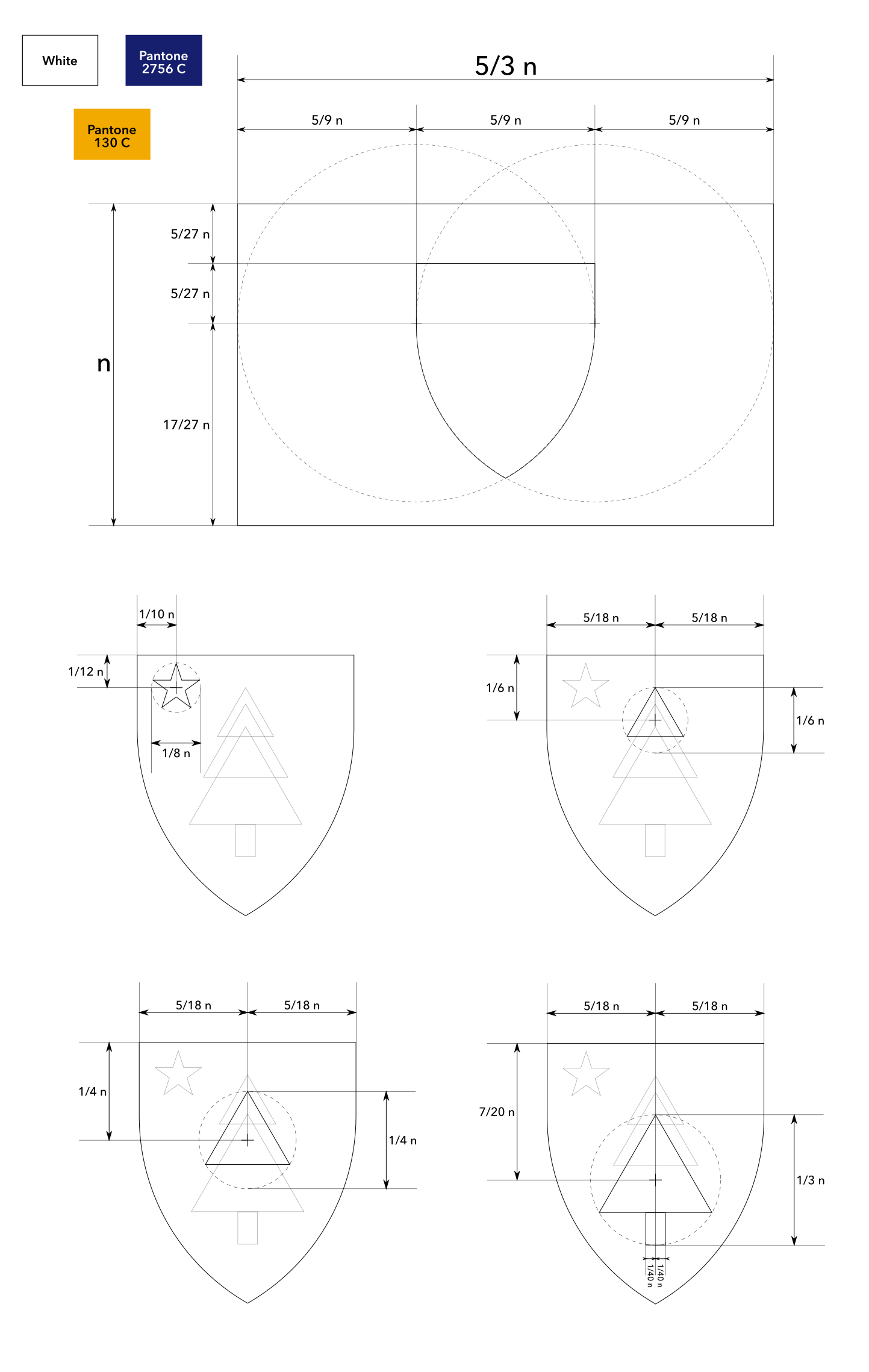
Construction sheet (multi-part)
Vector file download
Explanation
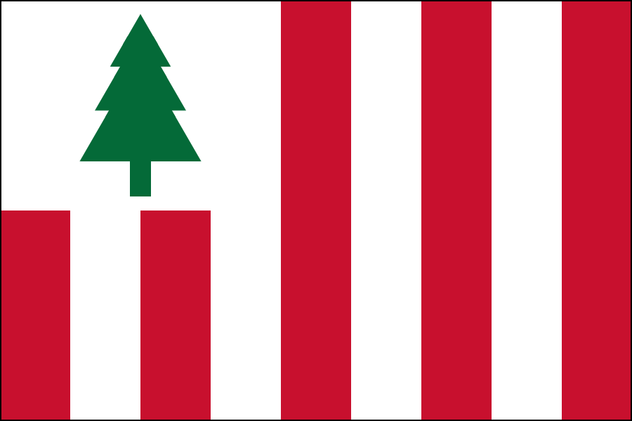
First off, this design is simple enough to be remembered by a child, yet distinctive enough to be identified at a distance. It is based on the flag of the Sons of Liberty, the group who instigated the Boston Tea Party, to represent the rich history and impact of the state.
This design also features the pine tree, a symbol of the New England region, shipbuilding, peace and brotherhood. This symbol has been in use for hundreds of years by indigenous people (featured on the Hiawatha Belt), English colonists (featured on coinage) and independent Americans (featured on flags and coinage).
Red represents passion and sacrifice. White represents peace, the coastline and snow. Green represents the forests.
Commentary
This design was ranked number 1 in a public poll of all Massachusetts flag redesigns (poll conducted by the U.S. State Flags Facebook group).
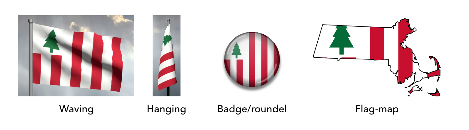
Mock-ups
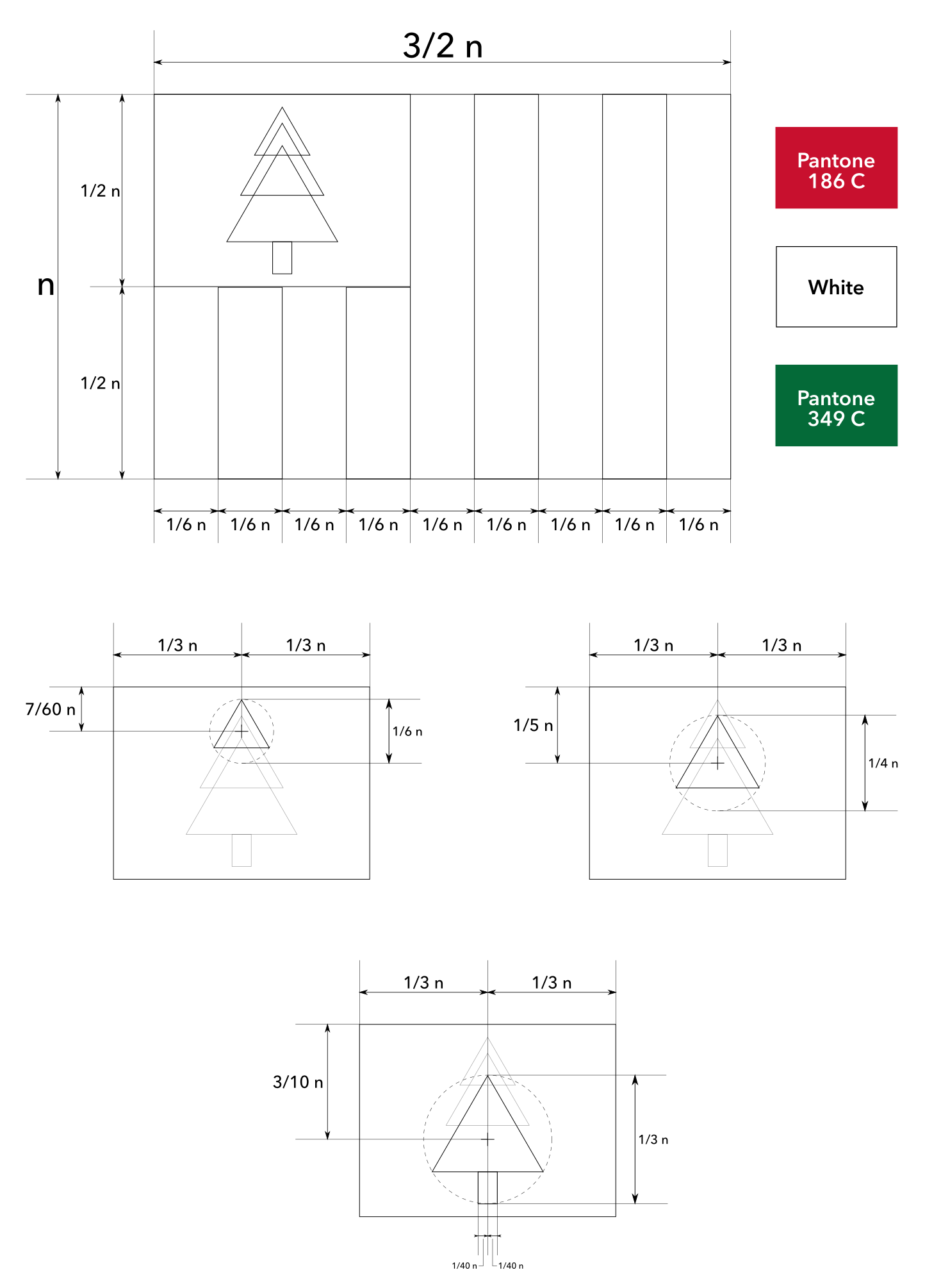
Construction sheet (multi-part)
Vector file download
🙏🏻 Acknowledgements
[section permalink 🔗]
Thanks to the members from Massachusetts for their valuable input, Joe Gorman for organising the meetings, and everyone else who participated in discussions. Thanks also to all the fans who encouraged the submission of these flags to the state commission.
 Proposed flag of Massachusetts (2009)

Hi Brian Cham,
First of all, I’m so glad that Massachusetts has finally committed to changing its godawful, convoluted, racist flag. However, I couldn’t find many proposed redesigns. I really dig your designs, I’m especially a fan of the Shield Concept design. It keeps Massachusetts’ historical color scheme while simplifying the flag and using non-deplorable symbology. The “Sons of Liberty” design is cool too, but I worry that it might get confused with the unofficial New England flag, which is also becoming a symbol of New England nationalism. Thanks for taking a crack at the redesign, I’d love it if one of your flags got to fly over Beacon Hill!
It looks like Christmas. Yes yes it checks all thr boxes but Massechootans are blind, by picking this they appear to more civilized states as gaudy white trash
Thanks for your honest opinion, Joseph. The Sons of Liberty design is similar to the unofficial New England flag, which is well accepted and not compared to Christmas decorations despite having a tree and the red-white-green colour scheme, so hopefully it would get the same positive response.
Just stumbled upon these while looking for updates on the news of our flag redesign. I love both of these designs, way more than any of the other ones I’ve seen recently which tend to be overdesigned and bearing little familiarity with any older Massachusetts iconography. I would love to have either of these.
Thanks for your kind words, bingusbingus.
Looks like someone chose to mention you to the Massachusetts government. The state was asking residents to submit their own flag proposals, and someone mentioned you, on page 121 of the document: https://www.mass.gov/doc/massachusetts-seal-flag-motto-submissions/download
Hi, Eric. You may be interested to know that these two flag designs were submitted multiple times, and others submitted adapted versions too, so it had some prevalence. However, none of these got into the 48 semifinalists.