This design is part of my 2009 flag proposal series (the flag designs from my old site with the most hits and ratings).
The current design

Current flag of New Hampshire
The current flag scored a 3.18/10.00 in NAVA’s North American flag survey, which makes it the tenth worst flag in North America.
My proposal

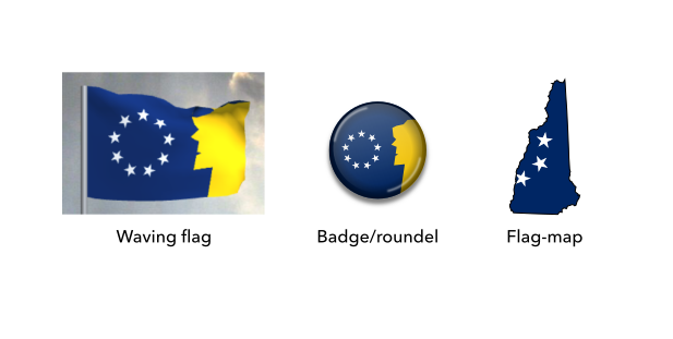
Proposed flag of New Hampshire
First off, this design is simple enough to be remembered by a child, yet distinctive enough to be identified at a distance.
This design depicts the “Old Man of the Mountain”, a well-known symbol of New Hampshire, overlooking a starry sky. The dominant circle of nine stars represents how New Hampshire was the ninth addition out of the original states in the US. The form of the stars is inspired by the historic Betsy Ross flag, the flag of New England and the national flag.
By representing the Old Man of the Mountain, New Hampshire’s official nickname “The Granite State” is also accounted for, as the Old Man was composed of granite. The colours are all present on the current flag, so any further symbolism they have can be carried over as well.
Vector files available on request.
Mock-ups of the proposed flag of New Hampshire
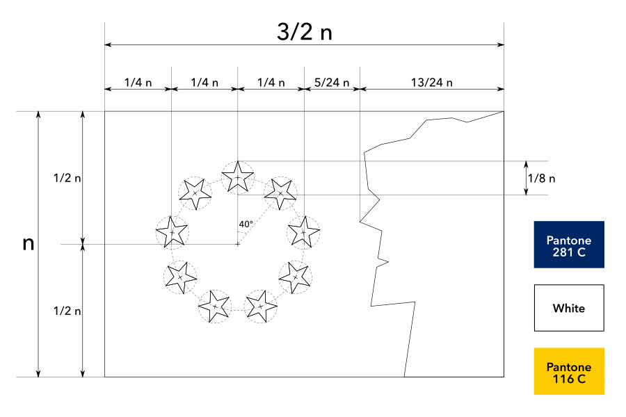
Construction sheet of the proposed flag of New Hampshire

I like the flag design and think people would use it if available. I am planning to make one
Decent idea. However I find the nose is too sharp and I more of get a European Union vibe than. I want to be honest and those are the first things I noticed when I saw it.
Thanks for your thoughts, Bob! I originally had the Betsy Ross flag in mind for the circle of stars, but I can see the resemblance to the European Union as well!
Given what’s happening in Mississippi, perhaps time for you to weigh in?
Hi Gavin, I quite like the Hospitality Flag for Mississippi and it is already popular so I won’t come up with a design myself. I have already reached out to its creator.
From NH here. The part of the Appalachians that are in NH are called the “White Mountains.” This is an important part of our identity as Granite Staters. I’d therefore recommend changing the Old Man of the Mountain to White.
Thanks for the advice! If I ever return to this project, I’ll consider changing the colours.
Mind putting the U.S.S. Raleigh inside the circle of 9 stars?
Hi, Akirale. Thanks for the suggestion, but adding another symbol would complicate the design too much, as it already has the Old Man of the Mountains.
I think your design is a great improvement and effectively incorporates important symbols.