This design is part of my 2009 flag proposal series (the flag designs from my old site with the most hits and ratings).
The current design
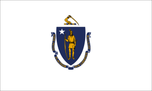
Current flag of Massachusetts
The current flag of Massachusetts is a typical American-style seal-on-a-bedsheet design, and as a result it is convoluted, unmemorable and uninspiring. In 2020, the flag came under intense scrutiny because the design seems to imply colonial violence: There is a sword hanging above a Native American figure, the beginning of the motto translates to “by the sword we seek peace” and the artistic rendering was directly based on figures and artifacts involved with killings of Native Americans. There is ongoing pressure with many groups and towns endorsing a redesign of the flag. As of 2021, the state senate and governor have officially decided to redesign the state seal and flag. Therefore, here is my proposal.
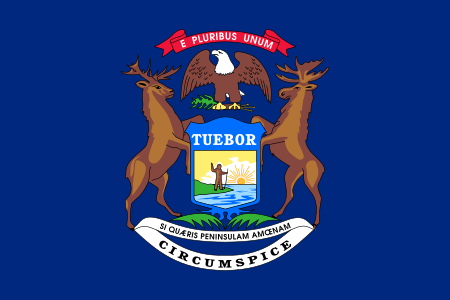
The current flag of Michigan is a typical American-style seal-on-blue-bedsheet design; as a result it is convoluted, unmemorable and uninspiring. It scored 3.46/10 in NAVA’s survey, making it the fourteenth worst flag in North America. In 2018, a state senator introduced a bill to replace it with a new design. Although nothing came of that, below is what I would have proposed:
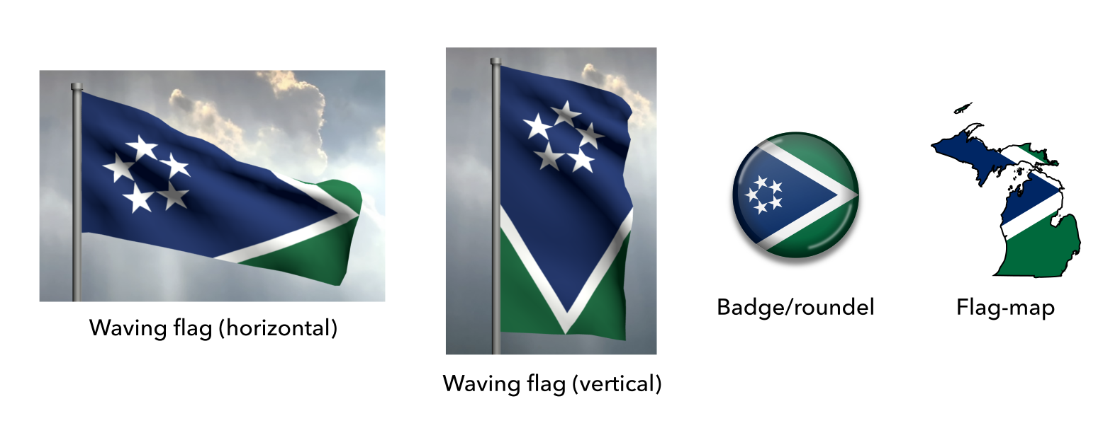
My Proposal
Proposed flag of Michigan
Explanation
First off, this design is simple enough to be remembered by a child, yet distinctive enough to be identified at a distance.
The overall layout represents the geography of Michigan, with two peninsulas (the green sections) and their coastlines (the white sections) united by water (the blue section). Together, these form an arrow representing unity and progress. If hung vertically, the design resembles a shield, recalling the motto Tuebor (Latin for “I defend”).
The five white stars represent the main lakes of Michigan which form a vital part of the state’s identity, lifestyle and livelihood (Lakes Erie, Huron, Michigan, Superior and Saint Clair). The lakes’ importance to Michigan is reflected in it’s official nickname, “The Great Lakes State”, its state quarter and even in the very name “Michigan”, which means “large water” or “large lake”. The stars are in the same form as those in the national flag, to suggest a connection.
The white represents the coast, peace and snow (one of Michigan’s nicknames was “Winter Water Wonderland”), the green represents the land and the blue represents the water. The colours are all present on the current flag, so any further symbolism they have can be carried over as well.
Updates
Michigan proposal flying outside Larry’s house
In the years since I posted this design, multiple Michiganders have fabricated physical versions to fly proudly. The photo above is from Larry, who said, “the redesign is better and the flag will stay in my family for generations. Thanks so much for the design.” I always appreciate surprises from local fans who love the flag!
Mock-ups
Mock-ups of the proposed flag of Michigan
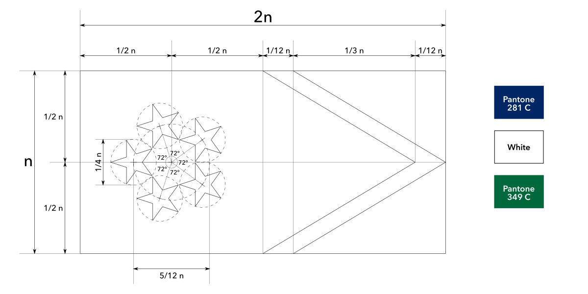
Construction sheet
Construction sheet of the proposed flag of Michigan
![02 proposed flag of michigan [recoded]](https://briancham1994.com/wp-content/uploads/2019/01/02-proposed-flag-of-michigan-recoded.png)