This design is part of my 2009 flag proposal series (the flag designs from my old site with the most hits and ratings).
Note: My choice of design does not reflect my political views.
Updates
- My proposal has taken on a life its own and gone viral since 2009, even though I never promoted it.
- It was directly plagiarised by a user on the Vexillology Wiki, which I take as a good sign.
- Modified versions were featured in regicollis’ DeviantArt project and Ben Karnell’s list of best US state proposals.
- In 2022, my proposal won fourth place in Flag Session’s “USA vs. The Rest of the World” competition.
The current design

Current flag of Idaho
The current flag scored a 3.17/10.00 in NAVA’s North American flag survey, making it the ninth worst flag in North America.
My proposal
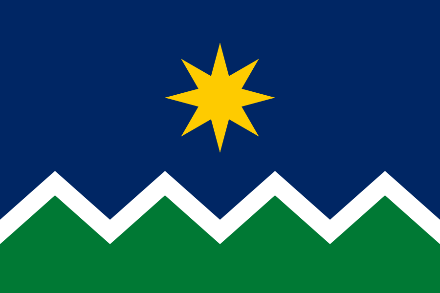
Proposed flag of Idaho
First off, this design is simple enough to be remembered by a child, yet distinctive enough to be identified at a distance.
The overall design reflects the nickname “Gem of the Mountains”. It depicts green mountains, white snowy mountain tops, a clear blue sky and a brilliant golden star. The star depicts both a life-giving sun and a brilliant gem, reflecting the official state nickname “The Gem State”. Apart from a literal depiction of a landscape, the flag also represents the high aspirations and achievements of Idaho. The colours are all present on the current flag, so any further symbolism they have can be carried over as well.
Vector files available on request.
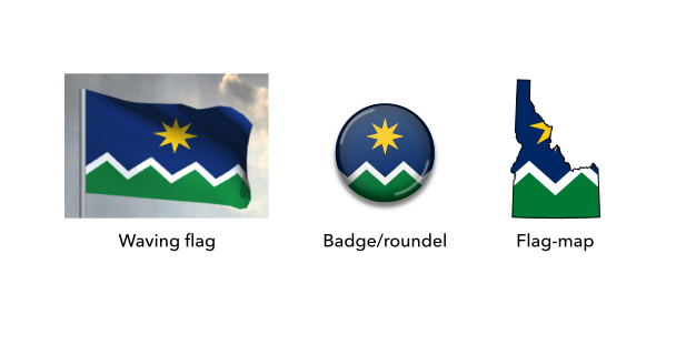
Mock-ups of the proposed flag of Idaho
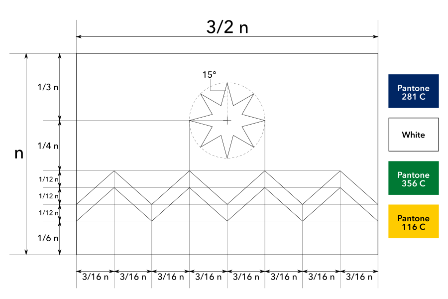
Construction sheet of the proposed flag of Idaho
