This design is part of my 2009 flag proposal series (the flag designs from my old site with the most hits and ratings).
Note: My choice of design does not reflect my political views.
The current design
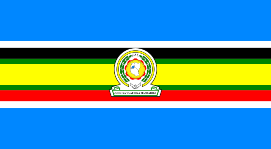
Current flag of the East African Community
The current flag of the East African Community is far too cluttered and tries to combine too many things into one. There are plans to transform this organisation into a full federation in the near future. When this happens, the region deserves a flag that is more visually appealing, distinct and memorable. Therefore, here is my proposal.
My proposal
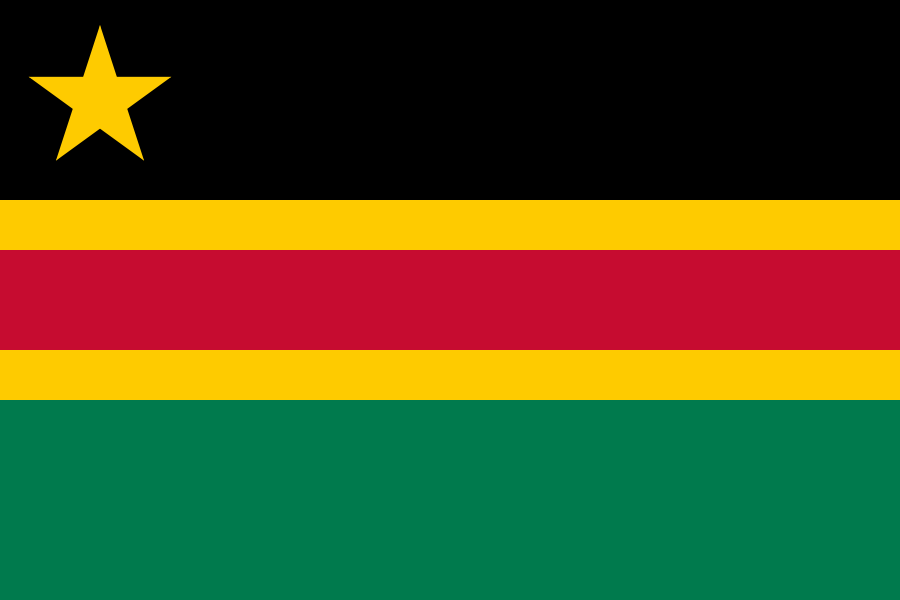
Proposed flag of the East African Federation
First off, this design is simple enough to be remembered by a child, yet distinctive enough to be identified at a distance.
The black represents the people. The gold represents the wealth of the earth and the warmth of the sun. The red represents the blood that we all share and that has been shed in the past. The green represents the natural environment, agriculture and the land. These colours include the Pan-African colours.
The star represents the sun, a bright future and the federation as a whole. The number of points representing the number of founding states [note: There were only five members at the time I made this design]. It is in the canton (top left corner) because that is where the most important parts of a flag should go. When it wears out, the hoist (left hand side) will be the last to remain. When it is not flying, this is the part of the flag that is most visible. When it is flying, the eye will be naturally attracted to that region as a starting point.
Vector files available on request.
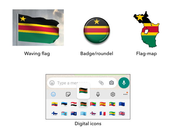
Mock-ups of the proposed flag of the East African Federation

Construction sheet of the proposed flag of the East African Federation
