Executive Summary
Here are the national flag concepts that I and James Fitzmaurice designed for Aotearoa New Zealand over the years.
Like all good flags, our designs are simple enough to be remembered by a child and distinct enough to be recognised at a distance. We conducted extensive research and analysis to ensure our designs surpass other proposals: They actually look like flags (rather than logos or souvenirs), the symbolism is intuitive, recognisable and familiar, the symbolism has wide appeal (rather than reflecting only our personal aesthetic preferences), and they are memorable.
For a quick summary, the gallery of designs is below. For an extensive read, scroll down and expand each section to see a compilation of our design methodology and details for each flag, including high-resolution graphics, commentary, mock-ups, construction sheets and vector file downloads.
Since we presented these in 2022, these flags have been featured in the Flagged for Content podcast. Blue Sky was featured in an award-winning presentation at NAVA 55, while Silver Fern Diagonal came fifth place in a 2024 international flag poll on Flag Session.
Design Process
[section permalink 🔗]
What we didn’t do: Just sit down and design a good New Zealand flag.
Why we didn’t do this: Even with my and James’ previous vexillological expertise, a naive process would just result in reinventing the wheel, repeating the mistakes of the past and confusing our intuitive preferences with those of the general population. This is what almost every other designer did and why they failed.
What we did instead:
We adopted the ultimate guiding principle of maximum feasibility. Our single focus and criterion of success was that the flag design must have the highest probability of winning a vote against the current flag. We shed the popular mindset where we were making a personal artistic expression and replaced it with the mindset where we were analysing and capturing the symbolism of the nation’s collective unconscious that would result in the most public resonance. Flags are supposed to express a group’s identity, rather than prescribe it, otherwise the designs cannot achieve the wide appeal that we need. Instead of activating the aesthetic part of our brain and asked what symbolism resonates with us, we activated the sympathy part of our brain and asked what resonates with others.
Anyone can design a flag and feel that it would be a popular and feasible choice but we put in the hard work to make our decisions grounded. Here are some techniques we used:
- Evaluate all (yes, all) existing proposals. What are the best and worst features? What are common symbols, colours and themes? How were they received by commenters? Why were some more popular than others? From this we constructed a rudimentary regression analysis to capture and predict which design elements and features were associated with higher public appeal.
- Study New Zealand themed insignia, logos and graphics. What are common symbols, colours and themes? Why?
- Research surveys and campaigns. What are the preferences among the public, and in what proportions?
- Survey a real spread of people throughout the design process, not just the people around us. Consulting only the people we knew personally would be short-sighted and misleading. We also conducted some memory testing on these people to see which designs were most memorable. While this process was not as scientific as we would have liked, some clear patterns emerged.
The more artistically inclined may feel this approach is too calculated and soulless, almost like a market research exercise. However, it was deemed necessary for reasons pragmatic (because that’s how referendum voting works and presenting a design with no actual chances would just be a waste of everyone’s time*), creative (because it focuses our thoughts and research into a specific direction) and democratic (because the design would appeal to most of the national population; isn’t that the point?).
Designs in the running to become the actual national flag deserve this level of certainty and effort – we are trying to design the New Zealand flag, not a New Zealand flag.
* i.e. what actually happened in the referendum, but that’s a story for another day.
[section permalink 🔗]
Update: This section has been expanded into its own presentation and article entitled The Six Little-Known Deal-Breakers of Bad Flag Design. It was presented at NAVA’s 55th annual conference where it got an Honorable Mention for the Driver Award.
We were aware that no previous proposal was loved enough to be a worthy contender to the current flag, so we consciously analysed the commentary behind them all to identify the common themes. This way, we could learn from everyone else’s mistakes and completely transcend them. Listed below are the deal-breakers that afflict so many proposals. Even the official referendum selection falls into these!
Generally bad flag design — The classic sins. Too complicated, too many colours, too many elements, irrelevant symbolism, too similar to other flags, the inclusion of writing, maps or gradients, and so on.
Looks like a logo, not a flag — Most proposals (we would say over ninety percent of them) look like modern art pieces, corporate logos or political statements stuck into a rectangle. Any appeal of these designs disappear if we imagine them actually fluttering on a flagpole alongside other national flags. The design should have a classic, timeless quality rather than an ephemeral, flashy quality. We posed a thought experiment—If you claimed that your design was from fifty years ago and that you had actually rediscovered it in an archive rather than created it, would anyone believe you?
Cheesy souvenir — A subset of “looks like a logo, not a flag”. Designs can evoke a feeling of cringe and contempt if they look too offbeat, informal or “un-flag-like”. This is subjective – for some, the silver fern is cheesy; for others, the silver fern is conventional.
Mystery symbolism — Roger Ebert once declared, “If you have to ask what it symbolizes, it didn’t.” Flag design is not like conceptual art with its invented imagery and lofty explanations, it’s more like advertising which uses a culture’s shared visual language to intuitively resonate with the audience at first glance. We posed a thought experiment—If your design were transported back in time by fifty years without any accompanying context, would the average person on the street immediately be able to reckon that it’s a New Zealand flag proposal and what everything represents? A similar thought experiment—If your design is submitted to Reverse Google Image Search, is it successfully labelled as “New Zealand”? (this is something we actually tried during our design process)
Designing for yourself – These designers made the mistake of designing for themselves, not for the general public. These designs focus on only one symbolic theme (see the explanation in the next section) at the utter exclusion of other preferences, which is essentially self-sabotage and negates the possibility of general public appeal. Different themes of national identity appeal to different people. They’re not wrong. They’re just not you.
Too radical — These designers wipe the slate clean and aim for a revolutionary design with no established symbolism. This is also self-sabotage. The vote would be held by everyone, and a substantial amount of the population is intimately attached to established symbolism. Flags are supposed to express a group’s identity, rather than prescribe it, otherwise the designs cannot achieve the wide appeal that we need.
It’s boring, but it works — Either James or I once critiqued a particularly minimalist flag proposal as “a bland vanilla design that just appeals weakly to everybody without really rousing anyone”. There is such a thing as a flag being too simple. There is such a thing as trying to satisfy everybody and ending up satisfying nobody. A design which is dull, uninspiring and typical will backfire, not grab attention, not stick in the memory and not have support.
We strove to avoid these deal-breakers and achieve their polar opposites.
[section permalink 🔗]
We were aware that any single individual’s idea of New Zealand identity is subjective and short-sighted, so we researched how the nation as a whole perceives itself. We comprehensively analysed all the existing symbolism, flag proposals, responses and preferences out there. As a result, we identified four themes of national symbolism, named as below:
- “Established” – Symbols and colours associated with the current flag.
- “Colloquial” – Symbols and colours associated with informal, colloquial, local culture.
- “Māori” – Symbols and colours associated with the indigenous Māori culture.
- “Environmental” – Symbols and colours associated with the environment.
The symbols and colours associated with each symbolic theme are summarised in the Euler diagram below.
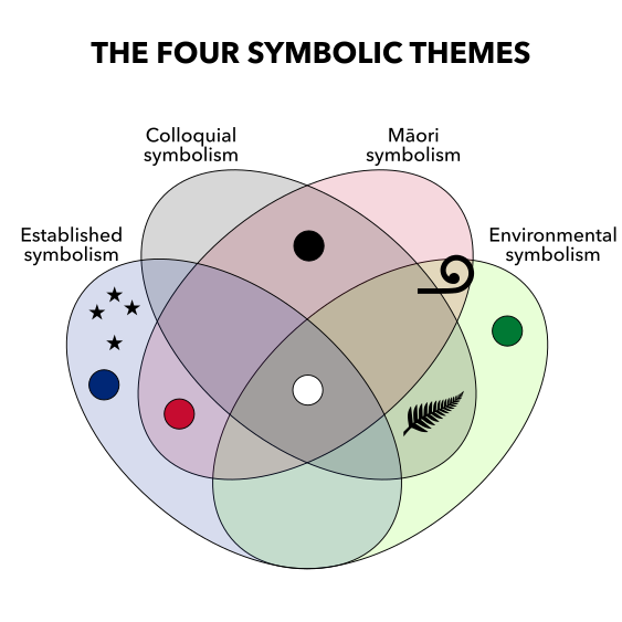
Simultaneously, social scientists have determined the core components of New Zealand’s national identity using extensive, empirical, nationwide studies. Sibley, Hoverd, & Liu’s (2011) study uncovered four facets, named as below:
- “Anglo-NZ (Post-Colonial) Ancestry” – Ideas about the British cultural and historical legacy as part of the country’s foundation.
- “Rugby/Sporting Culture” – Ideas about national sports teams as universally popular expressions of national unity and ambition.
- “Bicultural Awareness” – Ideas about Māori cultural and history as part of the country’s foundation.
- “Liberal Democratic Values” – Ideas about egalitarianism and mutual respect for cultures, religions and the environment as fundamental values of modern society.
Interestingly, these four facets concorded well with the four themes from our own analysis, suggesting they are well-grounded. Our inquiry also revealed that each symbolic theme has particular advantages and disadvantages which we needed to keep in mind throughout the design process.
We strove to harmoniously appeal to multiple themes and facets of national identity, harness the advantages of each one and avoid the disadvantages of each one. This would ensure that our designs truly represent the nation and resonate with the most people. At the same time, the designs must still remain simple and elegant. We particularly ensured each design had something from the “established” symbolic theme to ensure the most overall resonance across the social spectrum.
Details of each symbolic theme are explained below.
[section permalink 🔗]
The “established” symbolic category includes symbols and colours associated with the current flag. This corresponds to the “Anglo-NZ (Post-Colonial) Ancestry” facet from Sibley, Hoverd, & Liu’s (2011) study.
Specific design elements include:
- The red-white-blue colour scheme
- The southern cross
- Layouts that recall the flag of the United Kingdom, i.e. blue fields with red bars and white fimbriation.
Advantages:
- A lot of people are intimately attached to current symbolism and find it pleasingly familiar (refer to the mere exposure effect).
- Establishes continuity and carries over current symbolism.
- Formal feel.
- Historical and cultural significance.
- British representation.
- Appeals to the many “swing voters” who are attached to the symbolism in the current flag.
- Numerically speaking, our regression analysis shows that designs with more of this established symbolism get more support.
- Sibley, Hoverd, & Duckitt’s (2011) psychological study of subconscious graphical influences show that this symbolic theme is more emotionally salient than the others.
Disadvantages:
- Can feel too boring, uninspired, safe and soulless.
- Not as distinct as the purely local symbols like the silver fern.
- Aesthetically, the southern cross does not make a good focal point as it is too “empty” and spread out to be a bold or iconic symbol.
- Osborne, Lees-Marshment, & van der Linden’s (2016) study of New Zealand attitudes showed that a majority of respondents had a lukewarm or low support for the Commonwealth of Nations in relation to core national identity.
[section permalink 🔗]
The “colloquial” symbolic theme includes symbols and colours associated with informal, colloquial, local culture. This corresponds to the “Rugby/Sporting Culture” facet from Sibley, Hoverd, & Liu’s (2011) study.
Specific design elements include:
- The black-white colour scheme
- The silver fern
Advantages:
- Unique to New Zealand.
- The silver fern is the best polling design element (Cheng, 2014).
- De facto national colours/emblems that arose from local circumstances. These are very common in New Zealand themed logos and graphics.
- Symbolism is neutral and applies to all people (like Canada’s maple leaf).
- Osborne, et al.’s (2016) study of New Zealand attitudes showed that a majority of respondents (89.2%) had a high support for sports in relation to core national identity.
Disadvantages:
- Can feel too informal, too trendy, too cheesy, too associated with sporting teams (especially the All Blacks) and souvenirs and thus not appropriate for a formal national symbol.
- These were the most contentious design elements in existing flag proposals. The very presence of black or the silver fern put off some respondents; the presence of both black and the silver fern was an absolute deal-breaker for some.
- The black-white colour scheme by itself is dour or reminds some of pirates or ISIS.
- The silver fern is visually very complex and fiddly for a flag.
- Sibley, Hoverd & Duckitt’s (2011) psychological study of subconscious graphical influences show that silver ferns are less emotionally salient than the established symbolism.
[section permalink 🔗]
The “Maori” symbolic theme includes symbols and colours associated with the indigenous culture. This corresponds to the “Bicultural Awareness” facet from Sibley, Hoverd, & Liu’s (2011) study.
Specific design elements include:
- The black-white-red colour scheme
- The colour red in itself if dominant
- The Tino Rangatiratanga flag
- Māori patterns, especially the koru
Advantages:
- Unique to New Zealand
- Historical and cultural significance
- Indigenous representation
- Māori culture is already incorporated and accepted into mainstream, e.g. the coat of arms, haka, national anthem, symbols on coinage and banknotes, Air New Zealand logo and so on.
- Indigenous rights is a key factor that distinguishes New Zealand and its identity from other Western post-colonial nations (i.e. Australia, Canada, USA).
Disadvantages:
- If this theme is too dominant, especially elements of the Tino Rangatiratanga flag itself, it can feel sectarian, ignoring British history or ignoring a multicultural reality.
- Numerically speaking, our regression analysis shows that designs with the koru get far less support than the established symbols.
- Osborne, et al.’s (2016) study of New Zealand attitudes showed that Māori rights, in relation to core national identity, was one of the most polarising socio-cultural attitudes. Overall, a slight majority of respondents (59.2%) expressed a low support for this topic. However, 75.3% agreed with the statement “Māori culture is something that all New Zealanders can take pride in, no matter their background”.
[section permalink 🔗]
The “environmental” symbolic theme includes symbols and colours associated with the environment. This corresponds to the “Liberal Democratic Values” facet from Sibley, Hoverd, & Liu’s (2011) study, since this facet includes environmental values as well.
Specific design elements include:
- Green
- The silver fern
- The koru
- The kiwi
- Landscapes
Advantages:
- Expresses New Zealand’s “clean green” image
- Some of these elements are unique to New Zealand
- Positive and fresh feel
- The silver fern is the best polling design element (Cheng, 2014).
- Future-proof
- Symbolism is neutral and applies to all people (like Canada’s maple leaf).
Disadvantages:
- Can feel too “hippie”, trendy or informal and thus not appropriate for a formal national symbol.
- Some feel that “clean green” image is just artificial marketing hype writ large.
- Silver fern is visually very complex and fiddly for a flag. Sibley, Hoverd & Duckitt’s (2011) study of subconscious graphical influences show that silver ferns are less emotionally salient than the established symbolism.
- Numerically speaking, our regression analysis shows that designs with green and koru get far less support than the established symbols.
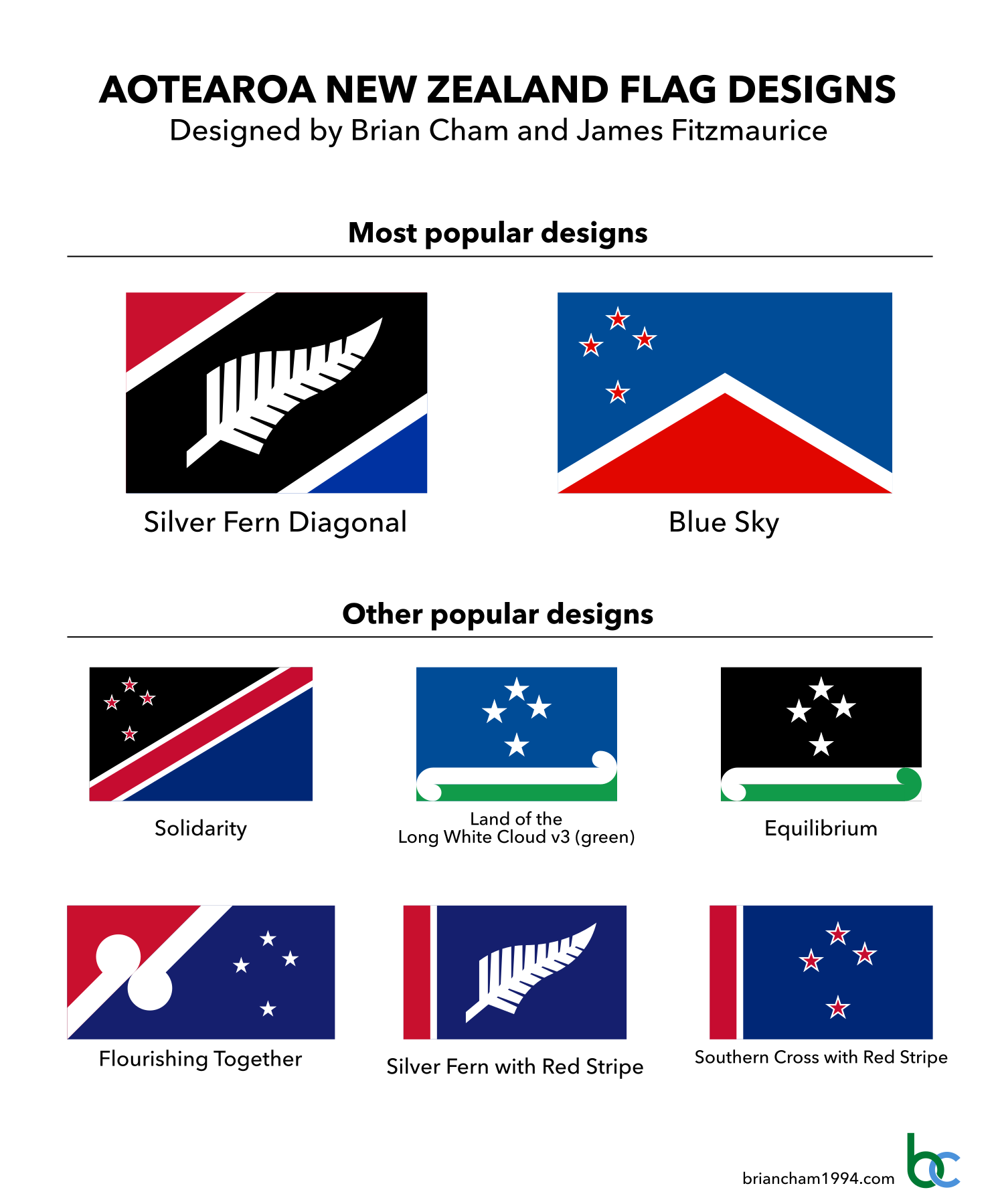
Most Popular Designs
Explanation
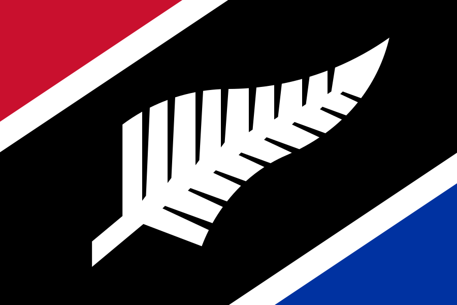
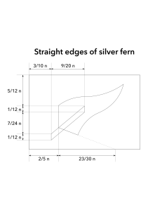
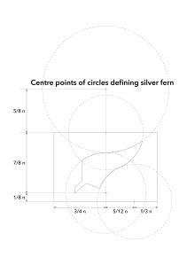
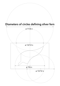
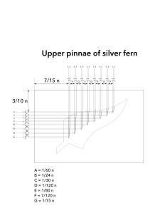
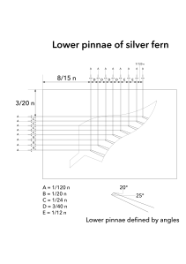
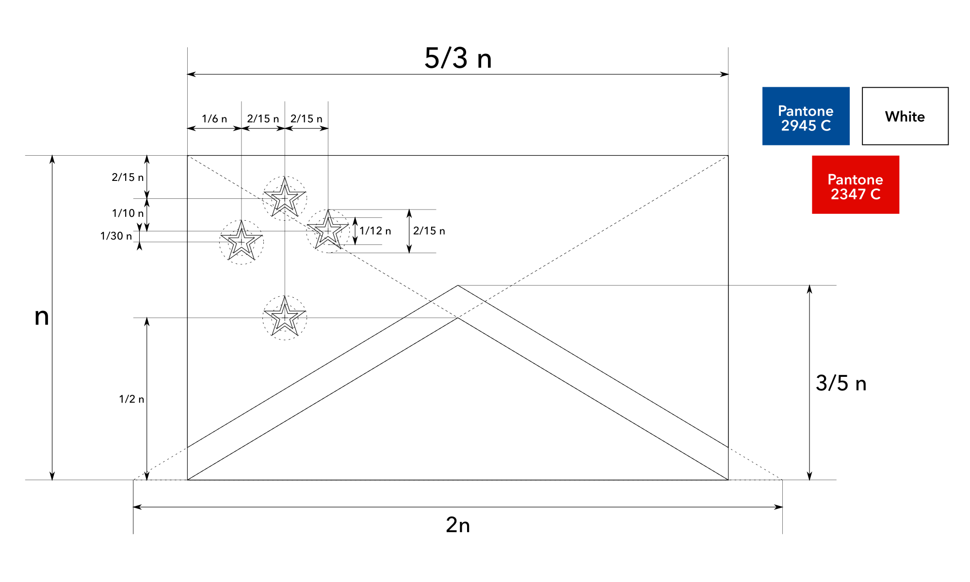
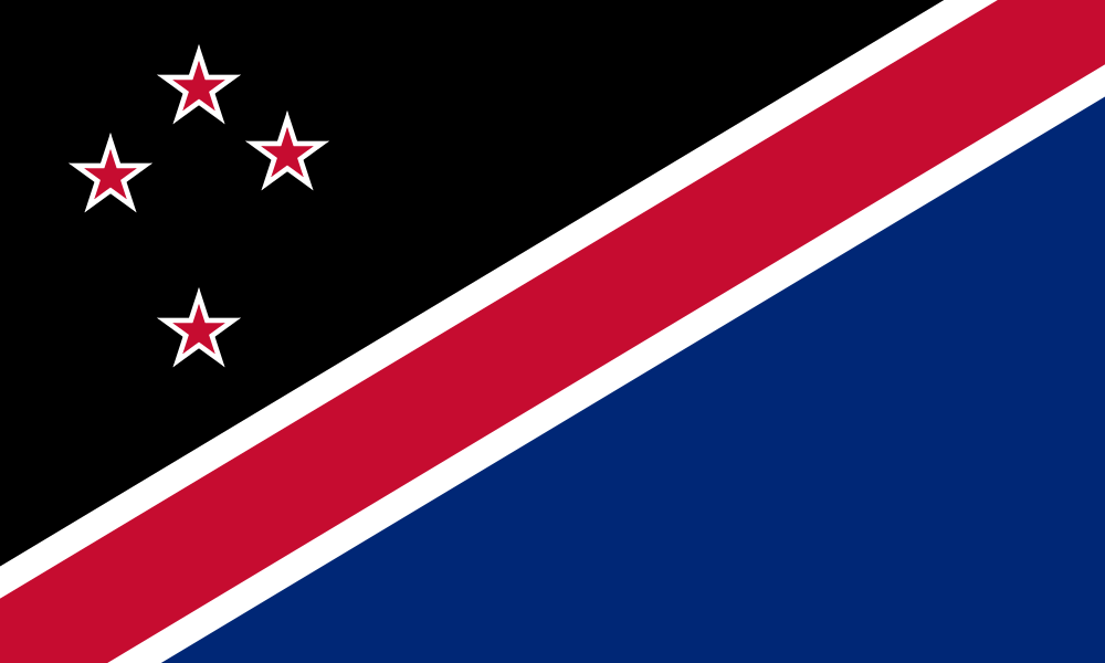
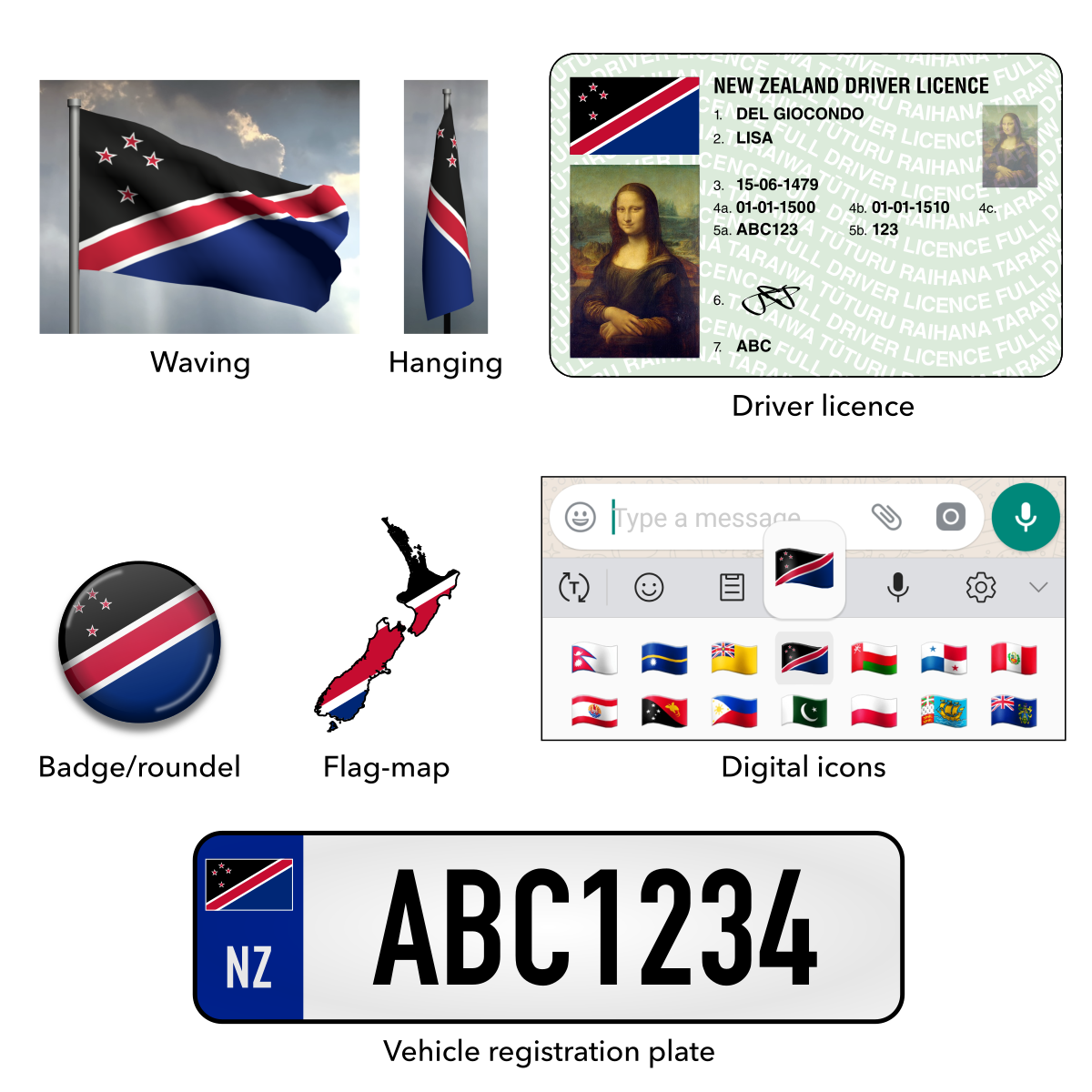
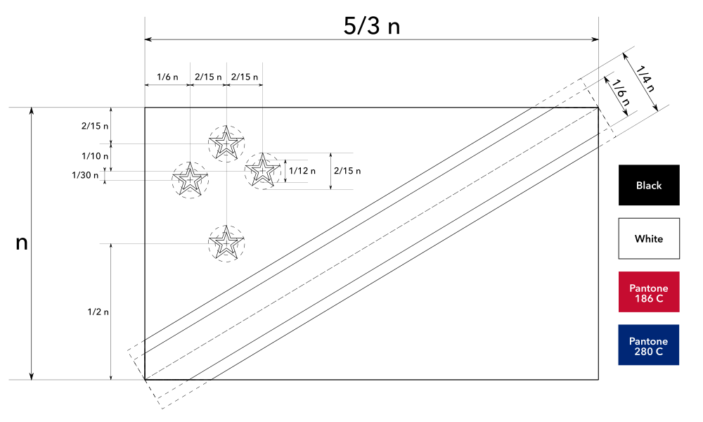
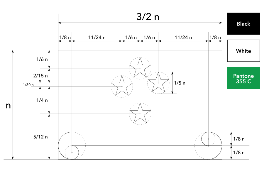
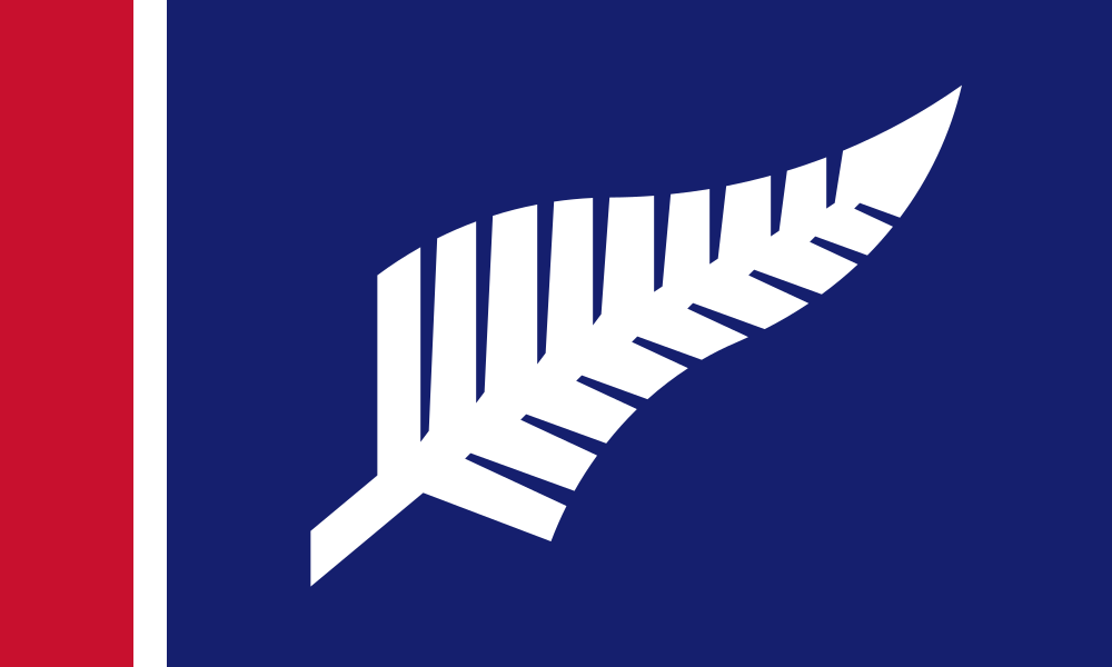
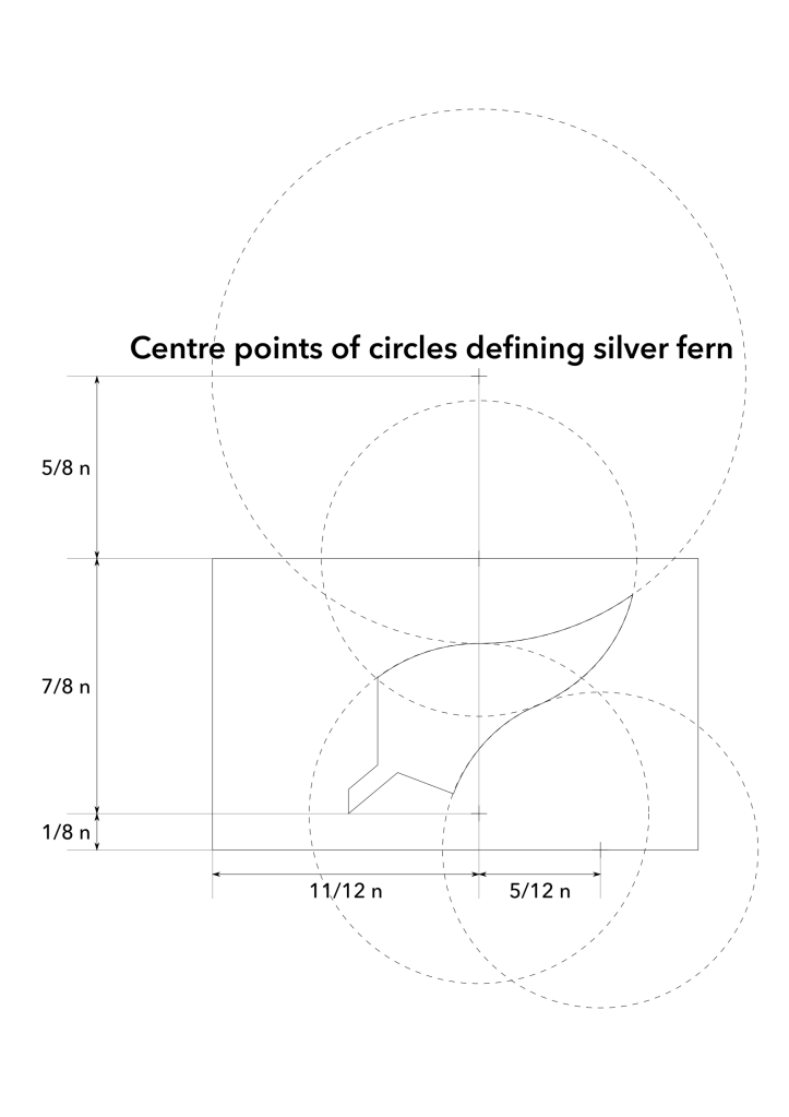
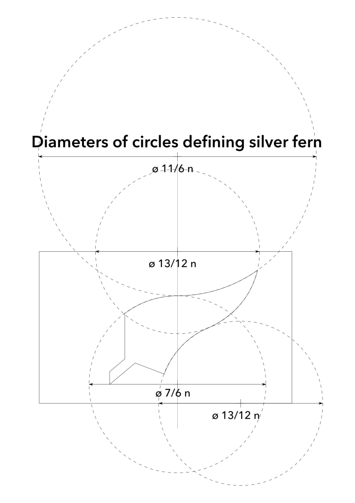
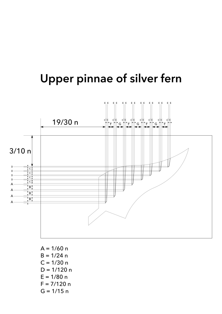
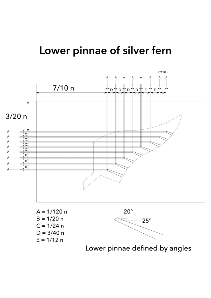
Silver Fern Diagonal is based on the silver fern on black, a unique and well-known symbol of New Zealand’s natural environment.
The form of the silver fern is simplified like the abstract maple leaf on the flag of Canada, with a smoother outline and fewer fine details. This minimal depiction makes the symbol more recognisable and prominent when waving at a distance. It was constructed by overlaying many different silver fern renditions and tracing the average outline, ensuring it is a generic, prototypical silver fern and does not resemble any particular logo or emblem.
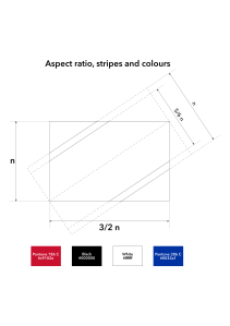
The striking colour scheme adds historical significance by including the colours from both cultures that signed the Treaty of Waitangi: Red, white and black from the Māori flag, and red, white and blue from the British flag. Red represents the land, white represents the “land of the long white cloud” epithet (there are two stripes to represent the country’s two main islands), black represents the night sky and blue represents the ocean. The diagonal arrangement balances the whole composition, highlights the upward flow of the silver fern and puts the central focus on black and white, the modern national colours that represent everyone.
Commentary
This design used to be the second most popular of our designs, but has gradually become the most popular.
It blew away the other designs in our memory testing, with quite a striking difference. We suspect that this is because of the diagonal layout. In the psychology of perception, “orientation selectivity” means that purely horizontal and vertical stimuli are treated as “background” elements and ignored by the cerebral cortex, but tilted stimuli elicit stronger attention (Hubel & Wiesel, 2004). Also, in the psychology of memory, concepts are more memorable if they are based on something familiar but with a slightly counter-intuitive twist (Barett & Nyhof, 2001), which applies to the way we modified the silver fern design.
Mock-ups
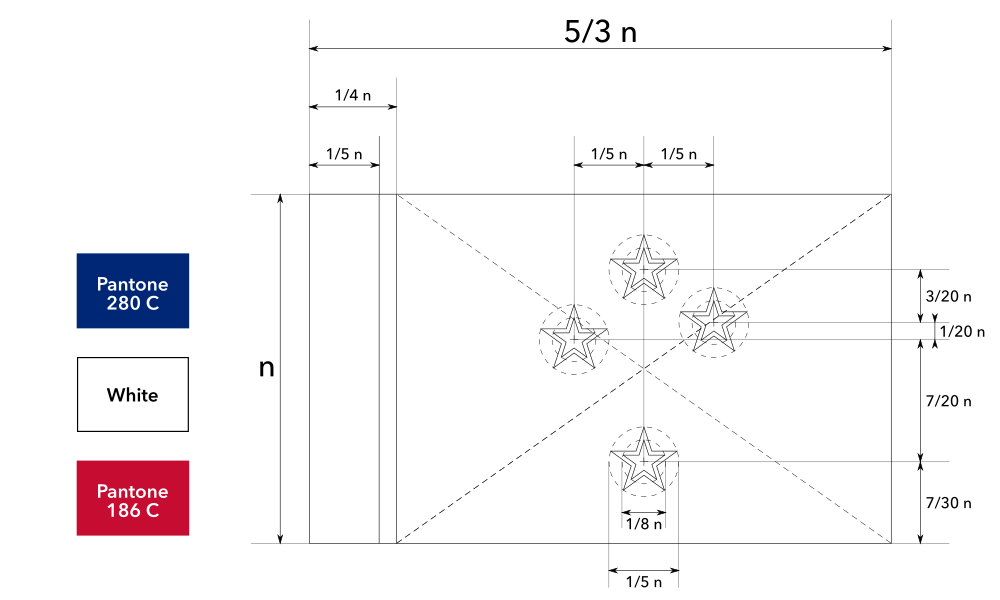
Construction sheet (multi-part)
Vector file download
Explanation
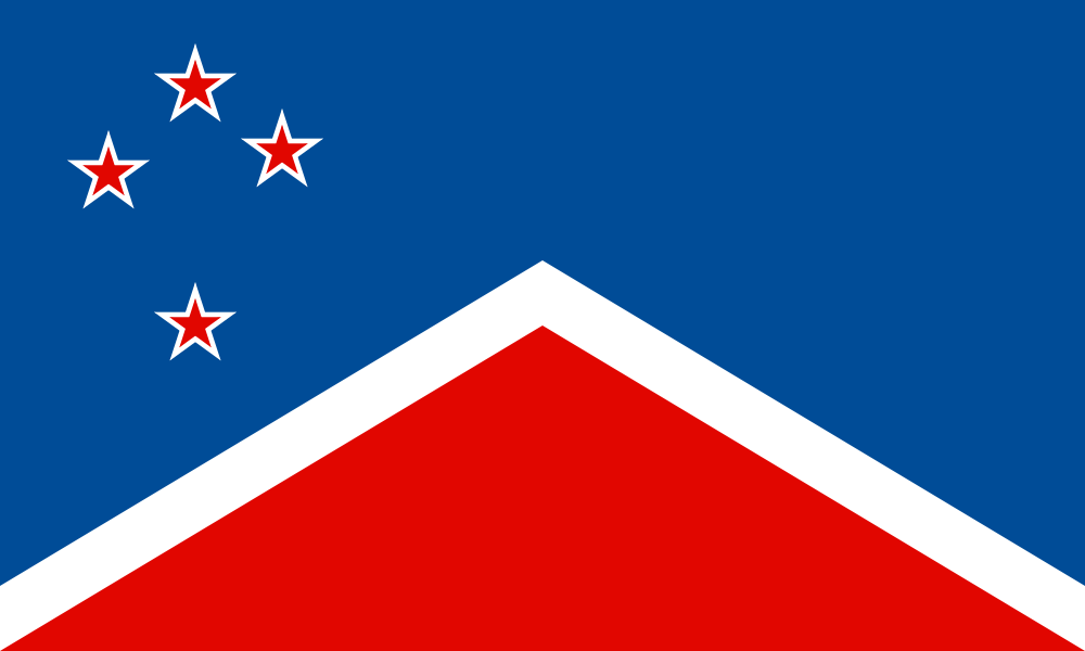
Blue Sky, White Mist and a Wholly Red Earth depicts an intuitive view of the country’s stunning scenery and unique natural environment that attract worldwide visitors. Above is the southern cross, representing our location in the Southern Hemisphere and our shared history. It is in the same rendition as the current national flag to establish continuity and aid recognition. Below is a chevron representing our misty mountains and volcanoes.
Red, white and blue are carried over from our current flag, representing past and present ties to the Commonwealth of Nations. Red represents the fertile earth, white represents the snow and mist, and blue represents the clear sky. Red is prominent because it is shared by both the British flag and Māori flag, and red is significant to Māori art and culture.
Commentary
This flag was designed to be the most effective NZ flag proposal for the 2016 referendum, outperforming the other designs by incorporating all the public feedback. It actually looks like a flag rather than a logo or souvenir, the symbolism doesn’t need to be explained, it has wide appeal and resonance, and it is very memorable based on our memory testing. Blue Sky formed part of the award-winning Six Deal-Breakers of Bad Flag Design presentation at NAVA 55, where it was used as an example of a flag that is specifically designed to counter-act those deal-breakers.
Funnily enough, we didn’t enter this flag into the referendum contest because James objected to the geometric style. Afterwards, I put it on the website out of public demand because everyone loved it so much! Some asked if Blue Sky was inspired by Aaron Dustin’s Red Peak design, but it was actually an independent creation based on the popularity of many chevron-based ideas submitted around the time.
Mock-ups

Construction sheet
Vector file download
Other Popular Designs
Explanation
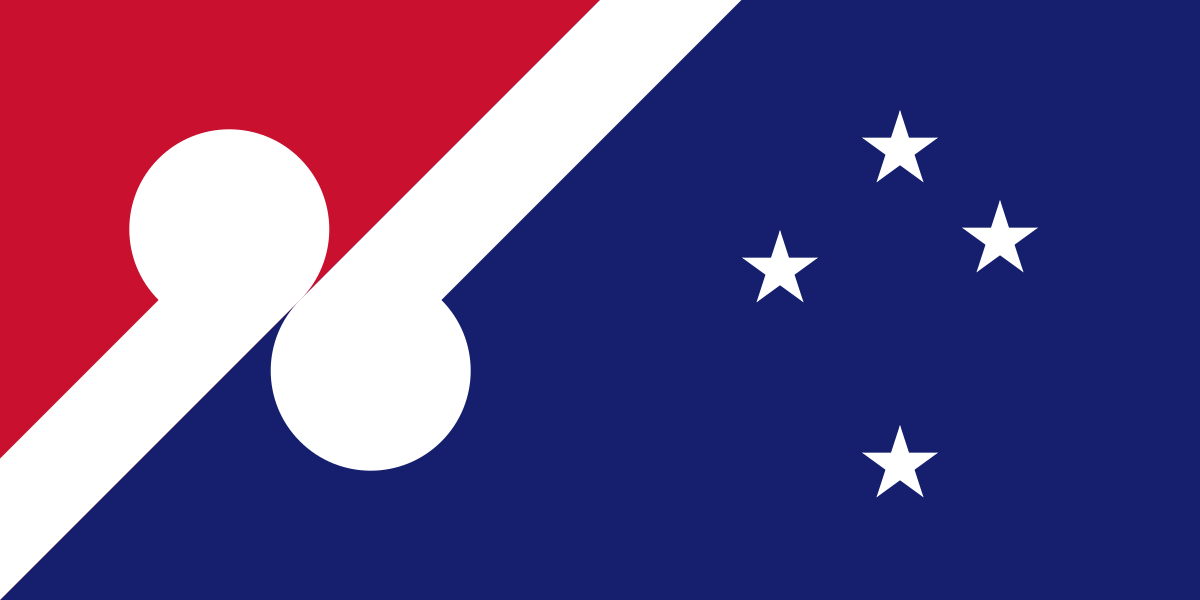
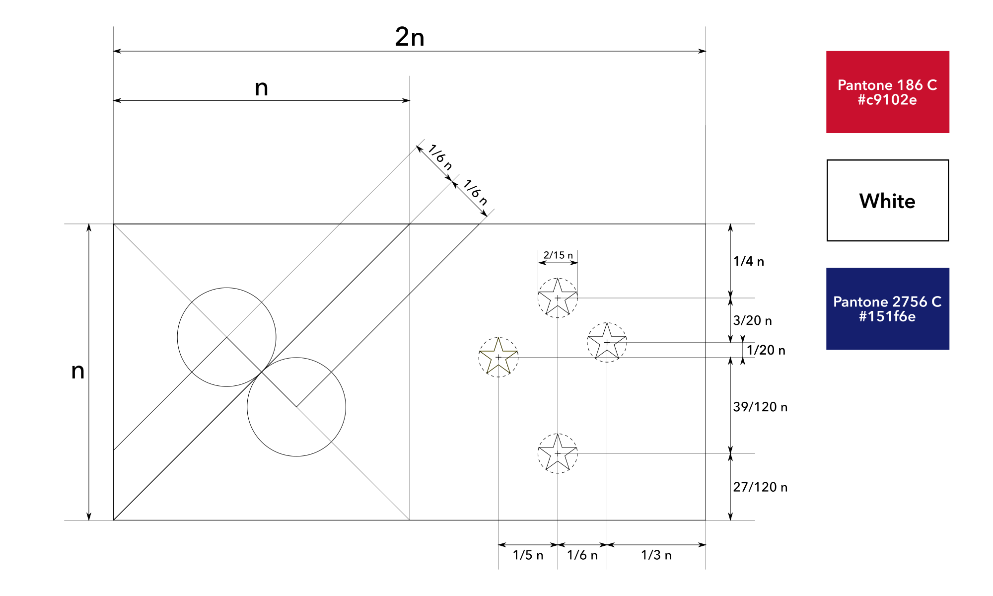
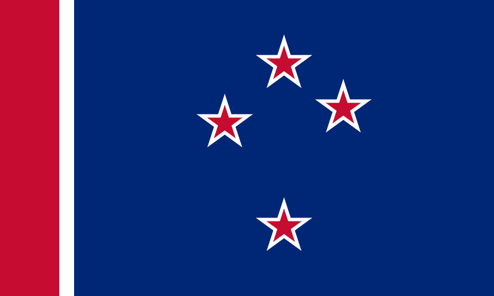
Solidarity combines the colours of the two cultures that signed the Treaty of Waitangi: The left half (hoist) features the red, white and black from the Māori flag, while the right half (fly) features the red, white and blue from the British flag. Red and white, the two colours shared by both colour schemes, are merged in a strong central bar that represents the solidarity of different cultures. The southern cross in the canton represents our location in the Southern Hemisphere and our shared history. It is in the same rendition as the current national flag to establish continuity and aid recognition.
Black represents the night sky, white represents the “land of the long white cloud” epithet (there are two white fimbriations to represent our two main islands), red represents the blood that we all share, and navy blue represents the ocean.
Commentary
This is the first design we ever made, and is now one of our most popular designs. Personally, I like it less than our newer designs.
Mock-ups
Construction sheet
Vector file download
Explanation
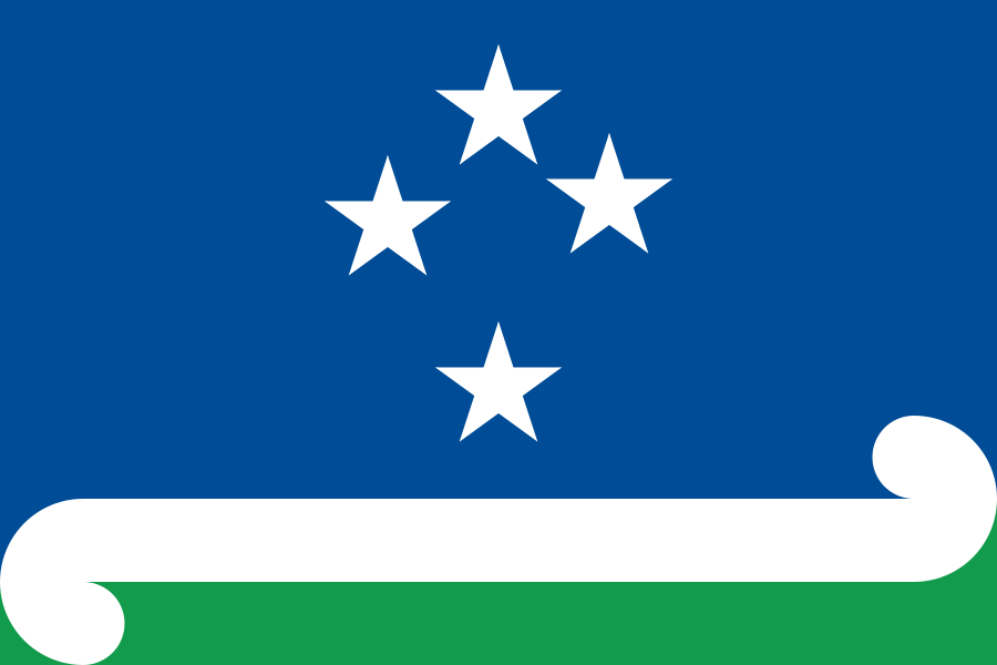
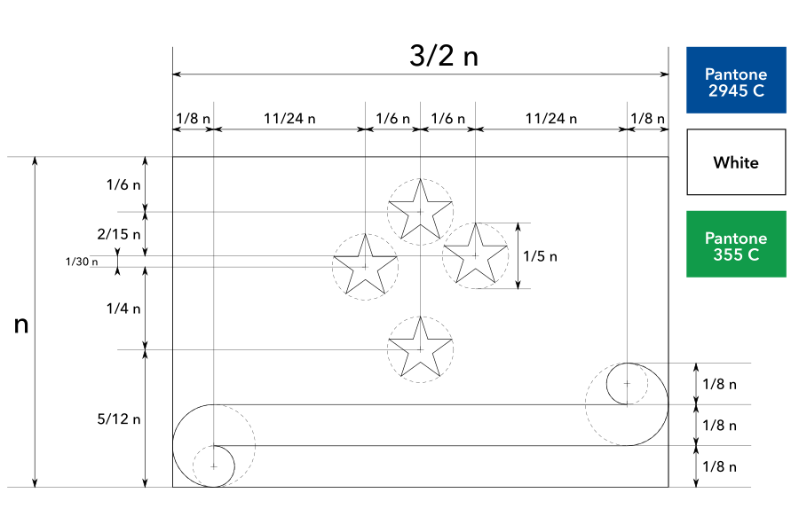
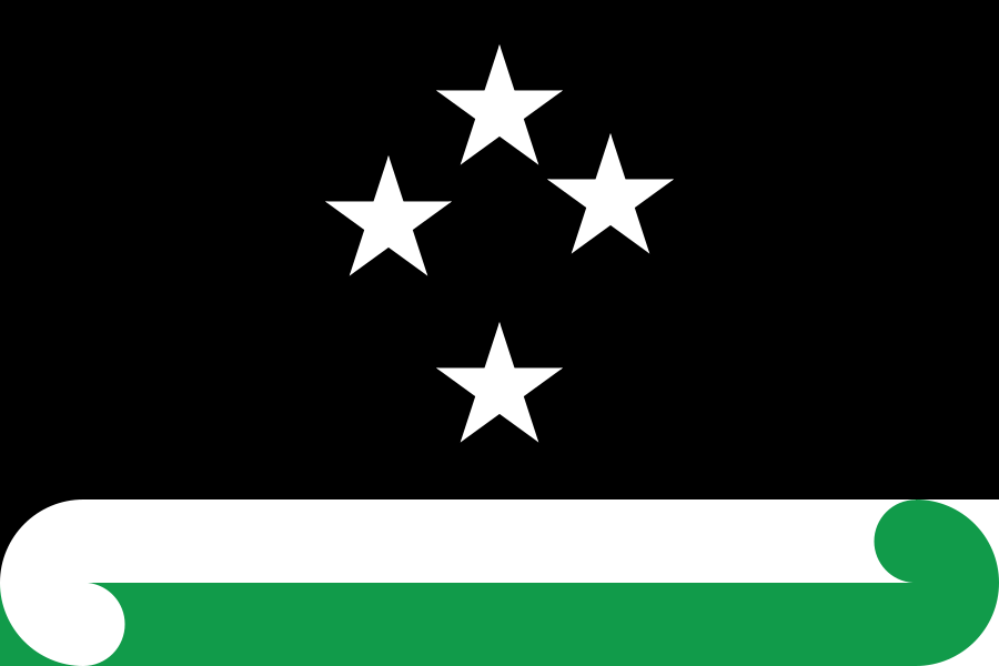
Land of the Long White Cloud v3 (green) depicts an intuitive view of the country’s stunning scenery and unique natural environment that attract worldwide visitors. Above is a simplified southern cross on a bright blue sky, representing our location in the Southern Hemisphere. Near the bottom is a white stripe representing the “land of the long white cloud” epithet. Its form is inspired by the traditional Māori koru pattern, a symbol of new life and growth, applied in a universal way. At the bottom is a green stripe, representing our lush land and scenery.
Compared to the current flag, the larger, simplified southern cross shines better against its background when waving at a distance. The colour shades are much brighter than the current flag to evoke a more positive and lush natural feel.
Commentary
Land of the Long White Cloud v3 (green) is the second design we ever made, but with some minor adjustments over the years. It remains one of my personal top picks.
Mock-ups
Construction sheet
Vector file download
Explanation
Equilibrium depicts an intuitive view of the country’s stunning scenery and unique natural environment that attract worldwide visitors. Above is a simplified southern cross on a black night sky, representing our location in the Southern Hemisphere and boundless possibilities. Near the bottom is a white stripe representing the “land of the long white cloud” epithet and peace. Its form is inspired by the traditional Māori koru pattern, a symbol of new life and growth, applied in a universal way. At the bottom is a green stripe, representing our lush land, also in the form of a koru.
The arrangement of the two koru symbolises our successful multiculturalism. Just as the two koru embrace each other in visual equilibrium, people from different backgrounds embrace each other to connect, understand and exchange new ideas.
Compared to the current flag, the larger, simplified southern cross shines better against its background when waving at a distance.
Commentary
Equilibrium is the newest of these designs. It is similar to Land of the Long White Cloud v3 (above), but Equilibrium features the unique black rather than the conservative blue, and uses a different arrangement of koru.
Mock-ups
Construction sheet
Vector file download
Explanation
Flourishing Together retains the same basic layout as the current flag, aiding recognition and establishing continuity. The flag features two prominent koru, traditional Māori symbols of new life and growth. The arrangement of koru meeting in the middle represents different people “flourishing together” in mutual benevolence, respect and support. The simplified southern cross represents our location in the Southern Hemisphere and our shared history.
The red, white and blue are carried over from the current flag, representing our past and present ties to the Commonwealth of Nations. Red represents the blood we all share, white represents peace and blue represents the historic ocean migrations of our ancestors.
Commentary
This flag satisfied many of our standards of success. It is aesthetically charming, got enthusiastic responses, satisfied many aspects of national symbolism and scored highly in memory testing.
Our earliest version of the design veered a little into the “cheesy souvenir” deal-breaker, but we have simplified it into a much more popular design. It was a conscious attempt to appeal to James’ style to counterbalance mine: Longer aspect ratio, complex and free-form patterns.
This is the direct counterpart to my Australian flag proposal Dotted Sun and Stars.
Mock-ups

Construction sheet
Vector file download
Explanation
Silver Fern with Red Stripe is based on the silver fern, a unique and well-known symbol of New Zealand’s natural environment.
The form of the silver fern is simplified like the abstract maple leaf on the flag of Canada, with a smoother outline and fewer fine details. This minimal depiction makes the symbol more recognisable and prominent when waving at a distance. It was constructed by overlaying many different silver fern renditions and tracing the average outline, ensuring it is a generic, prototypical silver fern and does not resemble any particular logo or emblem.
The red, white and blue is carried over from the current flag, establishing continuity and balancing traditional symbolism with modern symbolism. Red represents passion, white represents peace and navy blue represents boundless possibility. The vertical red stripe at the hoist aligns with the pole to establish itself as a strong anchor, while the large blue section flies freely to establish a sense of dynamism.
Commentary
This design was also quite popular at the time. This was James’ personal favourite out of our designs – he felt it was “simple but not boring or an overdone layout”. When I first created this website, this was the only design published, and someone e-mailed me out of the blue just to tell me that he loved it and supplied a link to the government’s submission form because he wanted me to submit it so badly.
Mock-ups
Construction sheet (multi-part)
Vector file download
Explanation
Southern Cross with Red Stripe features the same colour scheme and southern cross as the current flag, aiding recognition and establishing continuity. Red, white and blue represent our past and present links to the Commonwealth of Nations. The southern cross represents our location in the Southern Hemisphere and shared history. The vertical red stripe at the hoist aligns with the pole to establish itself as a strong anchor, while the large blue section flies freely to establish a sense of dynamism. It has minimal change to the current flag, appealing to traditional symbolism.
Commentary
This design is deliberately the most conservative. It came from an exercise to aim for cautiousness and tradition above all else, with minimal change to the current flag. However, it easily fell into the “it’s boring but it works” trap, which many people picked up on. Aesthetically, it doesn’t really have a good focal point either.
Mock-ups
Construction sheet
Vector file download
End Matter
- The Spinoff – Insiders look back on the failed attempt to change New Zealand’s flag, 10 years on (interviewed key insiders including former Prime Minister)
- NAVA 55 – The Six Little-Known Deal-Breakers of Bad Flag Design (honorable mention for Captain William Driver Award)
 Proposed Flags of Australia
- All flag design proposals 🎨
[section permalink 🔗]
Thanks to James Fitzmaurice for all his expertise and contributions to our designs.
Thanks to everyone who participated in our surveys. Thanks to everyone who conducted the research that helped us in our design process.
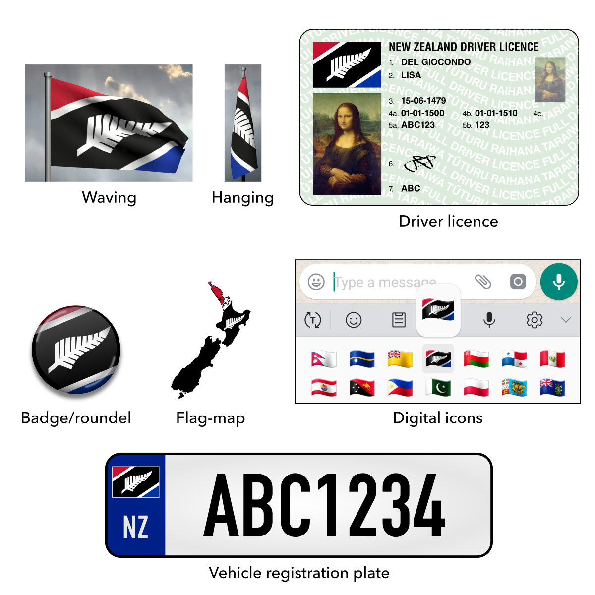
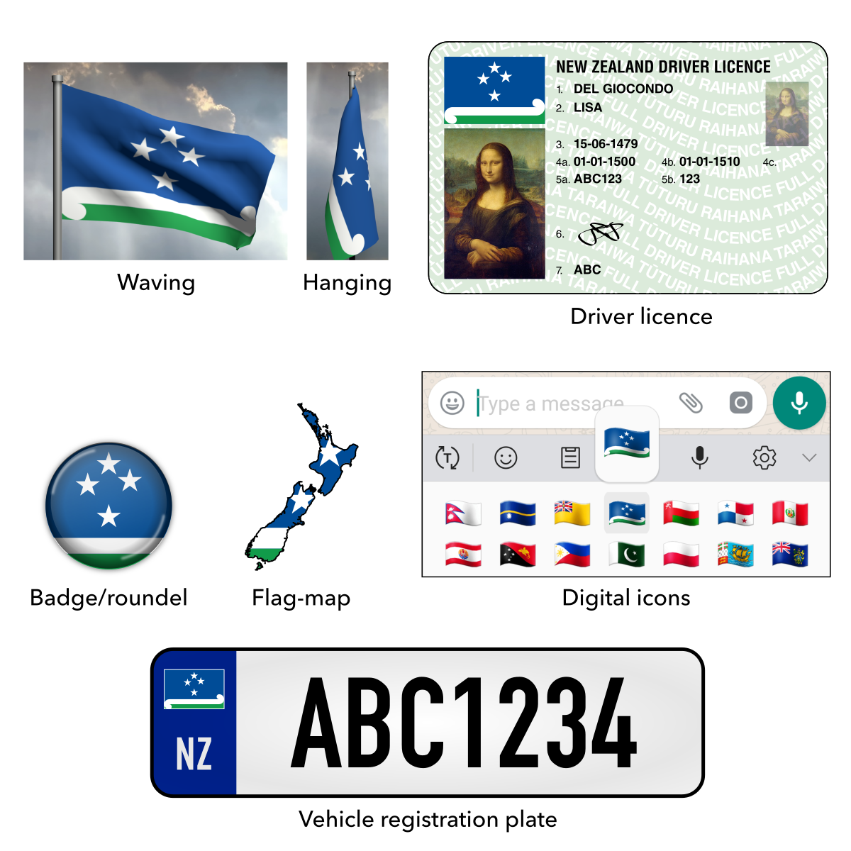
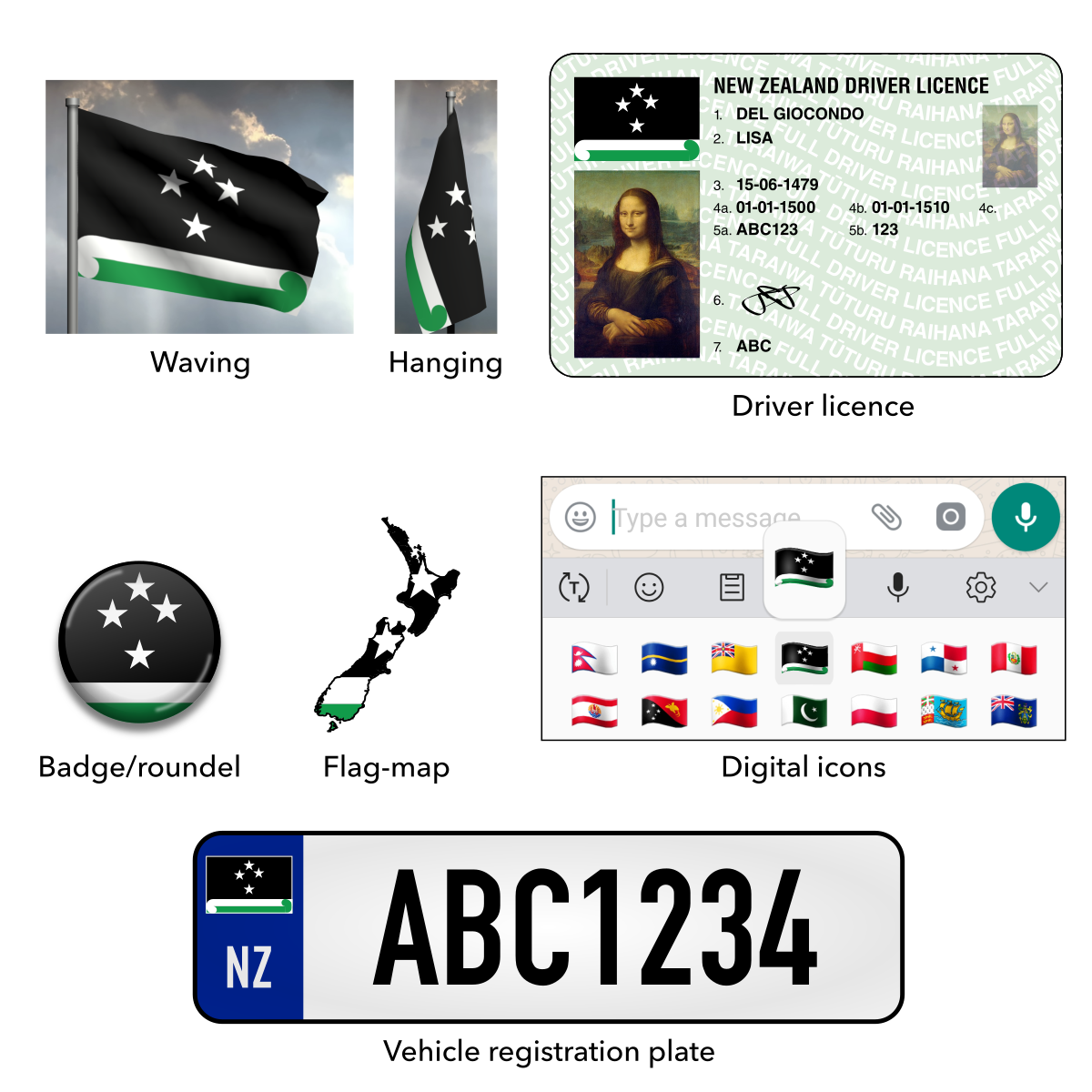
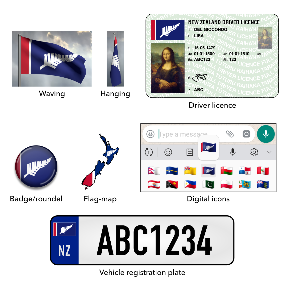
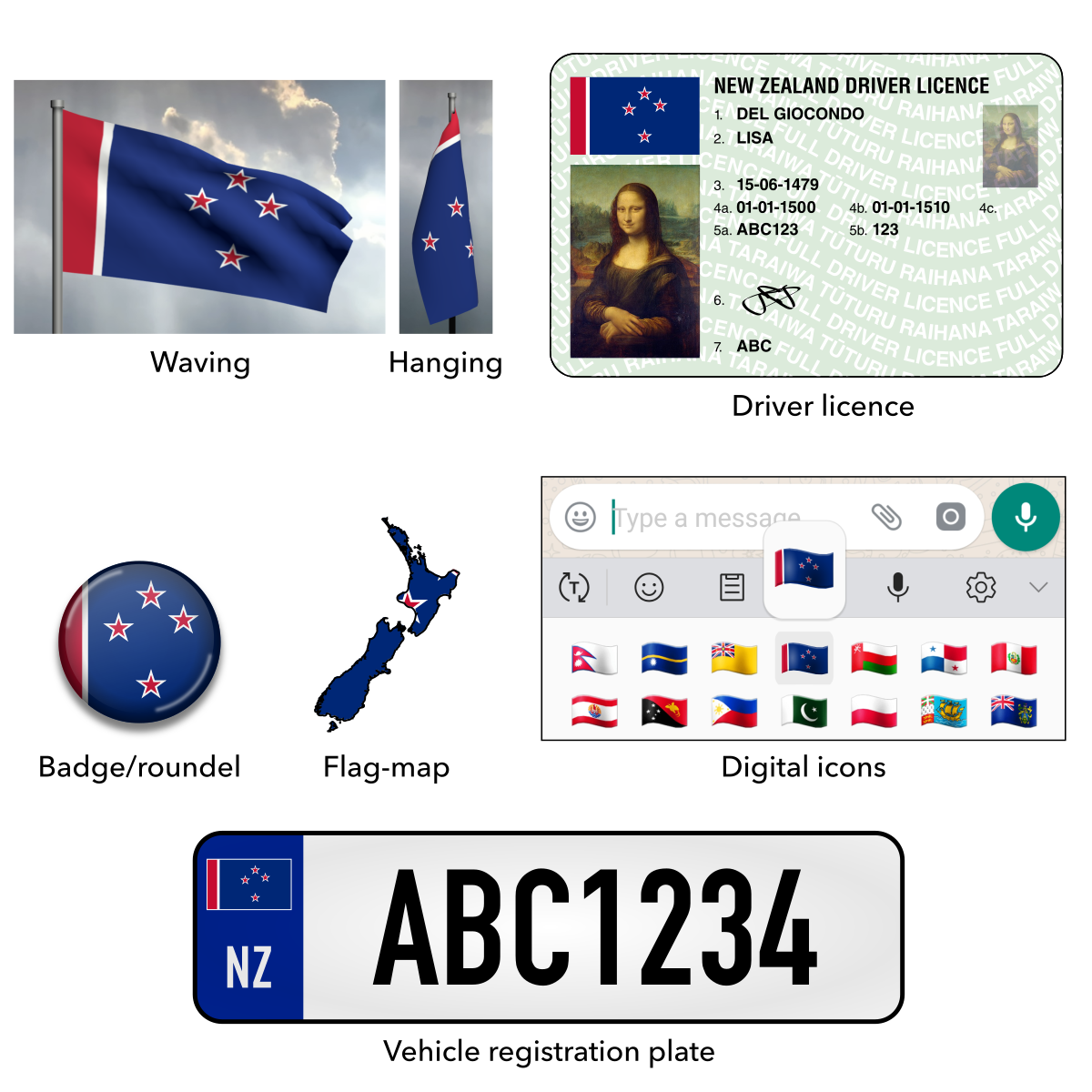
Waving flag mock-ups made with krikienoid’s Flag Waver software. Driver licence mock-ups contain licence design by New Zealand Transport Agency and painting of Lisa del Giocondo by Leonardo da Vinci. Digital icon mock-ups contain user interface elements from WhatsApp, Android Keyboard and Google’s flag emoji. We do not claim affiliation with nor ownership of the intellectual properties acknowledged in this section.
[section permalink 🔗]
Barrett, J. L., & Nyhof, M. A. (2001). Spreading nonnatural concepts: The role of intuitive conceptual structures in memory and transmission of cultural materials. Journal of Cognition and Culture, 1, 69–100.
Cheng, D. (2014). Flag debate: NZers favour new design – survey. Retrieved from http://www.nzherald.co.nz/nz/news/article.cfm?c_id=1&objectid=10625679
Davison, I. (2014). Kiwis back Union Jack flag. Retrieved from http://www.nzherald.co.nz/nz/news/article.cfm?c_id=1&objectid=11222086
Hubel, D. H., & Wiesel, T. N. (2004). Brain and Visual Perception. Oxford: Oxford University Press.
Osborne, D., Lees-Marshment, J., & van der Linden, C. (2016). “National identity and the flag change referendum: Examining the latent profiles underlying New Zealanders’ flag change support.” New Zealand Sociology, 31(7), 19-47.
Sibley, C., Hoverd, W., & Duckitt, J. (2011). “What’s in a Flag? Subliminal Exposure to New Zealand National Symbols and the Automatic Activation of Egalitarian Versus Dominance Values.” The Journal of Social Psychology, 151(4), 494-516. http://dx.doi.org/10.1080/00224545.2010.503717
Sibley, C., Hoverd, W., & Liu, J. (2011). “Pluralistic and Monocultural Facets of New Zealand National Character and Identity.” New Zealand Journal of Psychology, 40(3), 19-29.
Trevett, C. (2015). Flag poll message clear: Leave it alone. Retrieved from http://www.nzherald.co.nz/nz/news/article.cfm?c_id=1&objectid=11441353

When discussing proposed new New Zealand flags, I found myself drawn to two elements, the Koru and the constellation Matariki. There are no other national flags with either of those emblems, so it would be impossible to mistake for any other nation’s.
Thanks for your thoughts, Wesley.
Love your iteration of the silver fern flag — I think your creation of a slightly different version of the fern really did make it stick into my mind. I think a similar process could be observed in the Canada flag which may explain its popularity — as the maple emblem was common but normally in batches of three or with different points than on the final flag.
-Thomas D
Thanks for your feedback, Thomas. I drew inspiration from the design process of Canada’s iconic maple leaf, as documented in the book Our Flag: The Story of Canada’s Maple Leaf by Ann Maureen Owens. They started with a more complex rendering and learned to simplify it after wind tunnel testing.