Note: This post features my own judgement on the best flag designs. For the proposals that are most popular with the general public, see this post.
Now that the New Zealand government has closed submissions for a new flag, I decided to go through and pick out the best. That’s right, I looked through all 10,293 of them. Don’t worry, it only took me 48 minutes to evaluate (about 0.28 seconds per flag; thank god for learning scanning techniques).
It probably helped that the whole gallery was a beautiful testament to Sturgeon’s Law (in this case more like 99% though), Poe’s Law and the futility of crowdsourcing design, making it easy to mentally filter out the crud and parodies. You wouldn’t believe the Nazi, apartheid, North Korea, Israel, PRC, Imperial Germany, Quebec (of all places), meme and My Little Pony based parodies that got through their filters. Seriously, the name “Moswald Osley” didn’t ring any alarms? Well done to the Lautaro joke for subtlety and this thing for sheer insanity though. All in all, an experience I would not recommend. [2026 update: those links are all now broken, probably for the better]
I automatically dismissed any jokes, offensive statements, political statements and anything too similar to another national flag, no matter how well designed or New Zealand-y it was. I hope the judging panel can do that, but since it has no vexillologists (flag experts) I don’t have a lot of faith.
Anyway, here are the best I picked out, emulating the judges’ process of picking an initial list of 50-75 best designs. There were a lot of duplicates and near-duplicates so it’s hard to know exactly how to count and credit them (I’m sure I’ve missed a few credits, sorry!), but it should be around 50 some way or another.
This list is in no particular order.
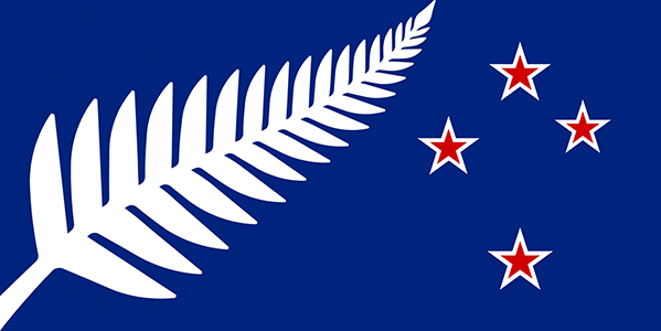
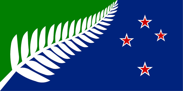
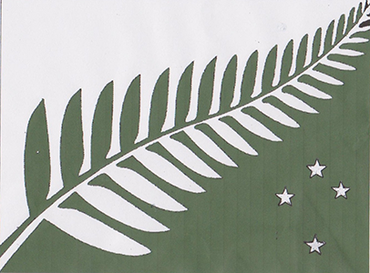
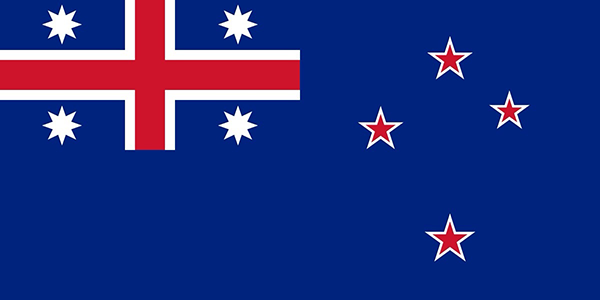
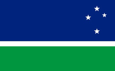
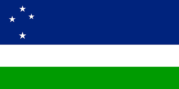
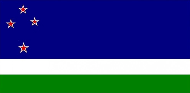
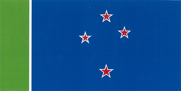
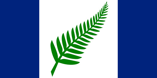
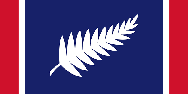
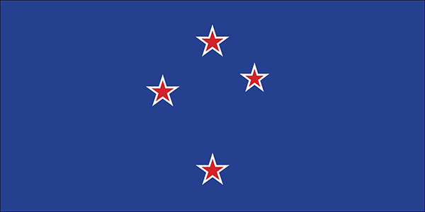
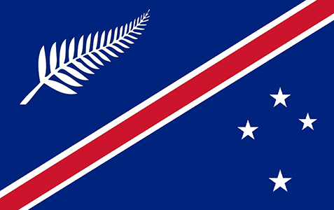
Silver fern and southern cross
Common design theme.
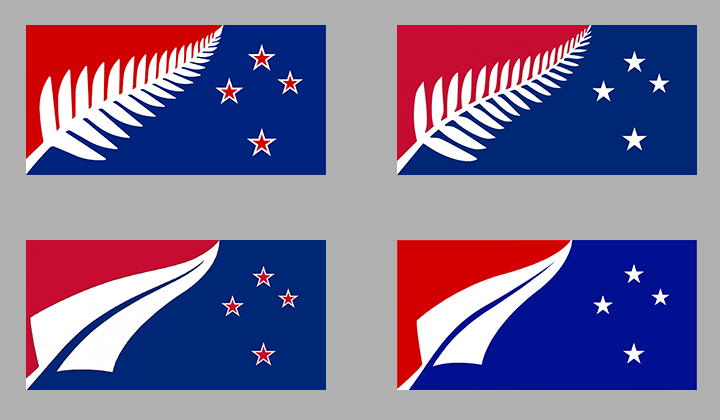
^ This design is pretty well known and wins a lot of polls. In the government’s gallery it was suggested and imitated by many.
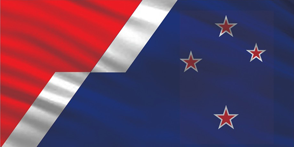
Out of the four main variants above, I prefer the one in the top-right. When the Southern Cross is only white, it competes less with the gigantic silver fern for focus. I can see why people like the design (it combines the right symbols and traditional red-white-blue) but I think the way the fern is both an emblem and division is a bit too abstract. It looks more like a logo and less like a flag, if you know what I mean.
^^ Hmm… these re-colours aren’t bad, but I still think the red is better. In the first, the blue background makes the elements look like they’re just floating on nothing. In the second, the green is too close to the blue in tone so there’s less contrast in the left panel and it doesn’t stand out.

^ Okay that shade of green is too close to olive/vomit…
The government gallery includes every possible variation of this basic design with different fern renditions and colour arrangements. I’d rather not keeping commenting individually on them, so I’ll just say that the original one with the three colours is best. There’s a reason Lockwood made a bazillion variants but chose that one as the main one (until 2016).


^ I like the one directly above, as the arrangement of green and blue fields now resembles a landscape and sky. No, it’s not just because of the resemblance to one of my designs. I swear.

^ Here the red stands out more but doesn’t resemble the ground anymore.

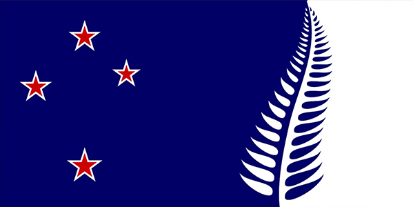
^^^ The counter-changing of the fern looks far too logo-like and “fiddly”, but it’s original. There are quite a few concepts like this which aren’t bad either, but these ones stood out more to me. Unfortunately some of them use the Qualmark fern which is just terrible enough to exclude from my list.
United Tribes flag variants
Based on the 1834 flag of the United Tribes of New Zealand. The retention of the St. George’s Cross makes them unsuitable, but they look nice.
Flags based on Tino Rangatiratanga flag
Linda Munn, the co-creator of the Tino Rangatiratanga flag, later told me that she refused to allow it or any design based on it to be considered for the national flag. I still included these for a decent attempt.
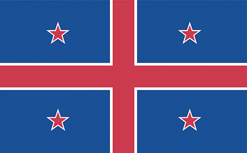
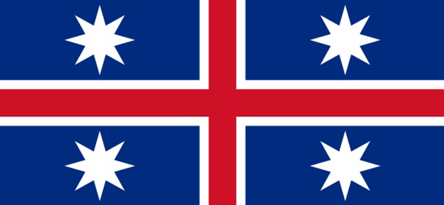
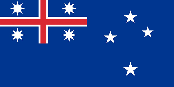
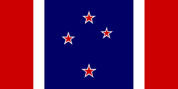
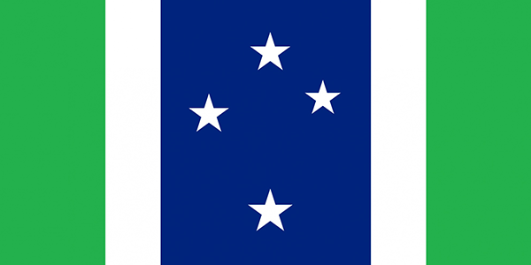
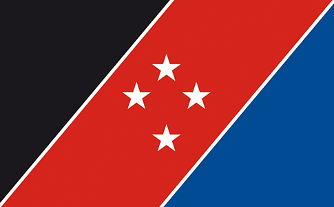
Southern cross and stripes
Boring, but it works.
Not even in the sense that it has elegant simplicity, or is a neutral compromise that satisfies all groups. This style is like a bland vanilla design that just appeals weakly to everybody without really rousing anyone. The southern cross looks too “empty” to be bold and iconic like the Maple Leaf or Rising Sun. It’s functional, just nothing more.

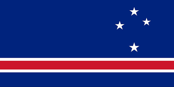
^ This at least tries to shake things up! Looks more dynamic.
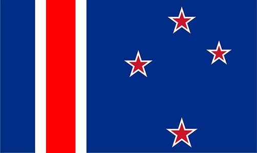
Flags based on Canadian Pale
Boring, but it works…
^^ … as long as the colours aren’t so bright!

^^ The ones with the fern leaf in the centre have a more bold central focus (the Southern Cross looks too “empty” for that purpose) but when green is also included, it becomes too hippie.
^ This one’s alright but the blue area is too wide and I hate this fern rendition. It’s so basic it’s almost cartoonish.
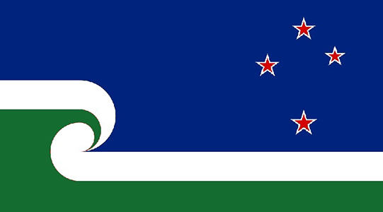
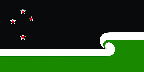
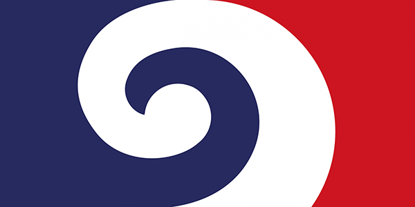
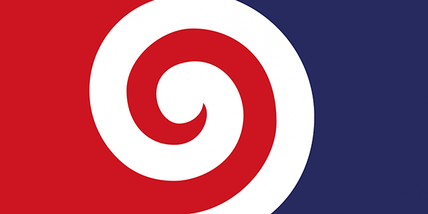
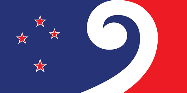
Flags based on koru layout
If you’re not careful, the koru can look like a fruit roll-up or candy-cane.
^^ I don’t like the excessive stylisation of the korus in the ones above. It’s just a stick-and-ball now! My friend from the USA says the first impression of this rendition is “oddly phallic”, which could be a problem. They also border very closely on “boring but it works”.

^ The well-known Hundertwasser design indeed looks better without the black bar and using more geometric curves. But it’s still too hippie, sorry.
^^^ It’s the Spiral Hill from The Nightmare Before Christmas!

(dammit, if I had seen these earlier, I would have entered a black and white version under the name Jack Skellington!)
Seriously speaking, I prefer the last one with the Southern Cross. The red, blue and white koru by itself is a good concept but it feels incomplete, like it’s just a background layout that needs something else added.
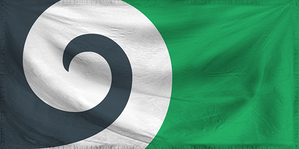
^ Now this koru is chunky enough to fill up the whole flag and not look “incomplete”. But while black-white-green may be bold, fresh, environmental and unique, it looks too African. I think that feeling only goes away if they’re used naturalistically (i.e. black for night sky and green for ground/plants).

^ Looks way too much like a graphic design or logo in the way the double-koru is cut off.
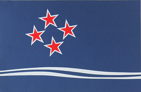
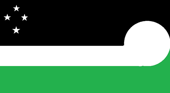
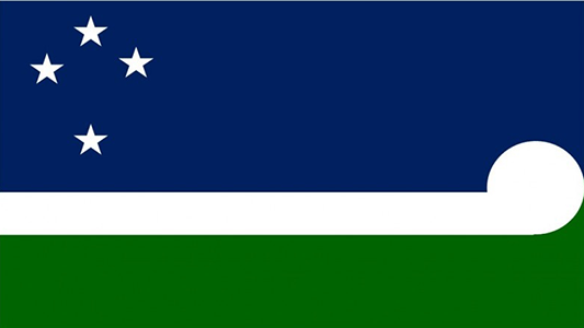
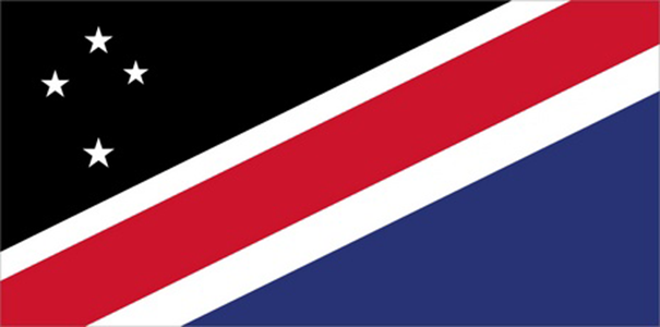
Others
^ Another “it’s boring but it works” concept. Especially this one. And the similar variants with the southern cross at the fly, at the hoist, rotated a bit, a little bigger, etc.
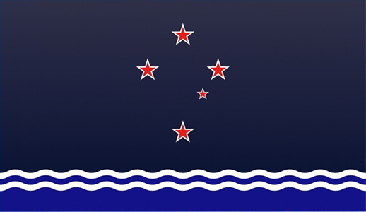
^ Barely made it onto the list. If the dark blue was black and the Southern Cross was in the form of the current flag, I’d like it better. I’m a bit torn on the waves though. It gives it an “obscure Pacific Island” feel.
^ Simple and bold. And not just because it resembles a great design of mine. I swear.
(but why is the diagonal bar so misaligned?)
^ Okay forget what I said before about bright colours before, this is the true offender. Appears to have been rendered with a restricted .GIF colour palette from 1995, but an alright underlying concept. I think it’s trying to cram too many things into one design though.
^ Slightly different colours and proportions go a long way! Even though it doesn’t combine as much symbolism as the Dignan design above, it looks simpler and nicer.
^ Interesting. Unconventional but simple. I didn’t like it at first but it stuck in my memory (and not the same way as the Microsoft Paint farting kiwi designs). I still don’t know what I think of it, but the memorability compelled me to include it.
^ One of the better mergers of Māori and British colours I’ve seen. More seamless and united, and less divided and shoehorned. This design also has many colour variations but this looks best and has the most meaning. However, the equal-sized stripes make it close to a boring tricolour and the compressed southern cross look a bit odd, though these are minor complaints.
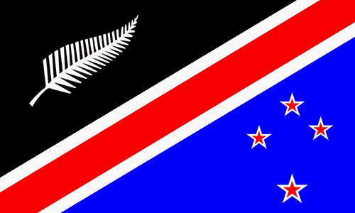
My own designs
Originally I excluded my/James’ designs from this list so I didn’t seem biased, but I actually do consider them the best by far, so here they are again for the sake of honesty.
My blog post contains the full explanations, details, methodology and mock-ups for these flags.
Conclusions
Out of the flags I winnowed for the list, most fall into the pitfalls of “functional but boring” or “interesting but looks like a logo, not a flag”. Even though these are my selection of the best (or rather, “least worst”) flags, I probably wouldn’t vote for most of them. They’re not all bad, but disappointingly few have the best-of-the-best “wow!” quality that is needed. I’m interested to see which ~50 designs the real judging panel will pick out. Will they think alike with my assessments? We’ll see in August.
2015 update: There are only four designs in common between the official long-list and mine – the main Lockwood design, Pikopiko, Modern Hundertwasser and Curly Koru. The judges seemed to prefer green, koru, logo-like designs and the Qualmark fern more than me and the general public.
Another update: There are no designs in common between the official short-list and my selection.

Some of the Kyle Lockwood red and blue designs make me think of the weetbix box.
Stop it, you’re making me hungry! :p
Nice to see you included my flag 🙂