This design is part of my 2009 flag proposal series (the flag designs from my old site with the most hits and ratings).
Cette conception fait partie de ma série de propositions de drapeau 2009 (les conceptions de drapeau de mon ancien site avec le plus de hits et de notes).
هذا التصميم جزء من سلسلة مقترحات العلم الخاصة بي لعام 2009 (تصميمات العلم من موقعي القديم مع أكبر عدد من النتائج والتقييمات).
Note: My choice of design does not reflect my political views.
Remarque: mon choix de conception ne reflète pas mes opinions politiques.
ملاحظة: خياري للتصميم لا يعكس آرائي السياسية.
The current design / La situation présente / الوضع الحالي

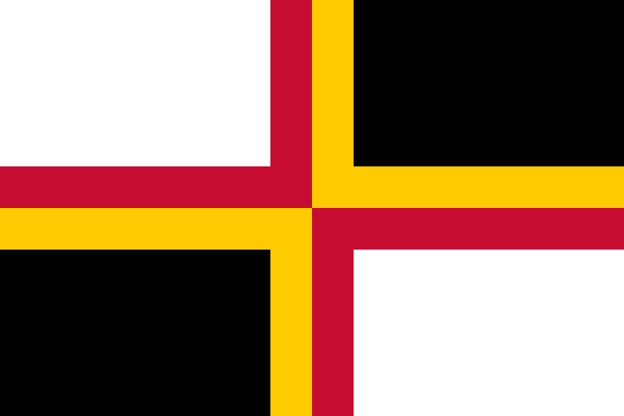
Current flag of Chad / Drapeau actuel du Tchad / علم تشاد الحالي

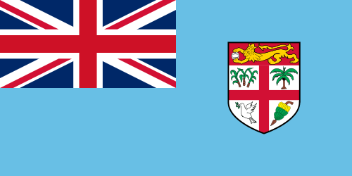
Current flag of Romania / Drapeau actuel de la Roumanie / علم رومانيا الحالي
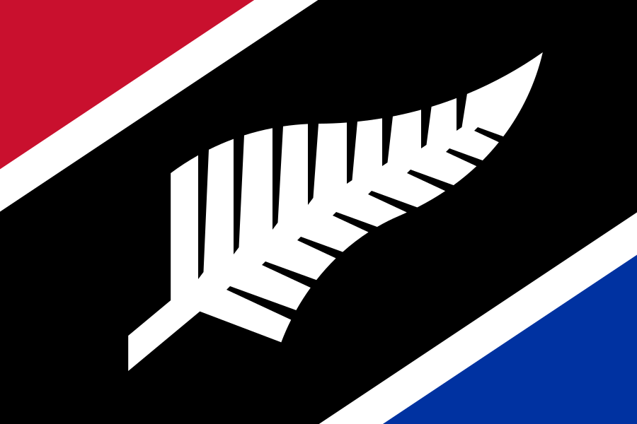
The flag of Chad is almost identical to the flag of Romania. This similarity is so close that Chad once asked the United Nations to inspect the issue. However, Romania pointed out that their flag is older, so Chad should be the one to change to make it more distinct. Therefore, here is my proposal.
Le drapeau du Tchad est presque identique au drapeau de la Roumanie. Cette similitude est si proche que le Tchad a demandé une fois aux Nations Unies de se pencher sur la question. Cependant, la Roumanie a souligné que son drapeau est plus ancien, le Tchad devrait donc être celui à changer pour le rendre plus distinct. Ainsi, je présente ma proposition ici.
علم تشاد مطابق تقريبًا لعلم رومانيا. هذا التشابه قريب جدًا لدرجة أن تشاد طلبت من الأمم المتحدة ذات مرة فحص القضية. ومع ذلك ، أشارت رومانيا إلى أن علمها أقدم ، لذلك يجب أن تكون تشاد هي الدولة التي يجب تغييرها لجعلها أكثر تميزًا. لذلك ، هذا هو اقتراحي.
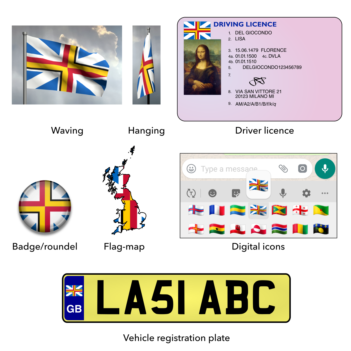
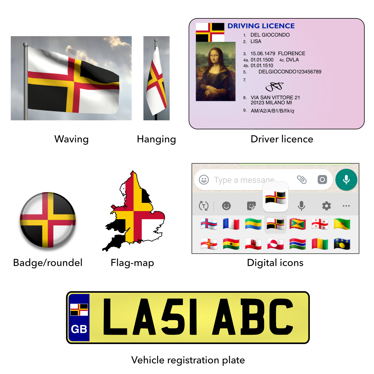
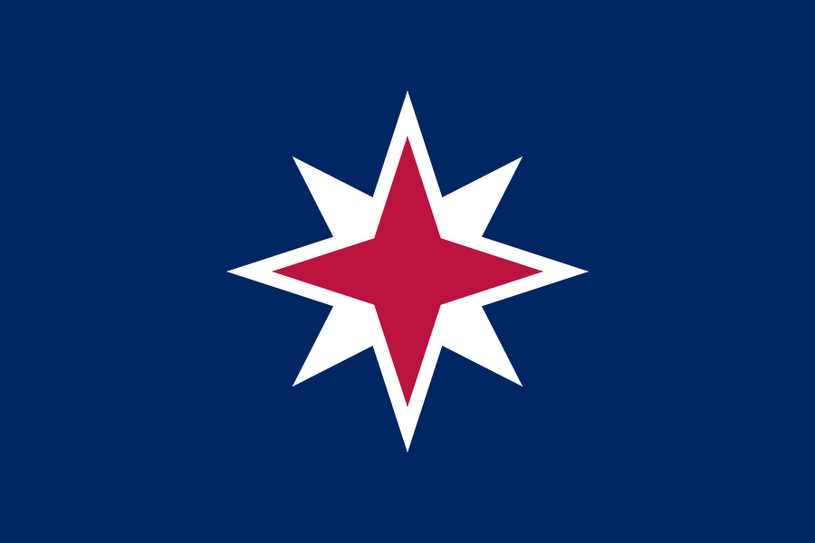
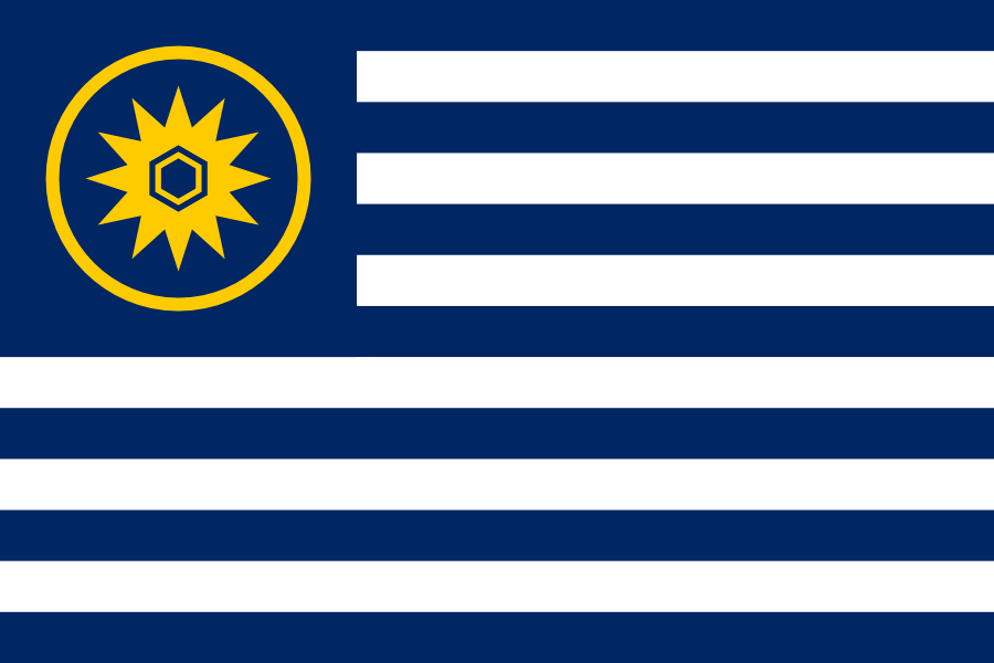
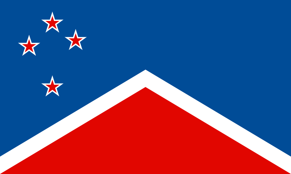
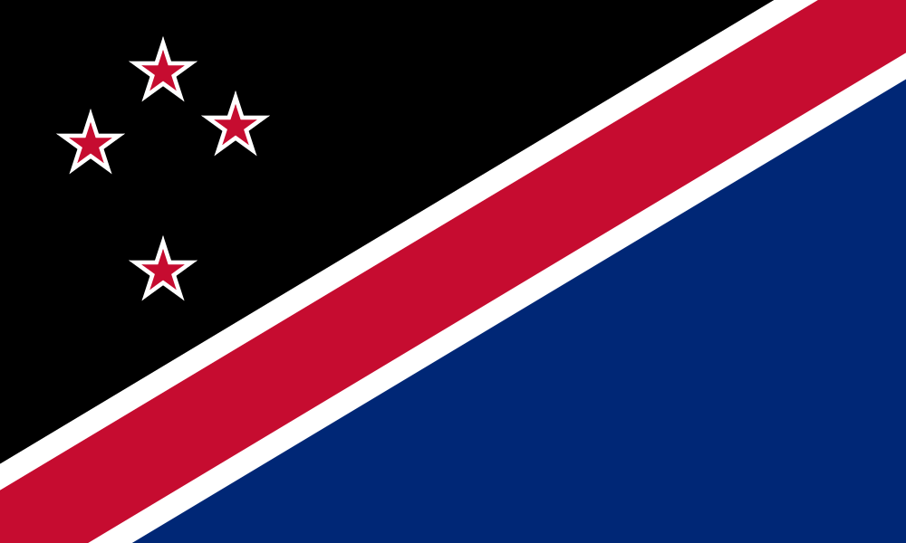
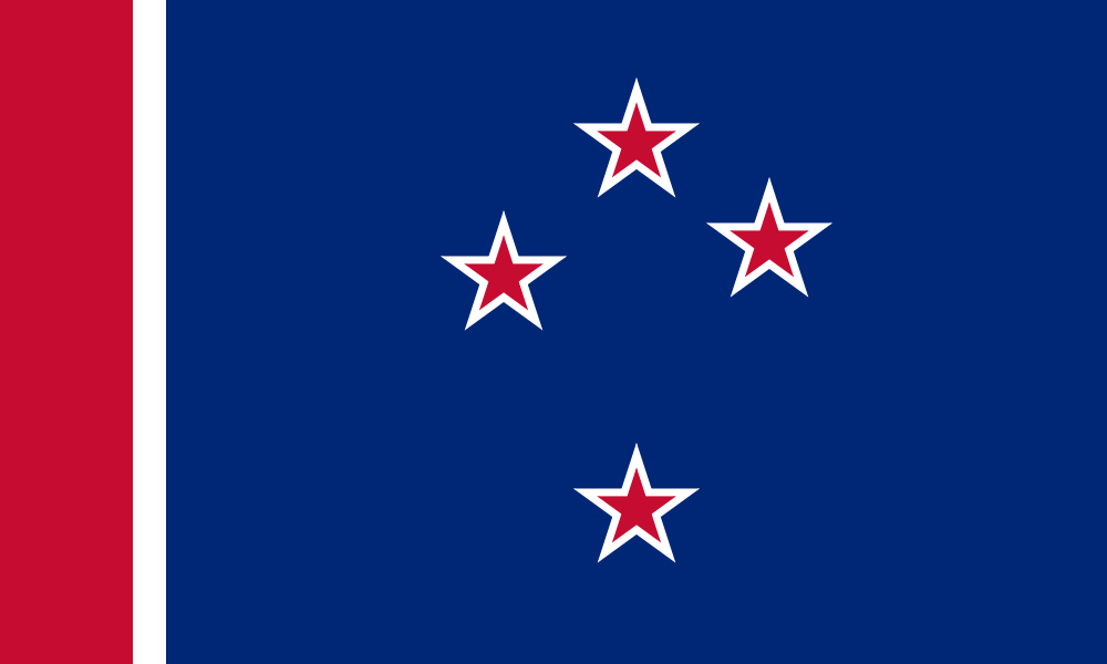
My proposal / Ma proposition / اقتراحي
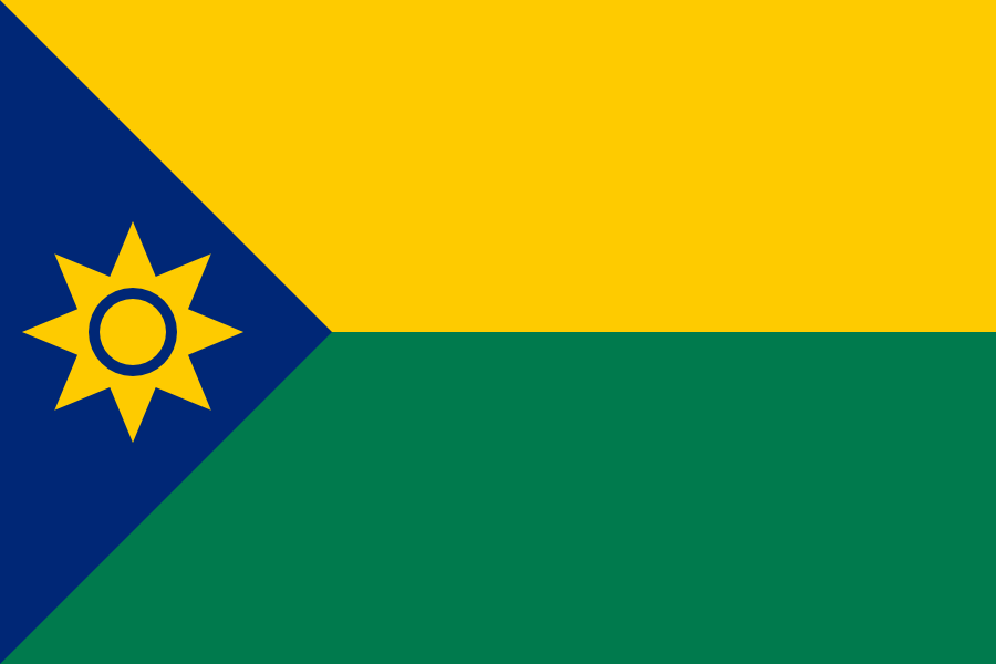
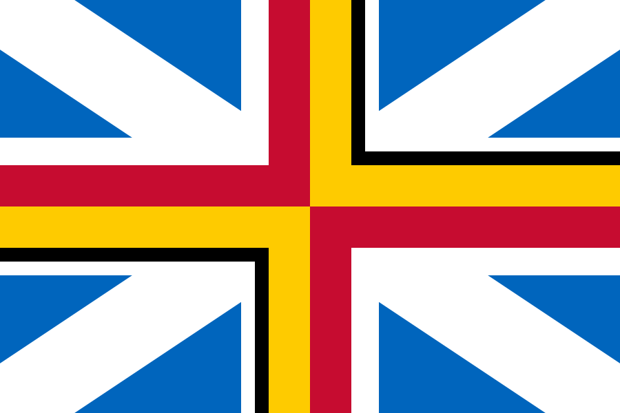
Proposed flag of Chad / Drapeau proposé du Tchad / علم مقترح لتشاد
First off, this design is simple enough to be remembered by a child, yet distinctive enough to be identified at a distance.
Tout d’abord, cette conception est assez simple pour être mémorisée par un enfant, mais suffisamment distinctive pour être identifiée à distance.
أولاً ، هذا التصميم بسيط بما يكفي ليتذكره الطفل ، ولكنه مميز بما يكفي ليتم التعرف عليه عن بعد.
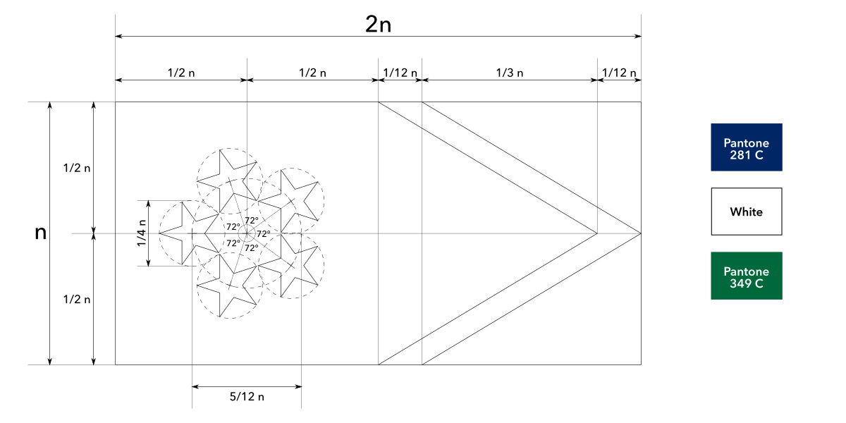
The overall layout represents the geography of Chad. In the south is fertile land, in the north is the Sahara Desert and in the west is Lake Chad, which is important to the country. The eight pointed star represents the sun, warmth, vitality and hope for a bright future. The eight points represent the eight directions, referring to the vast size of Chad. The location of the sun ensures its importance, as the left hand side will be last part of the flag to wear out.
La disposition générale représente la géographie du Tchad. Au sud se trouve des terres fertiles, au nord le désert du Sahara et à l’ouest le lac Tchad, qui est important pour le pays. L’étoile à huit branches représente le soleil, la chaleur, la vitalité et l’espoir d’un avenir radieux. Les huit points de l’étoile représentent les huit directions, faisant référence à la vaste étendue du Tchad. L’emplacement du soleil assure son importance, car le côté gauche sera la dernière partie du drapeau à s’user.
يمثل التصميم العام جغرافية تشاد. في الجنوب أرض خصبة ، وفي الشمال توجد الصحراء الكبرى وفي الغرب بحيرة تشاد ، وهي مهمة للبلاد. تمثل النجمة الثمانية الشمس والدفء والحيوية والأمل في مستقبل مشرق. النقاط الثماني تمثل الاتجاهات الثمانية ، في اشارة الى الحجم الشاسع لتشاد. يضمن موقع الشمس أهميتها ، حيث سيكون الجانب الأيسر هو الجزء الأخير من العلم الذي يتآكل.
Vector files available on request.
Fichiers vectoriels disponibles sur demande.
ملفات المتجهات متاحة عند الطلب.
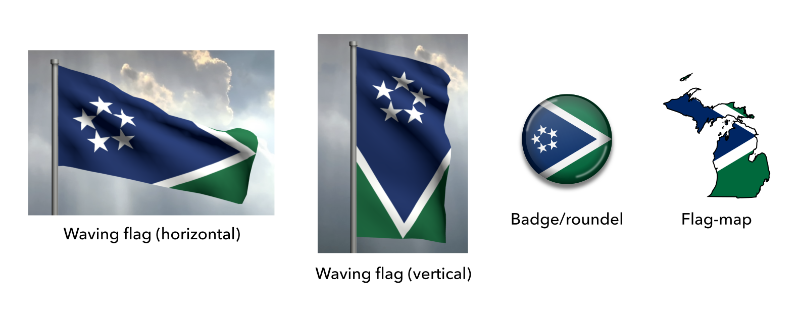
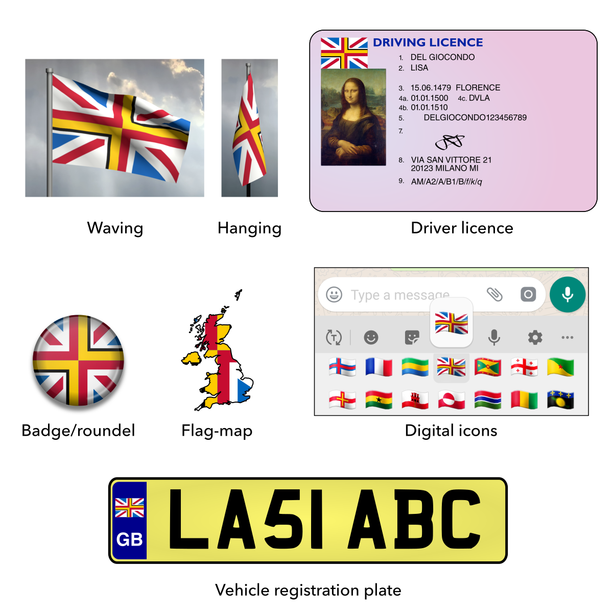
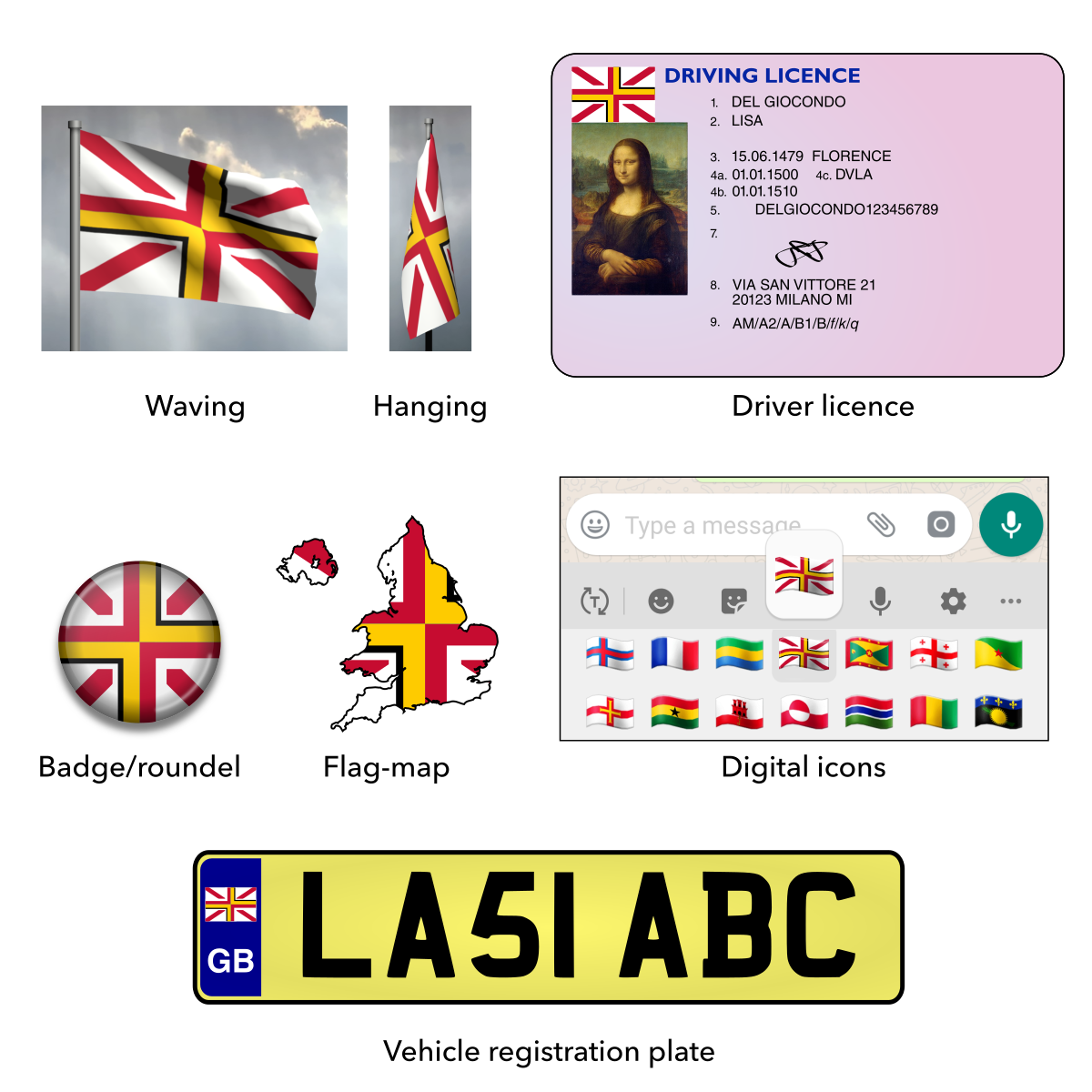
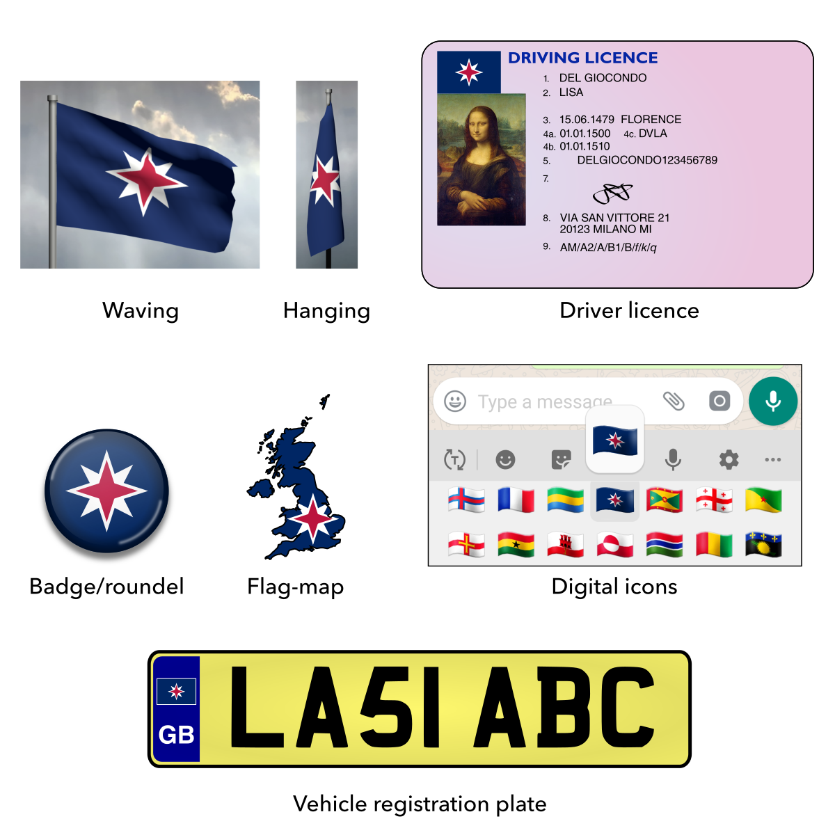
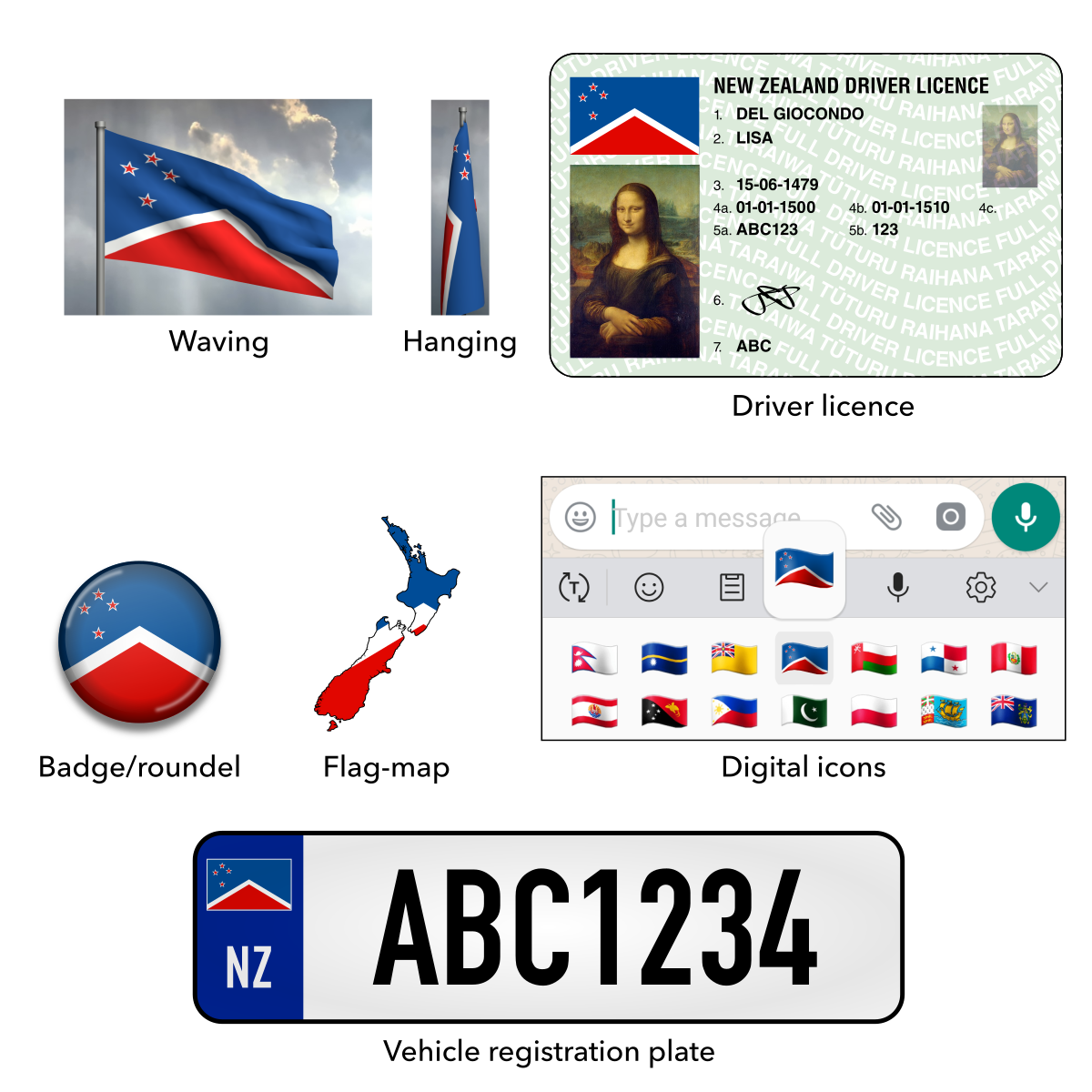
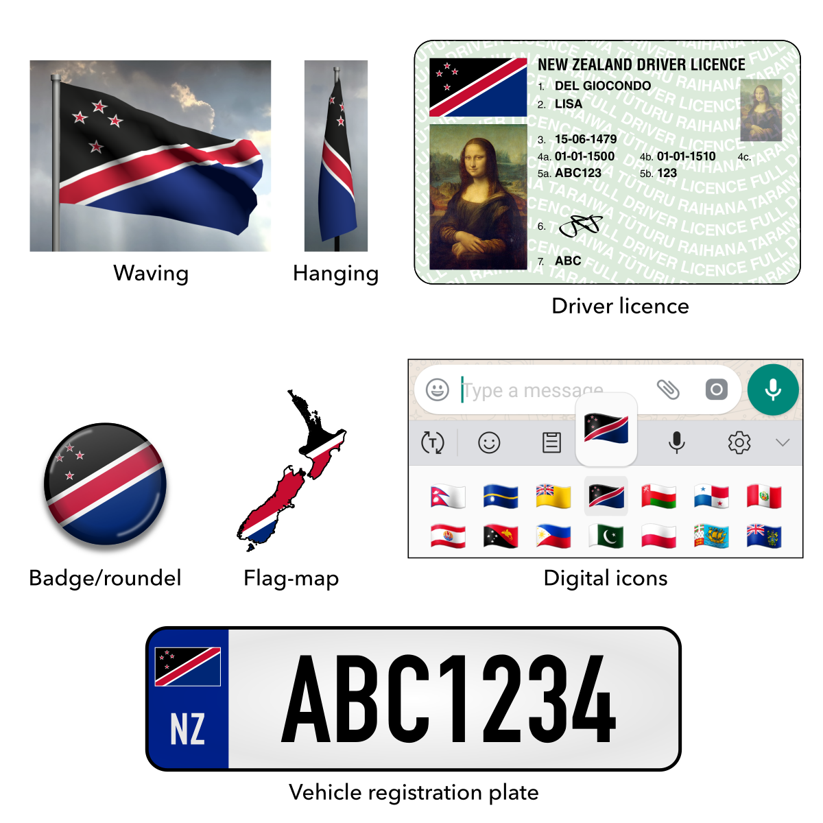
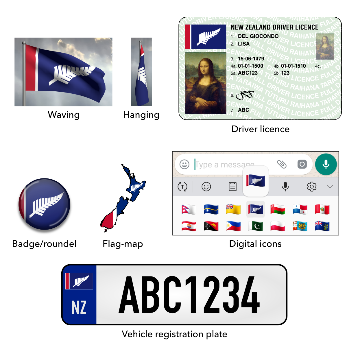
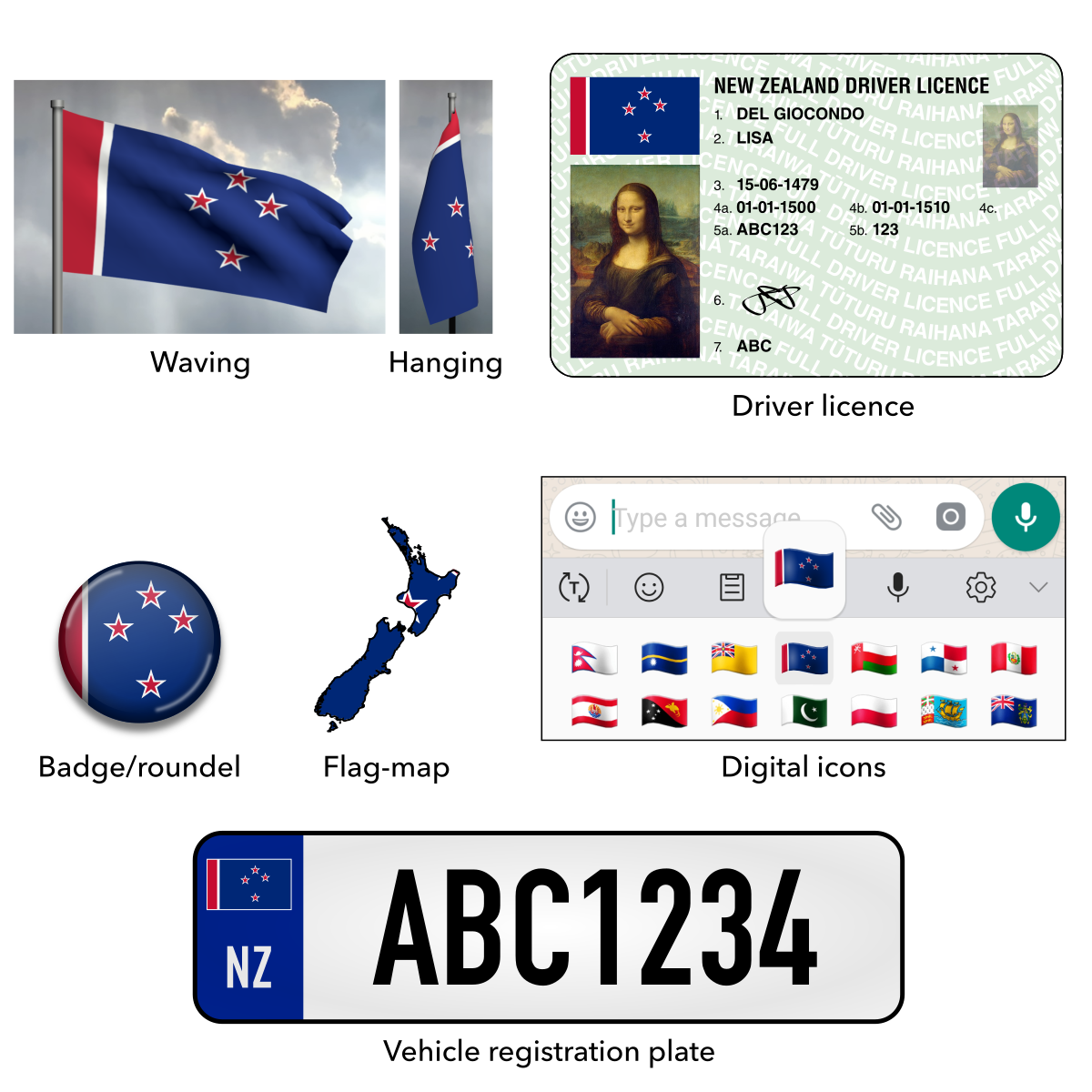
Mock-ups of the proposed flag of Chad / Maquettes du drapeau proposé du Tchad / نماذج بالحجم الطبيعي لعلم تشاد المقترح

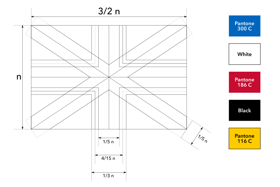
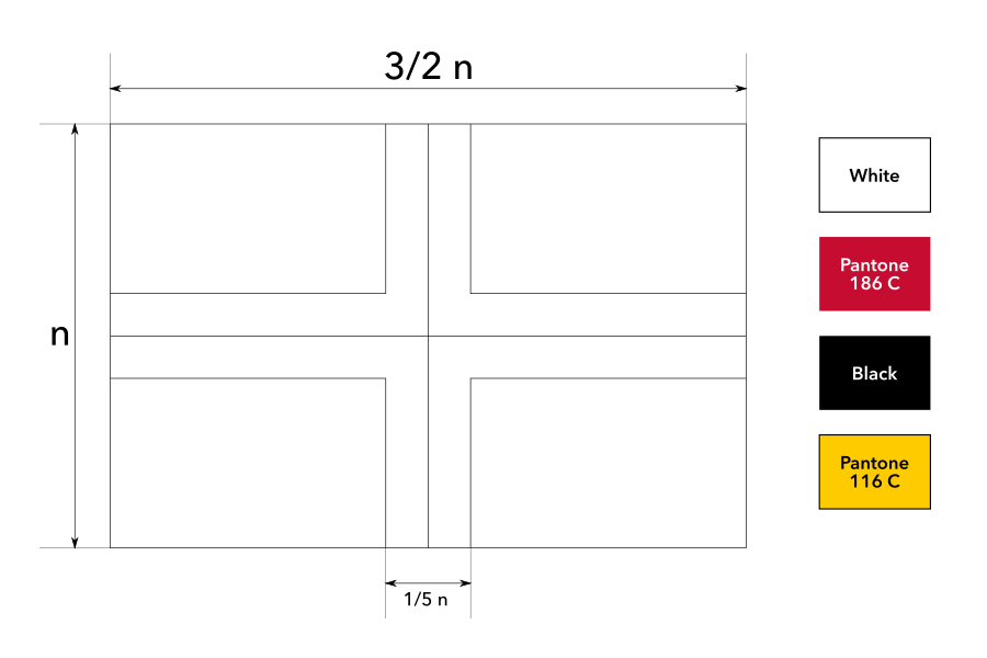
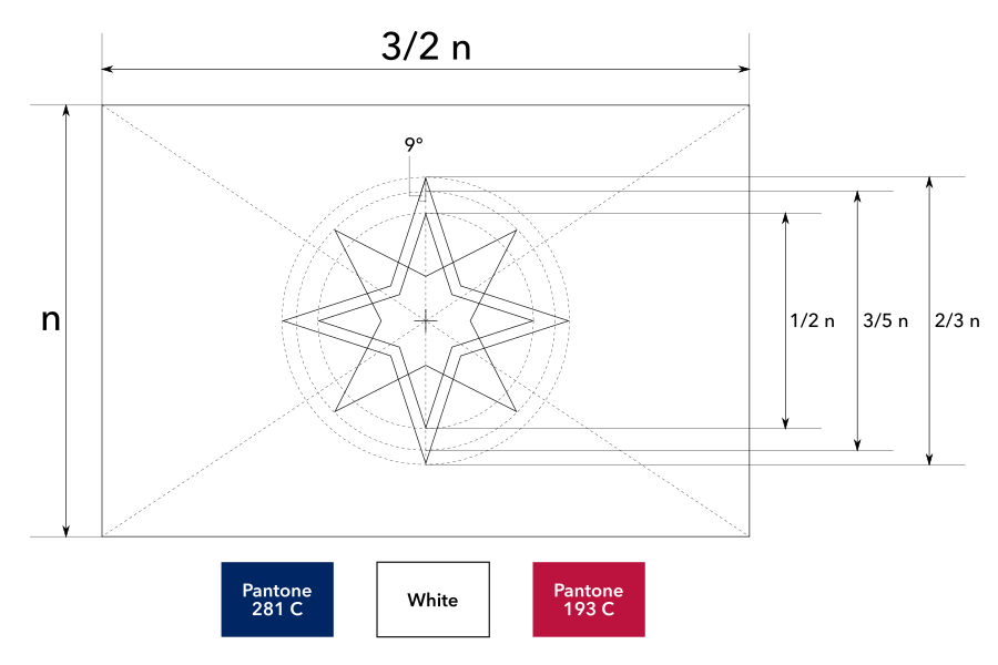
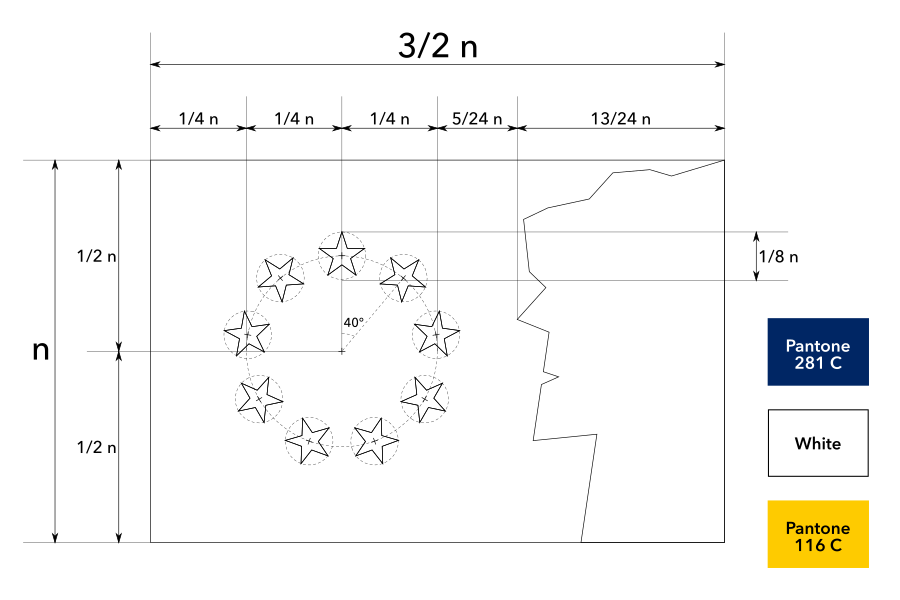
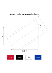
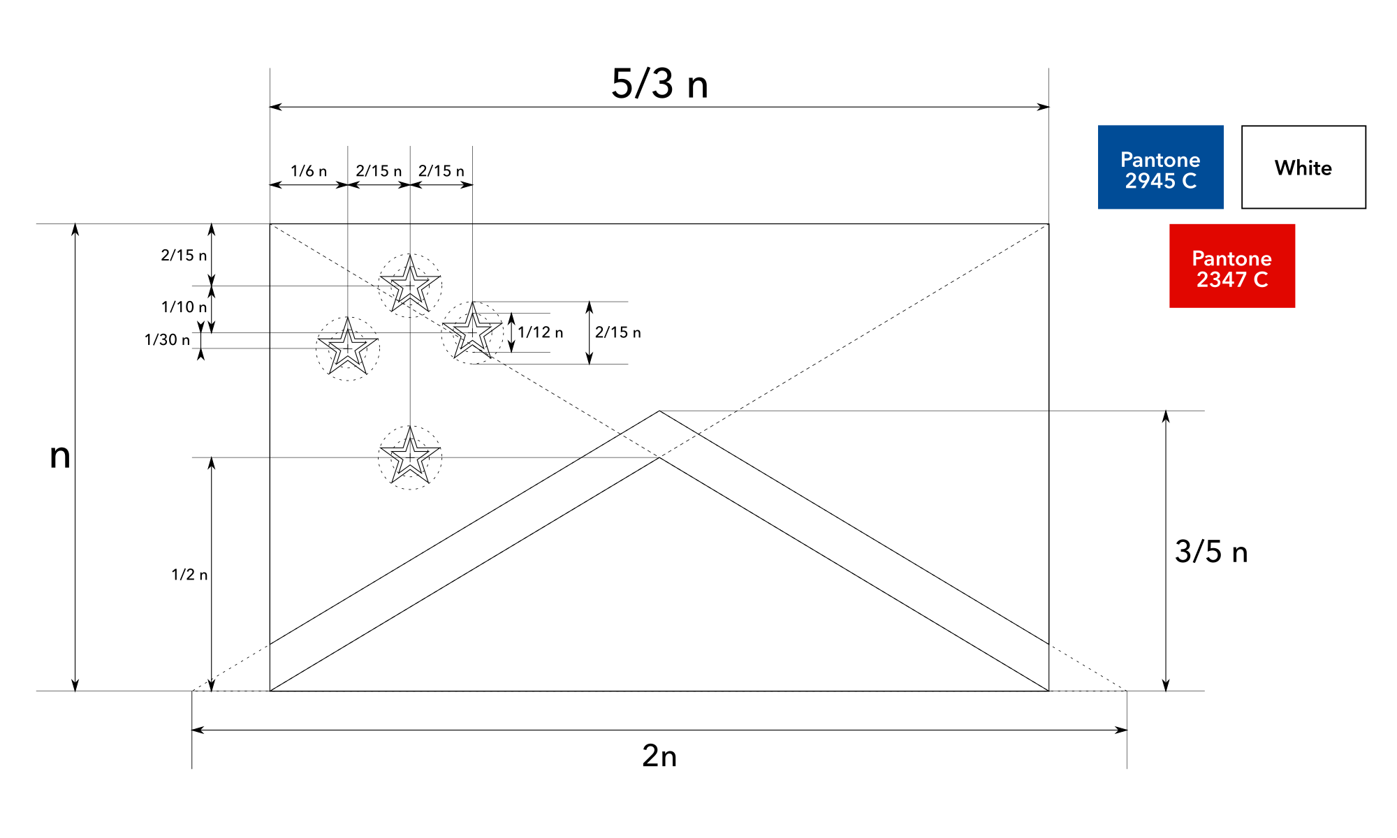
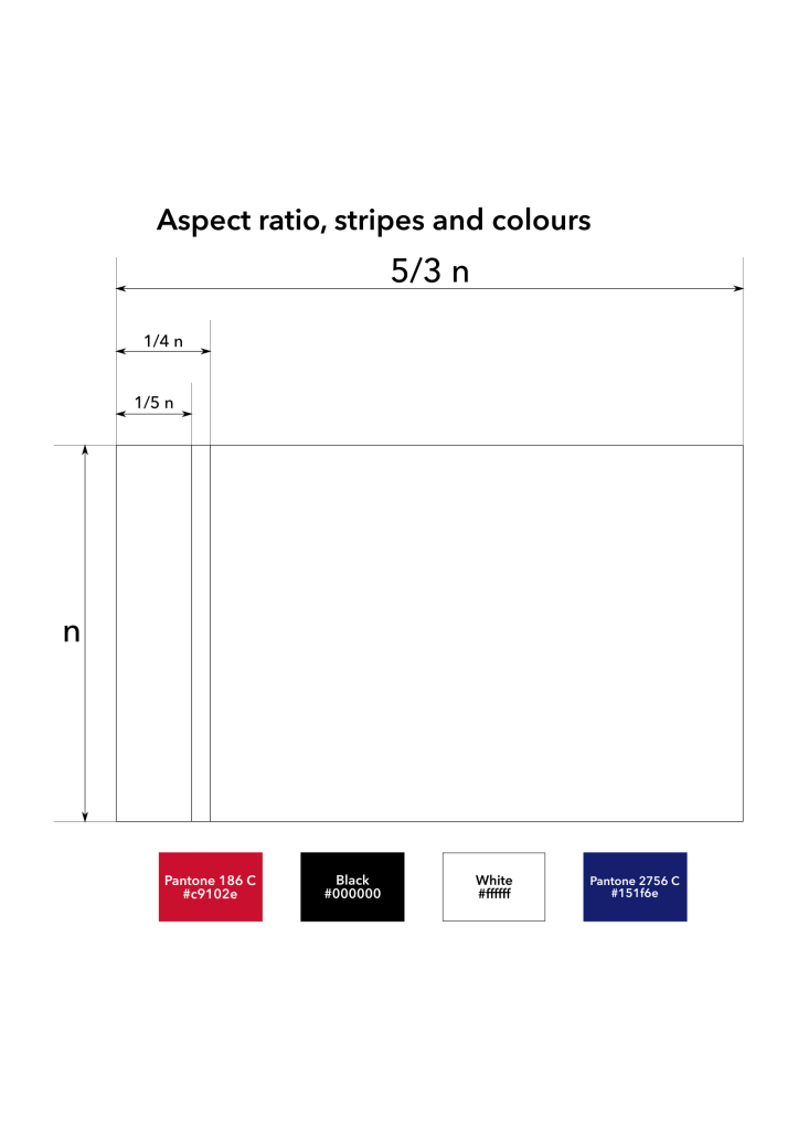
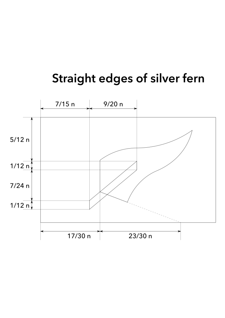
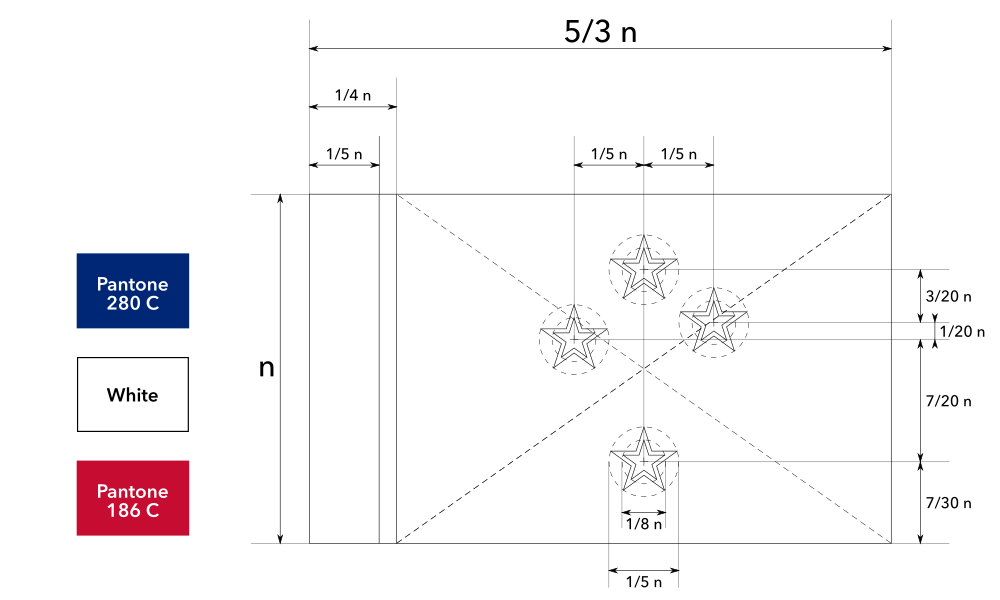
Construction sheet of the proposed flag of Chad / Fiche de construction du drapeau proposé du Tchad / أبعاد علم تشاد المقترح


![02 proposed flag of michigan [recoded]](https://briancham1994.com/wp-content/uploads/2019/01/02-proposed-flag-of-michigan-recoded.png)