[section permalink 🔗]
Update: This section has been expanded into its own presentation and article entitled The Six Little-Known Deal-Breakers of Bad Flag Design. It was presented at NAVA’s 55th annual conference where it got an Honorable Mention for the Driver Award.
We were aware that no previous proposal was loved enough to be a worthy contender to the current flag, so we consciously analysed the commentary behind them all to identify the common themes. This way, we could learn from everyone else’s mistakes and completely transcend them. Listed below are the deal-breakers that afflict so many proposals. Even the official referendum selection falls into these!
Generally bad flag design — The classic sins. Too complicated, too many colours, too many elements, irrelevant symbolism, too similar to other flags, the inclusion of writing, maps or gradients, and so on.
Looks like a logo, not a flag — Most proposals (we would say over ninety percent of them) look like modern art pieces, corporate logos or political statements stuck into a rectangle. Any appeal of these designs disappear if we imagine them actually fluttering on a flagpole alongside other national flags. The design should have a classic, timeless quality rather than an ephemeral, flashy quality. We posed a thought experiment—If you claimed that your design was from fifty years ago and that you had actually rediscovered it in an archive rather than created it, would anyone believe you?
Cheesy souvenir — A subset of “looks like a logo, not a flag”. Designs can evoke a feeling of cringe and contempt if they look too offbeat, informal or “un-flag-like”. This is subjective – for some, the silver fern is cheesy; for others, the silver fern is conventional.
Mystery symbolism — Roger Ebert once declared, “If you have to ask what it symbolizes, it didn’t.” Flag design is not like conceptual art with its invented imagery and lofty explanations, it’s more like advertising which uses a culture’s shared visual language to intuitively resonate with the audience at first glance. We posed a thought experiment—If your design were transported back in time by fifty years without any accompanying context, would the average person on the street immediately be able to reckon that it’s a New Zealand flag proposal and what everything represents? A similar thought experiment—If your design is submitted to Reverse Google Image Search, is it successfully labelled as “New Zealand”? (this is something we actually tried during our design process)
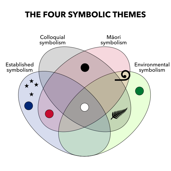
Designing for yourself – These designers made the mistake of designing for themselves, not for the general public. These designs focus on only one symbolic theme (see the explanation in the next section) at the utter exclusion of other preferences, which is essentially self-sabotage and negates the possibility of general public appeal. Different themes of national identity appeal to different people. They’re not wrong. They’re just not you.
Too radical — These designers wipe the slate clean and aim for a revolutionary design with no established symbolism. This is also self-sabotage. The vote would be held by everyone, and a substantial amount of the population is intimately attached to established symbolism. Flags are supposed to express a group’s identity, rather than prescribe it, otherwise the designs cannot achieve the wide appeal that we need.
It’s boring, but it works — Either James or I once critiqued a particularly minimalist flag proposal as “a bland vanilla design that just appeals weakly to everybody without really rousing anyone”. There is such a thing as a flag being too simple. There is such a thing as trying to satisfy everybody and ending up satisfying nobody. A design which is dull, uninspiring and typical will backfire, not grab attention, not stick in the memory and not have support.
We strove to avoid these deal-breakers and achieve their polar opposites.


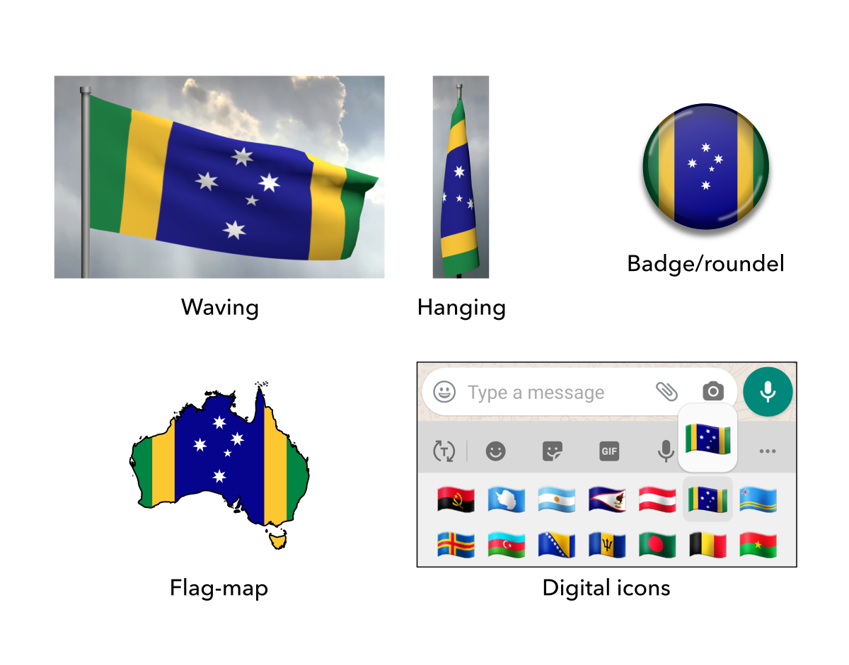


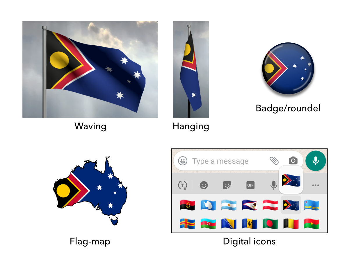

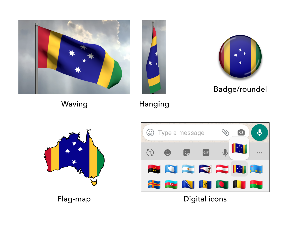
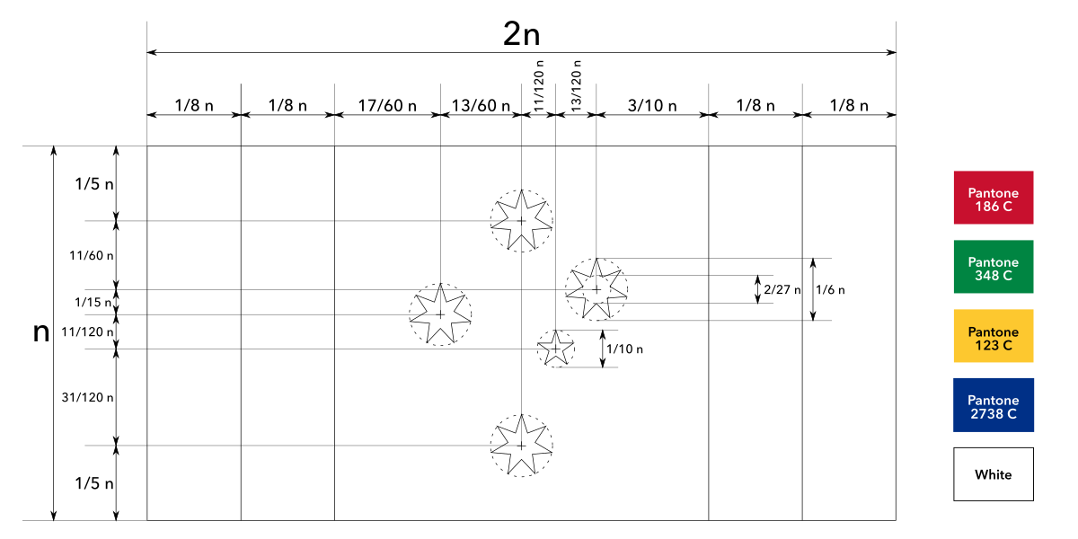

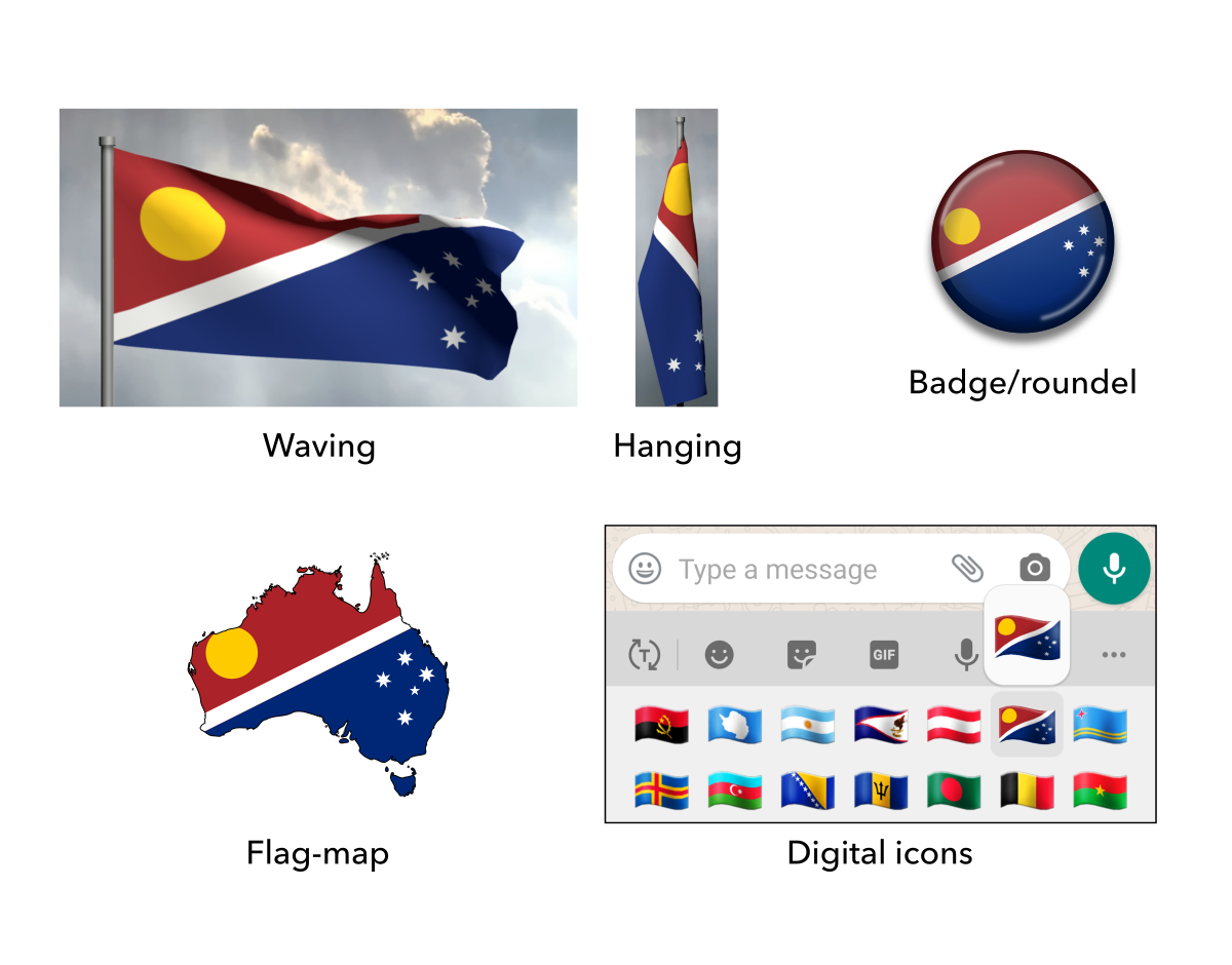


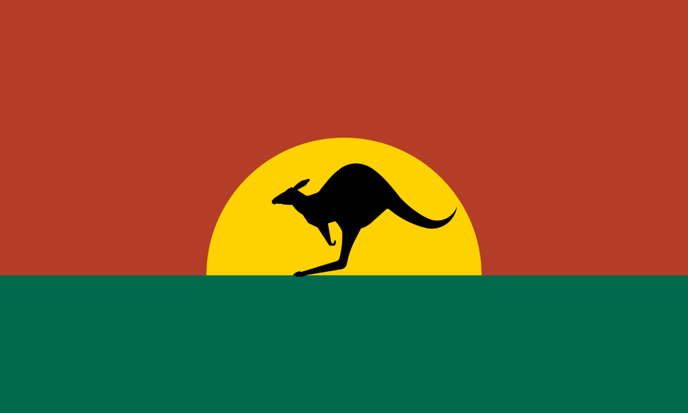
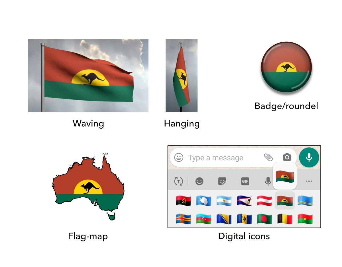
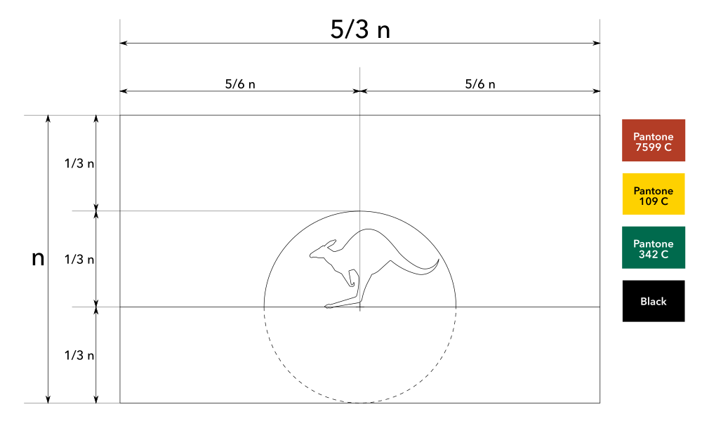
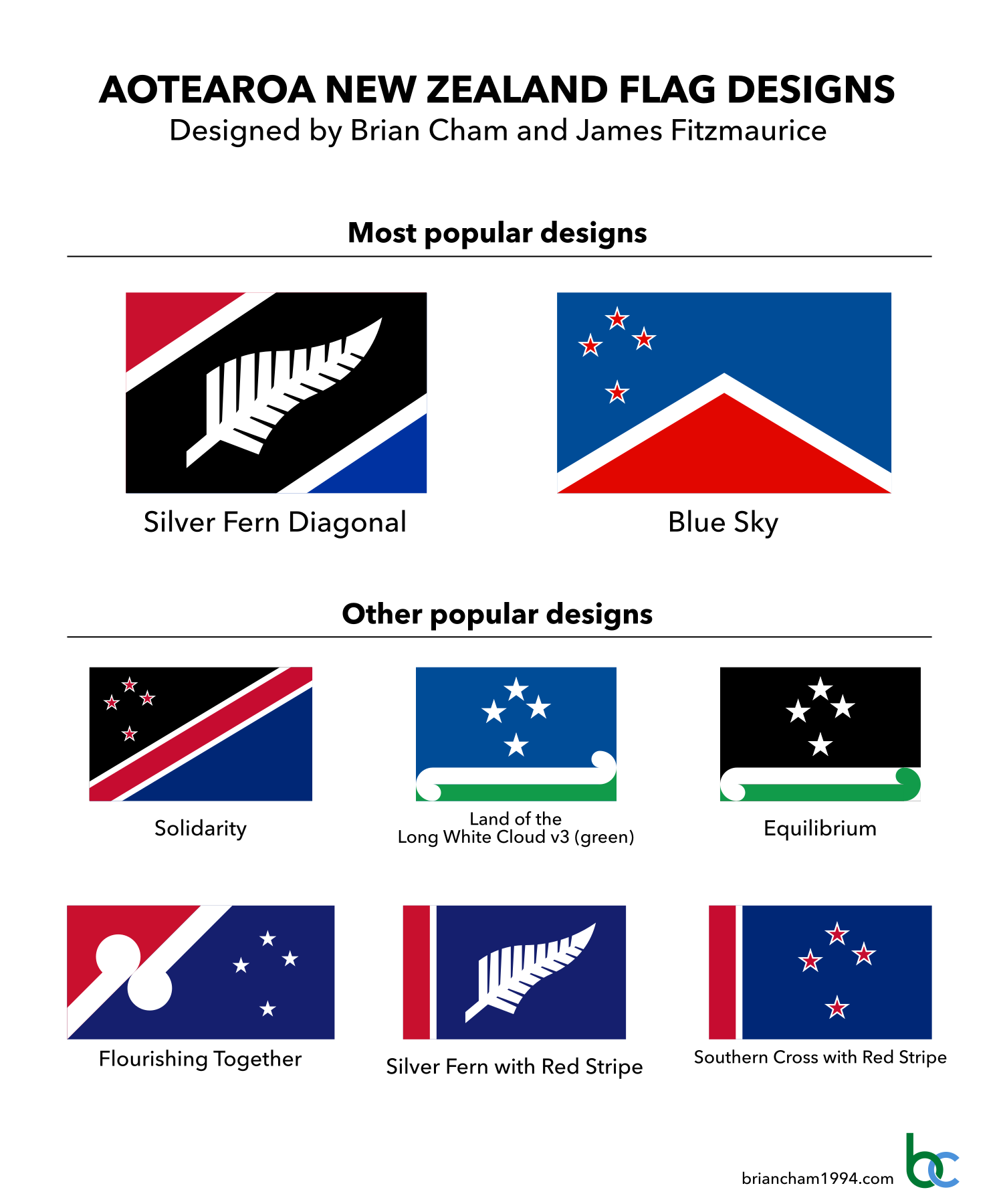
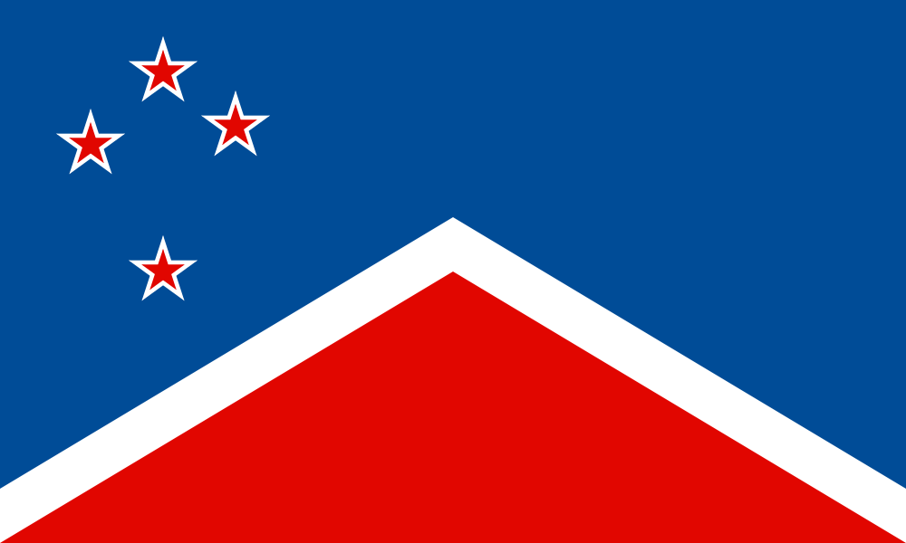
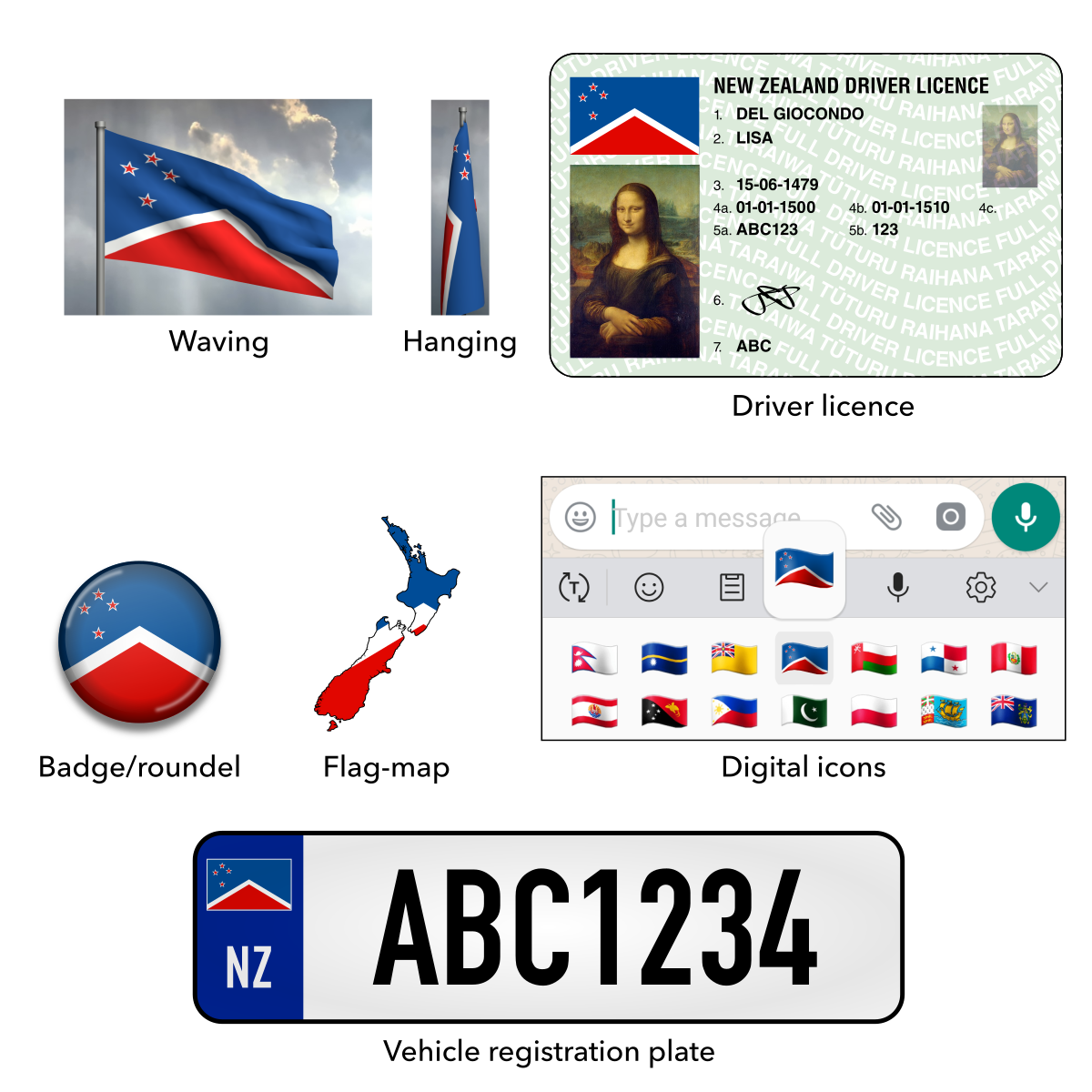
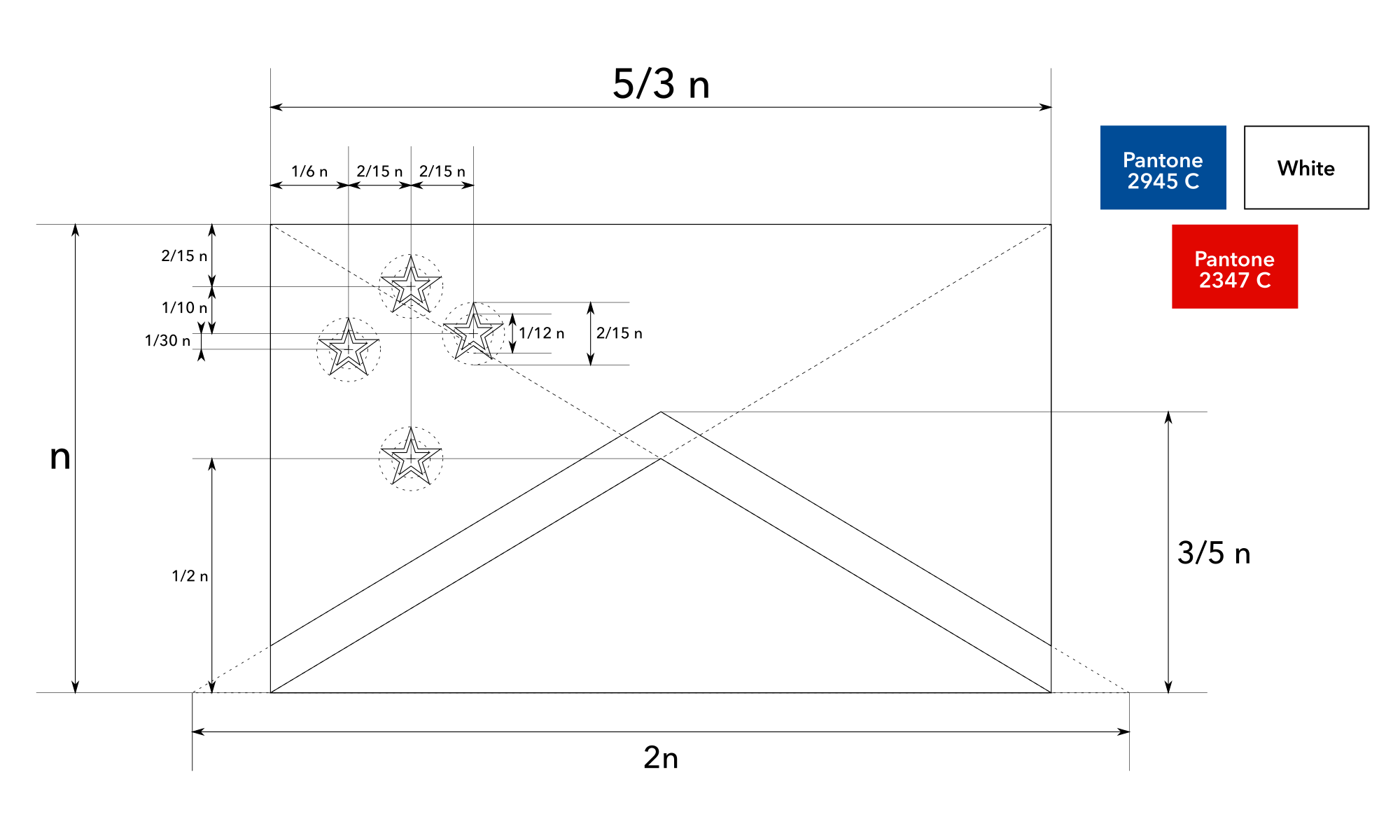
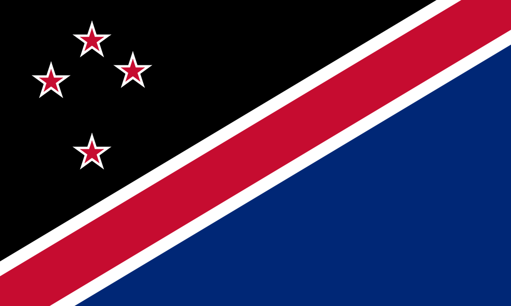
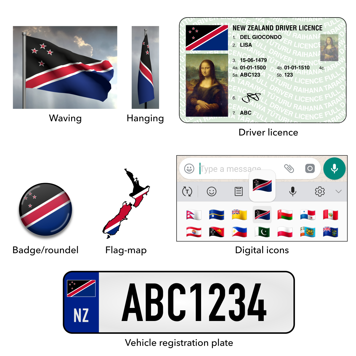
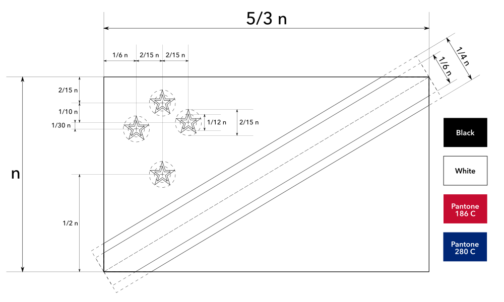
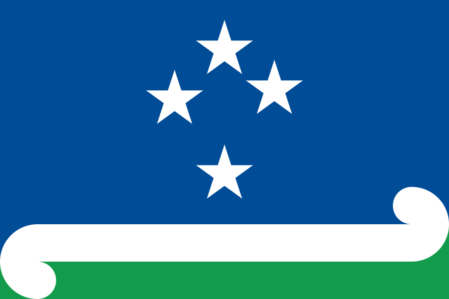
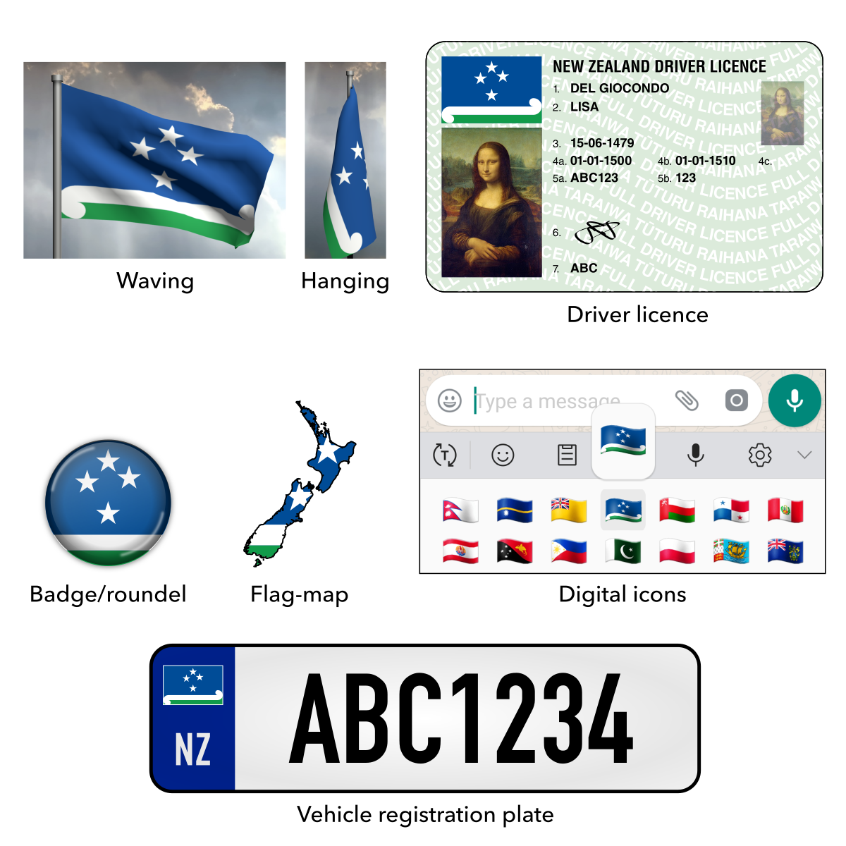
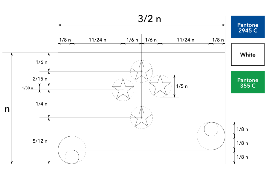
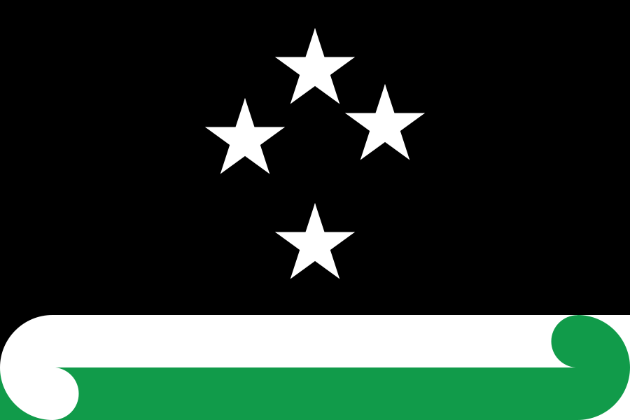
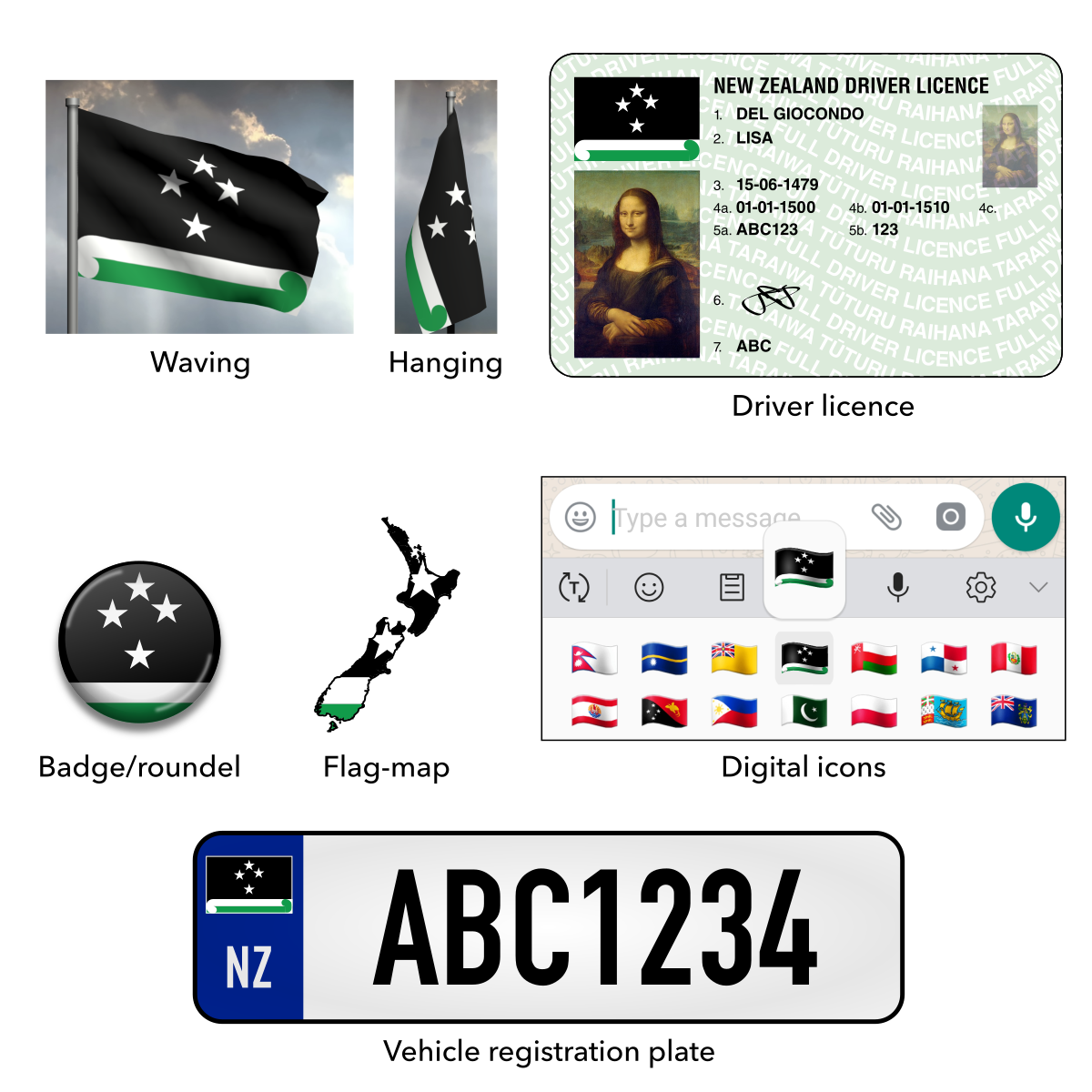
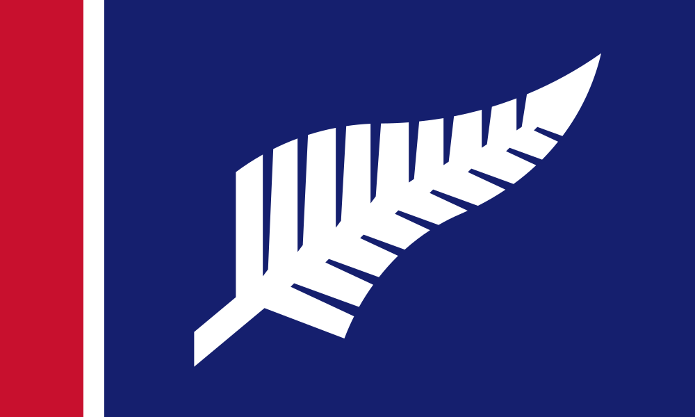
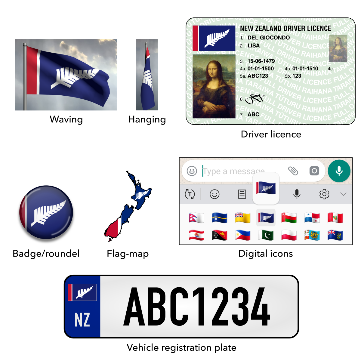
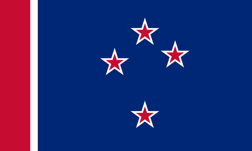
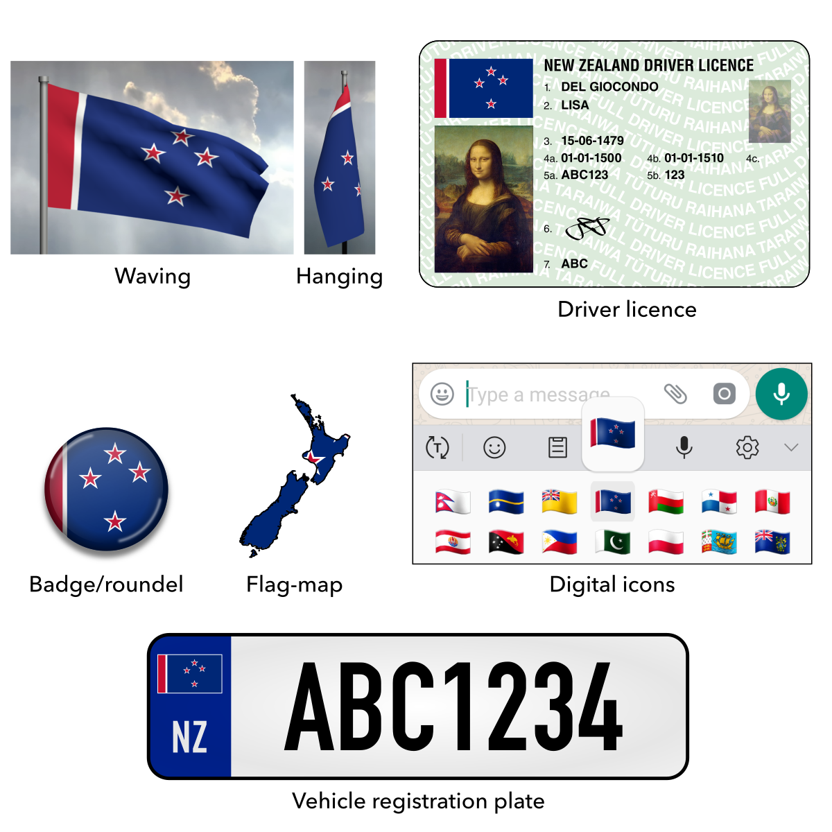
 Proposed Flags of Aotearoa New Zealand
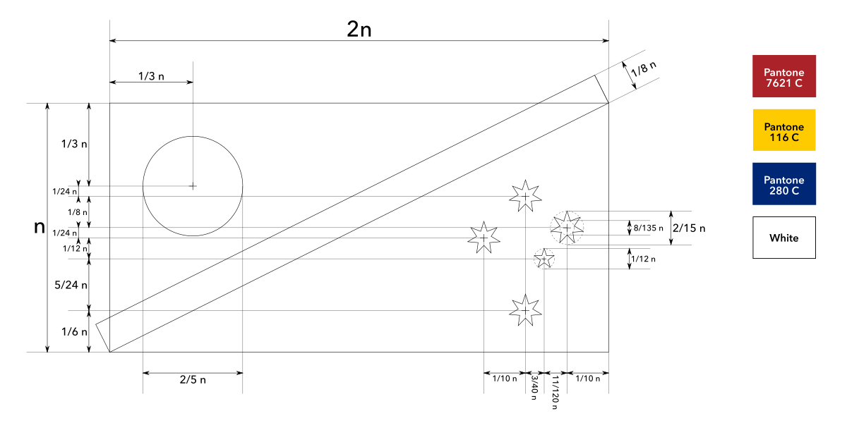
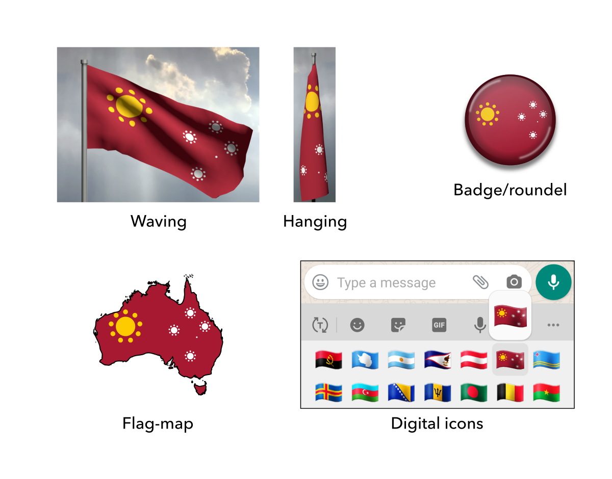


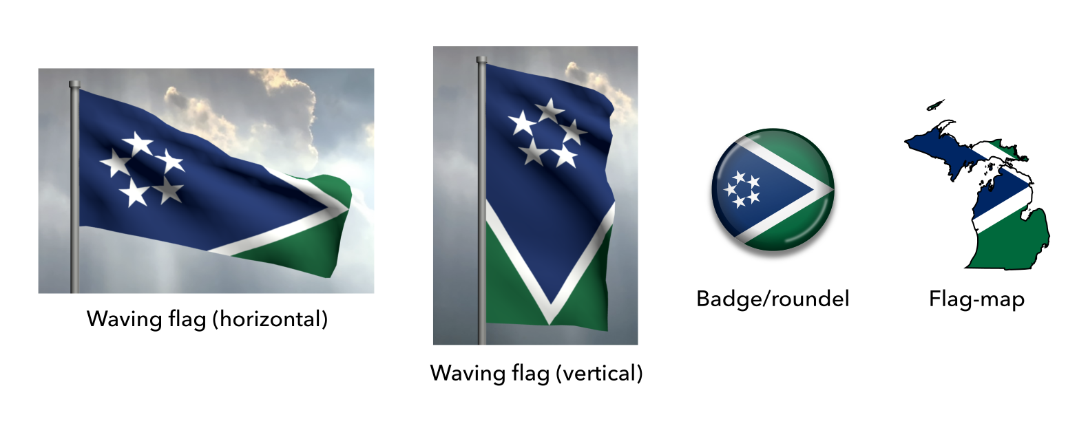
![02 proposed flag of michigan [recoded]](https://briancham1994.com/wp-content/uploads/2019/01/02-proposed-flag-of-michigan-recoded.png)