Executive Summary
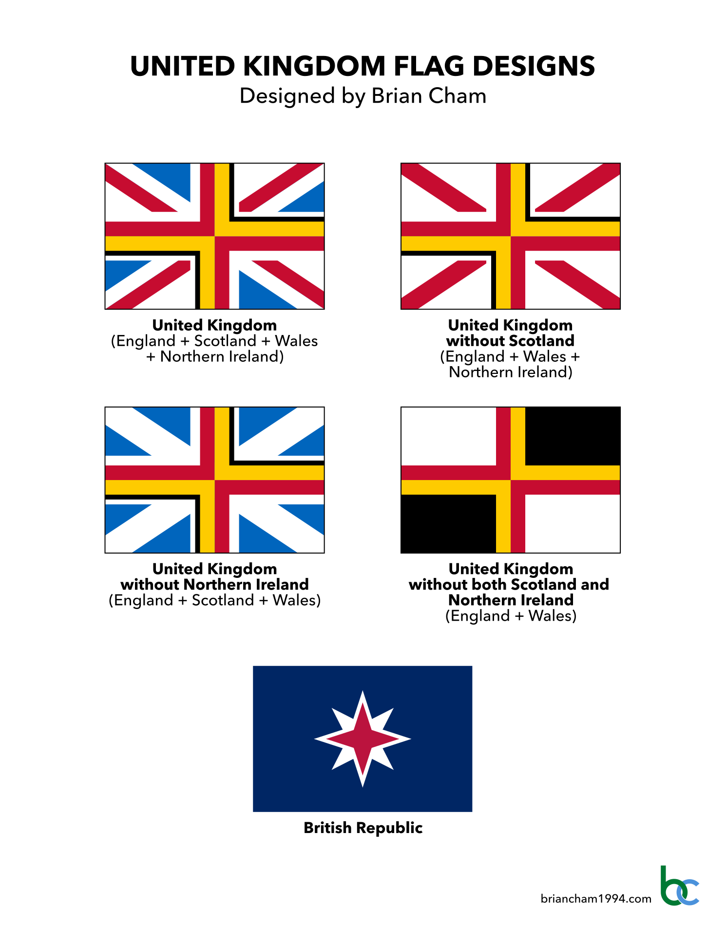
Here are my national flag concepts for the United Kingdom, representing different scenarios where some of its home nations (England, Scotland, Wales and Northern Ireland) are present in the union and others have left.
Like all good flags, these designs are simple enough to be remembered by a child and distinct enough to be recognised at a distance. For a quick summary, the gallery of designs is below. For an extensive read, scroll down and expand each section to see details for each flag, including high-resolution graphics, commentary, mock-ups, construction sheets and vector file downloads.
The Current Design
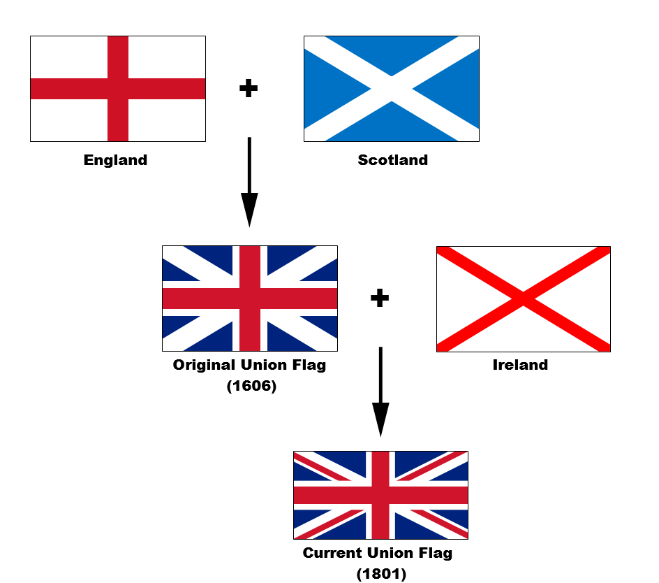
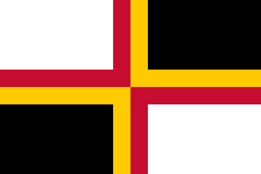
As demonstrated in the above diagram, the current flag of the United Kingdom combines Saint George’s Cross (representing England), Saint Andrew’s Cross (representing Scotland) and Saint Patrick’s Cross (representing Northern Ireland).
The future of the United Kingdom and its flag have been questioned in recent years, especially after Brexit, the passing of Queen Elizabeth II and rising support for Scottish independence and Irish unification. I have designed a flag to answer each of these questions:
- Only three of the four Home Nations are represented on the flag. There is no representation for Wales. What should happen to the flag if Wales were included on the flag?
- What should happen to the flag if Scotland leaves the union?
- What should happen to the flag if Northern Ireland leaves the union?
- What should happen to the flag if both Scotland and Northern Ireland leave the union?
- What should happen to the flag if Britain becomes a republic?
In all cases, I have aimed to retain the pattern of the Union Jack as much as possible to aid recognition and suggest continuity.
Disclaimer: My choice of designs do not reflect my political opinions.
United Kingdom Flag Designs

Explanation
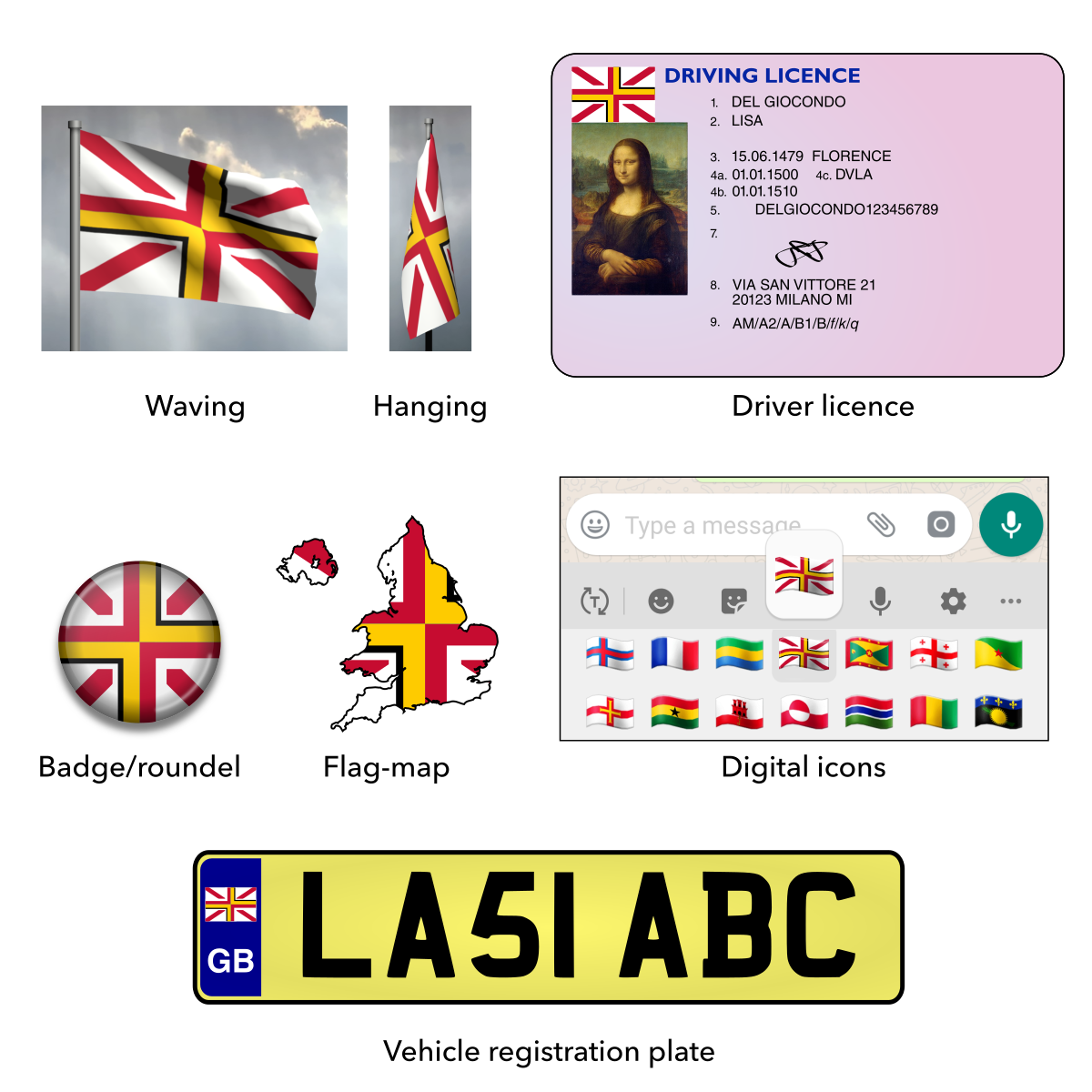
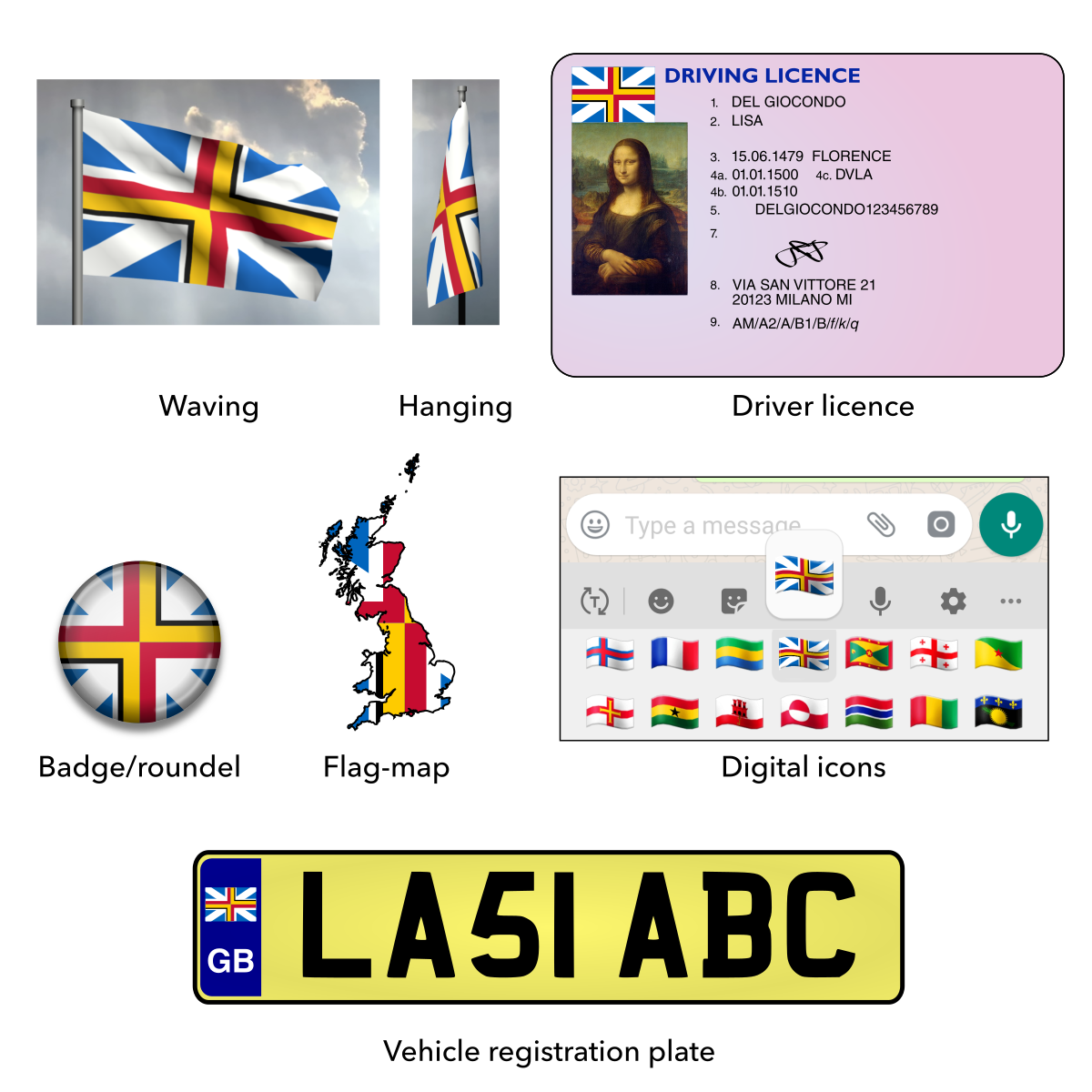
The current flag includes crosses to represent three of the four Home Nations: England, Scotland and Northern Ireland. However, there is no reference to Wales, the remaining Home Nation, as it was part of England at the time of the flag’s creation. There have been periodic calls for the flag to be updated to properly include Wales, but other such design proposals tend to be unwieldy and overly complex.
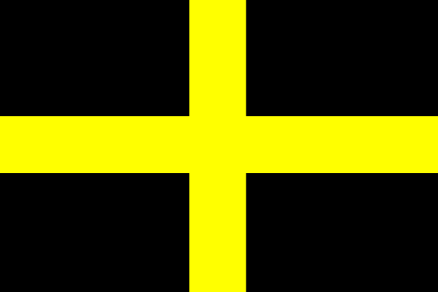
This design modifies the current flag by adding Saint David’s Cross (black and gold) to represent Wales. This way, all four Home Nations are now represented in a way that continues the original tradition of the Union Jack.
This design also features some other small “fixes”:
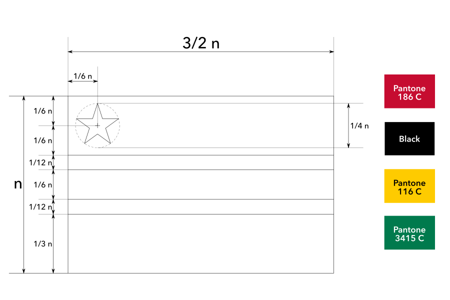
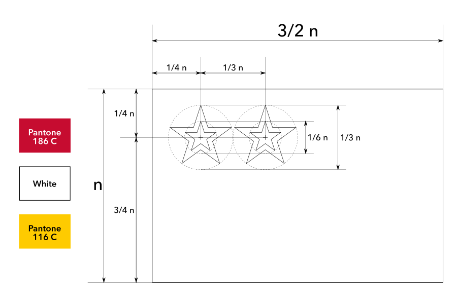
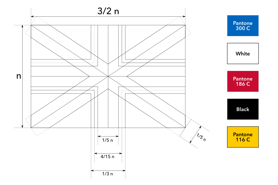
- The ratio of the overall flag is now shorter to match the original ratios of the Home Nations flags.
- Saint Andrew’s cross (representing Scotland) is now sky blue to match the blue on the original Scottish flag.
- Saint Andrew’s cross (representing Scotland) and Saint Patrick’s cross (representing Northern Ireland) are now in equal proportions.
Commentary
This design is part of my 2009 flag proposal series (the flag designs from my old site with the most hits and ratings).
Initially, this flag did not get many hits, so I didn’t transfer it from my old site in 2009. Years later, someone personally requested me to upload this design again. It had not been online for over five years, yet this person remembered the design and its author! That had to mean something.
Mock-ups
Construction sheet
Vector file download

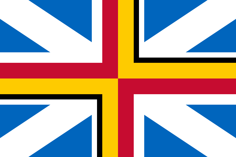
Explanation
In the future, Scotland may vote to become independent. This nearly happened in a referendum in 2014 and it is an ongoing topic of discussion
In this scenario, Saint Andrew’s Cross (blue and white saltire) would be removed from the Union Jack. Here is my proposal for how to achieve this neatly. It also includes the fixes from my “Proposed flag of the United Kingdom with Wales” design – Saint David’s Cross is included to represent Wales and the overall ratio is the original short length.
Mock-ups
Construction sheet

Vector file download
Explanation
In the future, Northern Ireland may vote to leave the United Kingdom and unite with the rest of Ireland. The Good Friday Agreement stipulates that a referendum for Irish unification can be held if public support is high enough; this has not happened yet but it remains a future possibility.
In this scenario, Saint Patrick’s Cross (white and red saltire) would be removed from the Union Jack. There are a number of proposals for what the result should look like. My proposal is shown below. It also includes the fixes from the “Proposed flag of the United Kingdom with Wales” design – Saint David’s Cross is included to represent Wales, the blue has been corrected to the original sky blue and the overall ratio is the original short length.
Mock-ups
Construction sheet

Vector file download
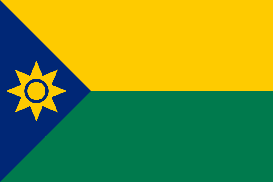
Explanation
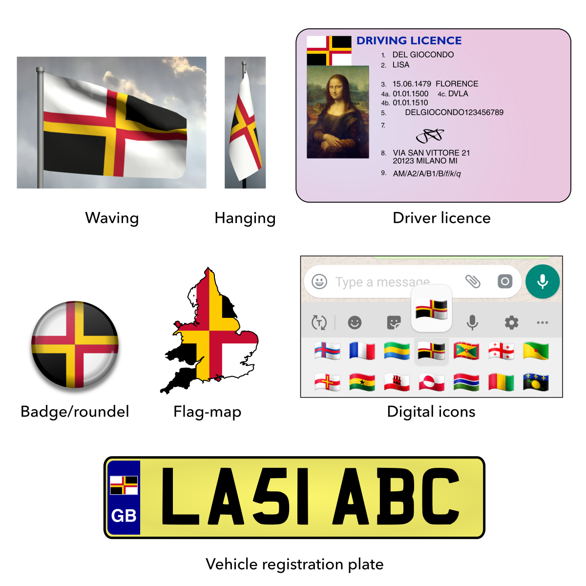
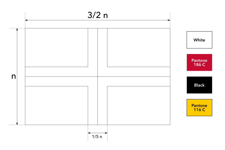
In the future, the previous two scenarios might both happen, leaving only England and Wales in the union.
My proposal quarters Saint George’s Cross (representing England) and Saint David’s Cross (representing Wales). It also adjusts the overall ratio to the original short length.
Mock-ups
Construction sheet
Vector file download

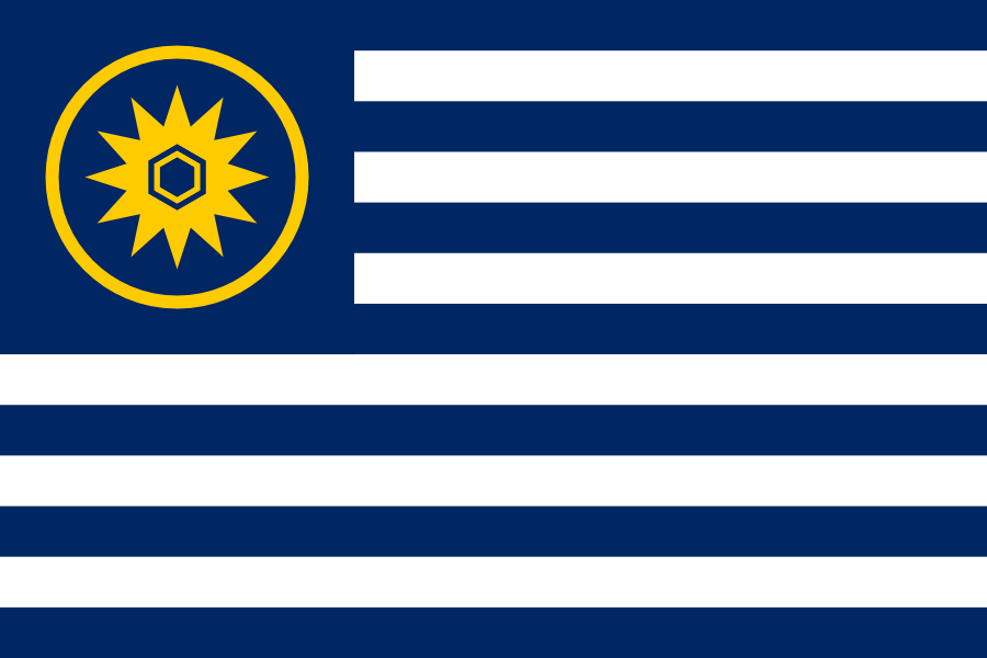
Explanation
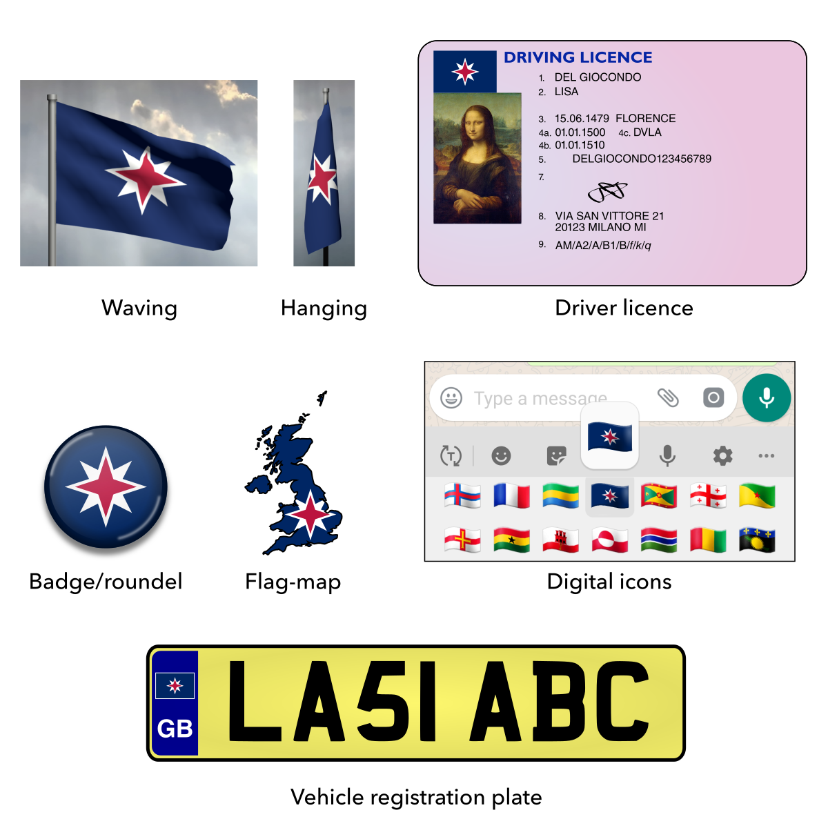
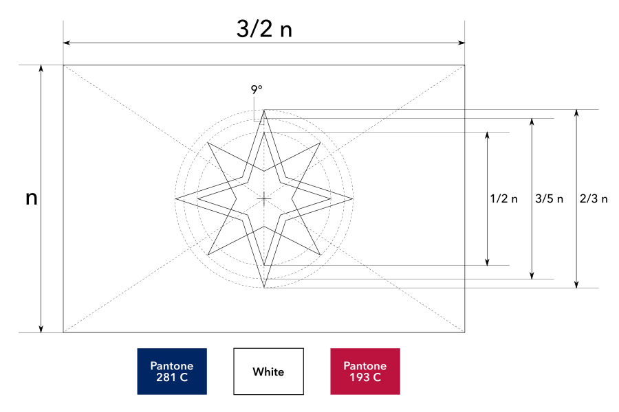
In the future, the United Kingdom might even become a republic! It’s unlikely, but stranger things have happened in history (and are happening right now). Some have asked whether becoming a republic would compel the flag to change. I think the monarchy is so fundamental to the country’s current identity (it’s even in the name “United Kingdom”) that a republic would be a change to a fundamentally different nation and raises the potential possibility of a new flag.
While there were other historical British republican flags, these designs are not very well-known, are quite plain and essentially identical to the present flag of Hungary.
My proposal is simple and bold. It resembles the current Union Jack to aid recognition and suggest continuity, yet has its own distinct symbolism.
The central emblem is a compass, representing Britain’s maritime history, its role in the Age of Exploration, its global outlook and its worldwide influence in all directions.
The four cardinal points represent the four Home Nations, united as one: England, Wales, Scotland and Northern Ireland.
The four intercardinal points represent Britain’s four worldwide influences:
- The English language, now the de facto global lingua franca.
- Political institutions like parliamentary democracy, common law and the Commonwealth of Nations.
- The Industrial Revolution, marking the shift from agrarian society to the use of machines and a higher standard of living.
- Significant contributions to modern science, including many geniuses like Isaac Newton, Charles Darwin, Ada Lovelace, Francis Crick, Stephen Hawking, Tim Berners-Lee and more.
The blue represents the ocean, boundless ambition and excellence, the white represents the coastline, snow and the Enlightenment, and the red represents the land, courage and sacrifice. The overall layout suggests an island surrounded by ocean, but not isolated by it, as its influence radiates outwards like the points of the compass.
Mock-ups
Construction sheet
Vector file download
🔗 Related Links

🔗 Acknowledgements
[section permalink 🔗]
Thanks to my cultural advisor and fact checker Gavin Ayling.