Graham Houser with the proposed flag of autism acceptance
Graham Houser, a special needs teacher from Oregon, printed out a real version of this flag to display proudly on the classroom wall. Other teachers loved the design and knew exactly what it meant without an explanation. Houser now uses this flag to spark discussion among his autistic students about how they see themselves. It was lovely to hear this positive update!
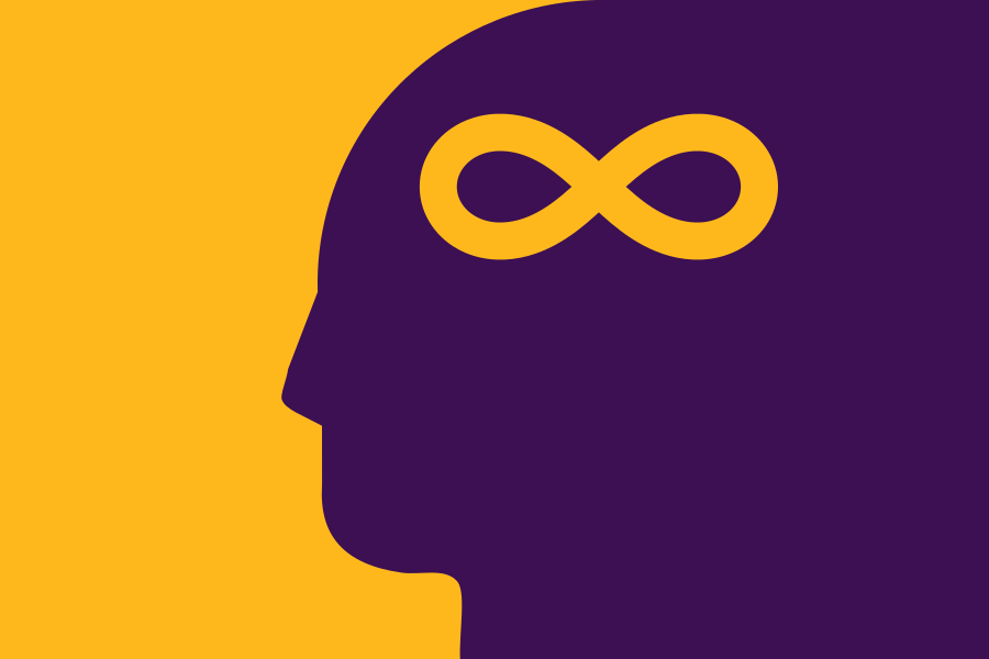
Proposed flag of autism acceptance
Here’s a flag design for autism acceptance, developed in conjunction with NAVA’s Flag Design Gauntlet. I’m on the autism spectrum and some autistic communities have already proposed some symbols and flag designs, so I thought I’d try an idea of my own.
This design is simple enough to be remembered by a child, yet distinct enough to be recognised at a distance. The golden infinity symbol is an existing autistic symbol representing the diversity of neurological configurations. In my flag design, the golden infinity symbol is placed within the head to make the meaning more intuitive.
The gold represents warmth and acceptance. The purple represents unconventionality. Together, the gold and purple represent hope that our differences will be understood, accepted and embraced.
I deliberately avoided the rainbow infinity symbol because it represents all of “neurodiversity” and is too broad.
I redesigned the flag of Massachusetts in 2022 with consultation from NAVA (North American Vexillological Association) members as part of their ongoing Flag Design Gauntlet meetings.
The Current Design
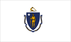
Current flag of Massachusetts
The current flag of Massachusetts is a typical American-style seal-on-a-bedsheet design, and as a result it is convoluted, unmemorable and uninspiring. In 2020, the flag came under scrutiny because the symbolism had links to colonial violence against indigenous Americans. In July 2020, the state senate voted unanimously to look into redesigning the state seal and flag. There is ongoing pressure with many towns endorsing a redesign of the flag. Therefore, here is my proposal.
My Proposals
I have two proposals:
The shield concept is based on the current flag for local familiarity and recognition. It was most preferred by the NAVA members from Massachusetts.
The Sons of Liberty concept is based on the flag of the Sons of Liberty, the group who instigated the Boston Tea Party. It was ranked number 1 in a public poll of all Massachusetts flag redesigns.
For a quick summary, the gallery of designs is below. For an extensive read, scroll down and expand each section to see more details for each flag, including high-resolution graphics, commentary, mock-ups, construction sheets and vector file downloads.
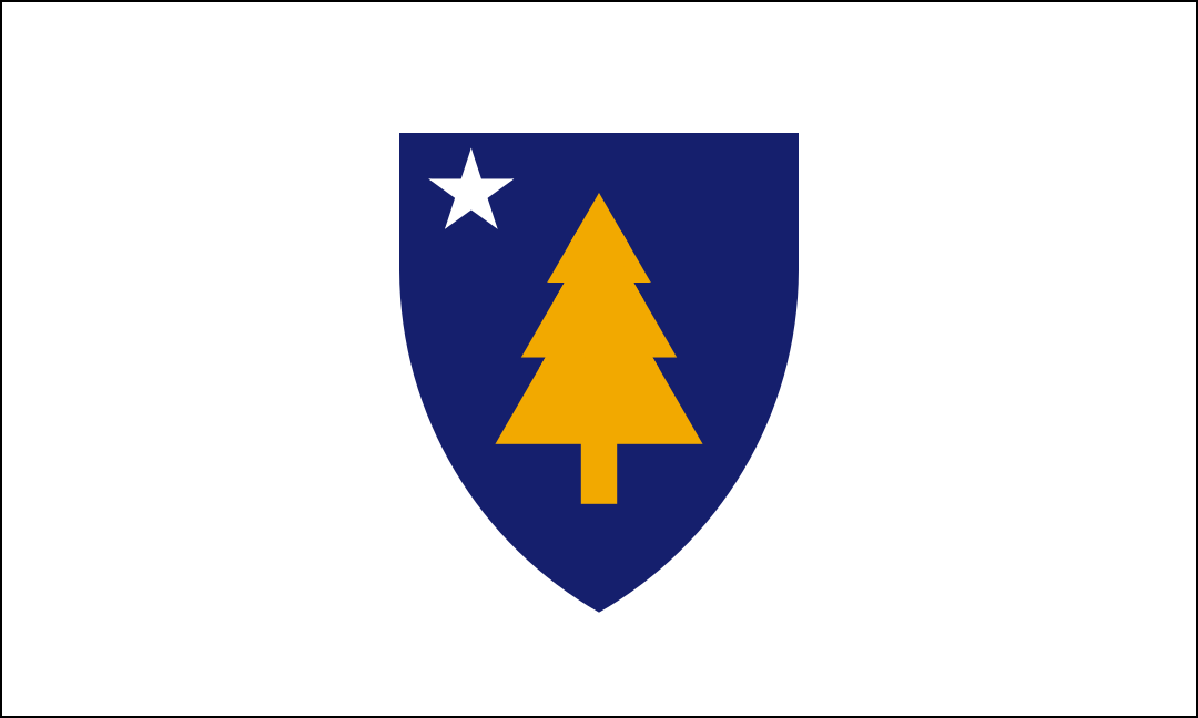
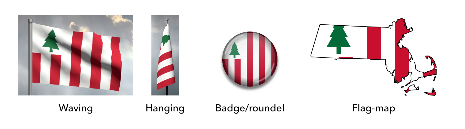
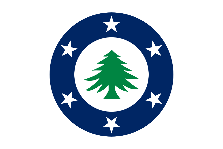
First off, this design is simple enough to be remembered by a child, yet distinctive enough to be identified at a distance. It is directly based on the current flag to aid recognition, establish continuity and promote acceptance among the public. The NAVA members from Massachusetts noted that their state’s residents are quite attached to the colours and shapes in the current design and would resonate with a similar flag.
This design’s central feature is the pine tree, a symbol of the New England region, shipbuilding, peace and brotherhood. This symbol has been in use for hundreds of years by indigenous people (featured on the Hiawatha Belt), English colonists (featured on coinage) and independent Americans (featured on flags and coinage).
The blue shield and white star are carried over from the current flag. The shield represents the long history of the state. The star represents Massachusetts’ status as a US state by reflecting the stars on the American national flag.
Gold represents prosperity. White represents peace, the coastline and snow. Blue represents the sea, maritime history, the official nickname “The Bay State” and the Blue Hills, after which the state is indirectly named. The scheme has been retained from the current flag.
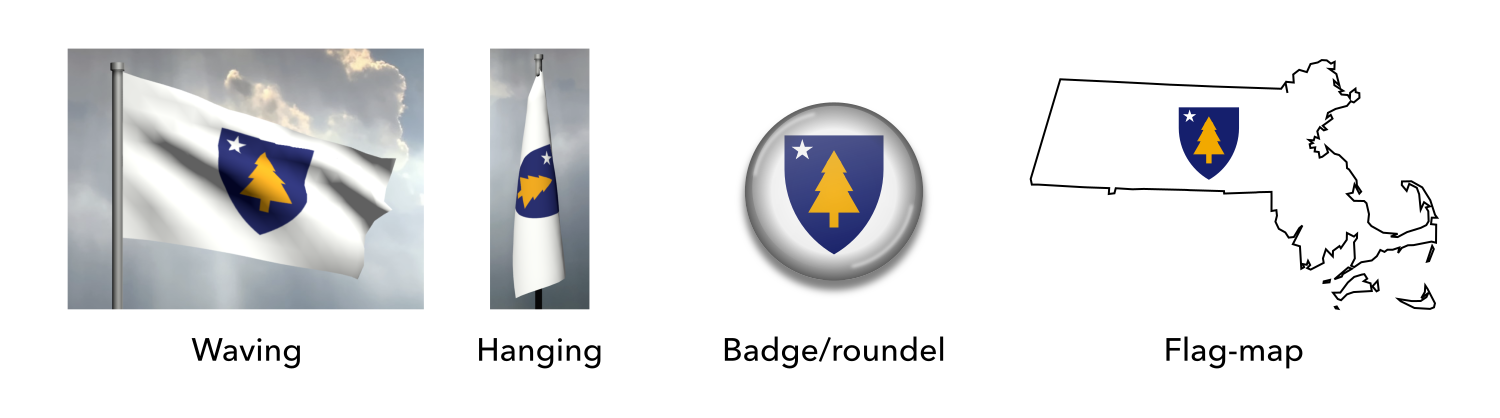
Mock-ups
Mock-ups of the proposed flag of Massachusetts (shield concept)
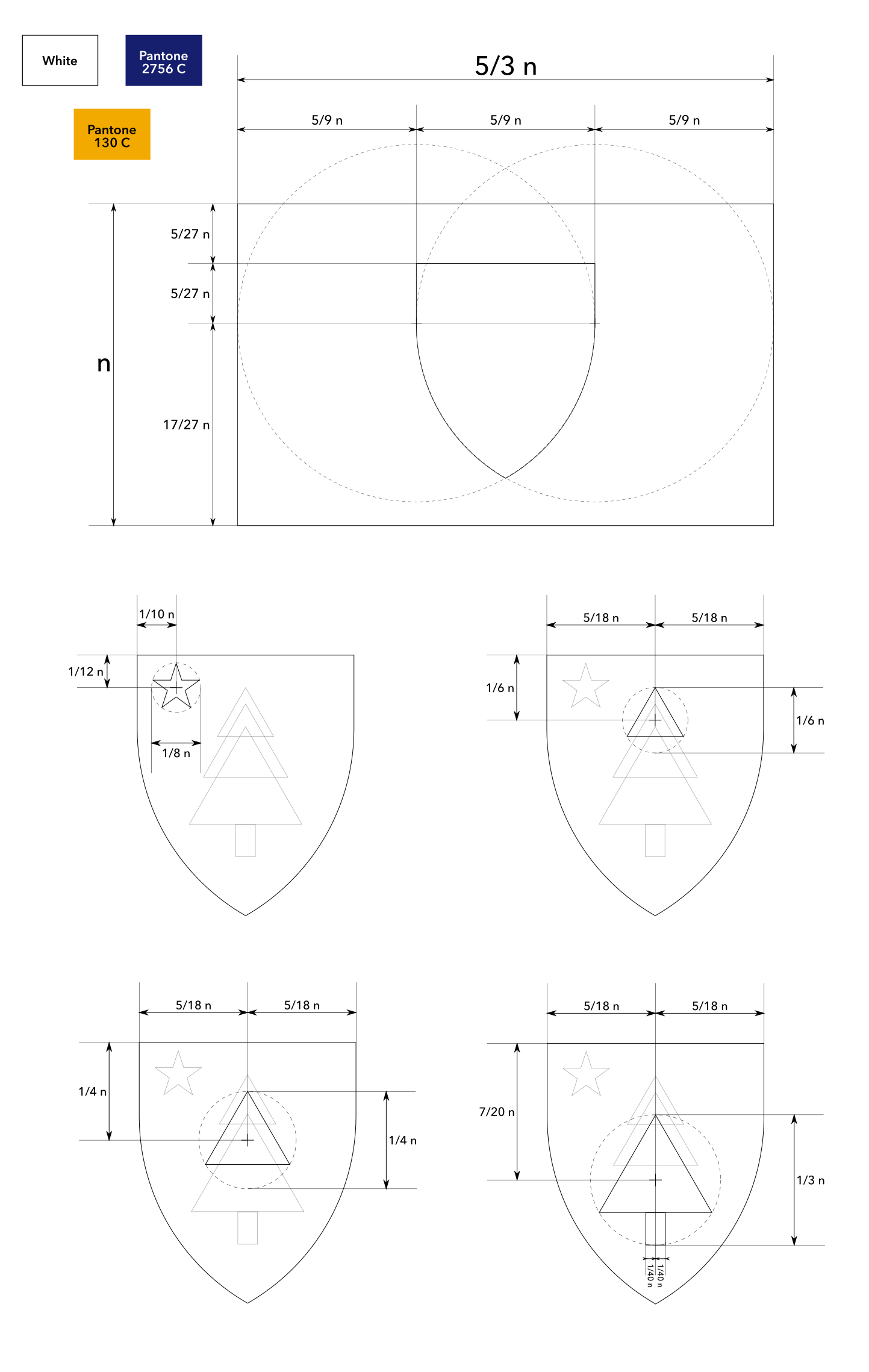
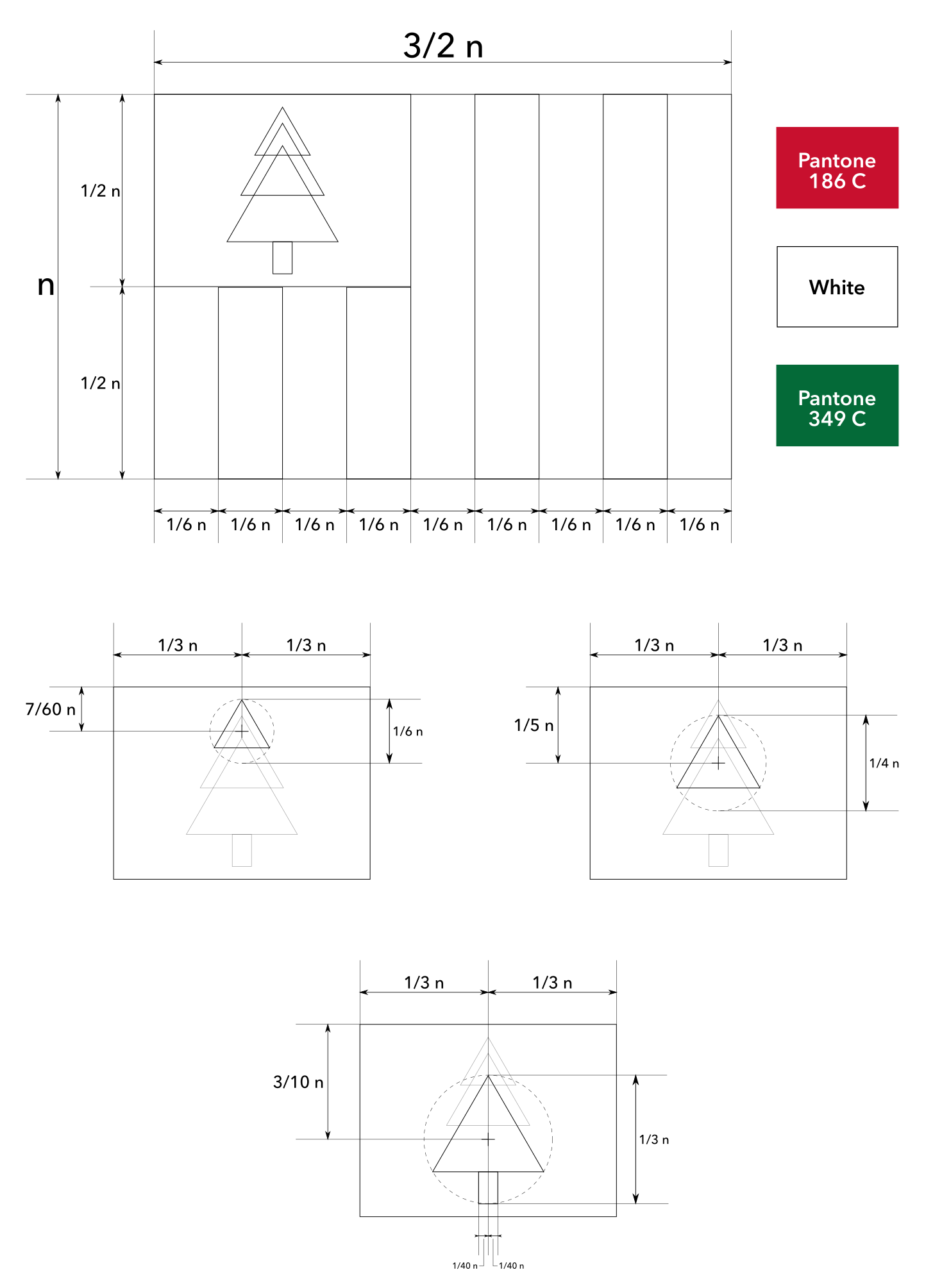
Construction sheet (multi-part)
Construction sheet of the proposed flag of Massachusetts (shield concept)
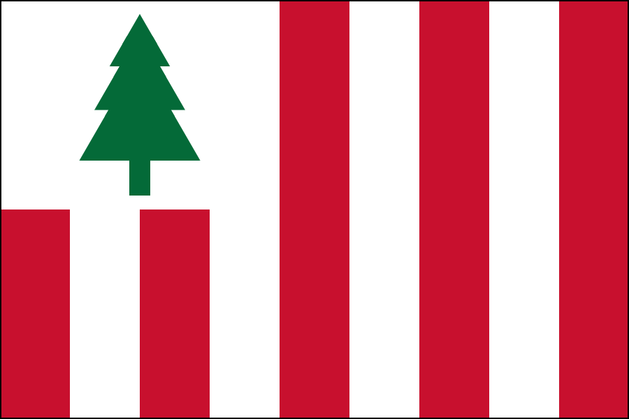
Proposed flag of Massachusetts (Sons of Liberty concept)
Explanation
First off, this design is simple enough to be remembered by a child, yet distinctive enough to be identified at a distance. It is based on the flag of the Sons of Liberty, the group who instigated the Boston Tea Party, to represent the rich history and impact of the state.
This design also features the pine tree, a symbol of the New England region, shipbuilding, peace and brotherhood. This symbol has been in use for hundreds of years by indigenous people (featured on the Hiawatha Belt), English colonists (featured on coinage) and independent Americans (featured on flags and coinage).
Red represents passion and sacrifice. White represents peace, the coastline and snow. Green represents the forests.
Commentary
This design was ranked number 1 in a public poll of all Massachusetts flag redesigns (poll conducted by the U.S. State Flags Facebook group).
Mock-ups
Mock-ups of the proposed flag of Massachusetts (Sons of Liberty concept)
Construction sheet (multi-part)
Construction sheet of the proposed flag of Massachusetts (Sons of Liberty concept)
Thanks to the members from Massachusetts for their valuable input, Joe Gorman for organising the meetings, and everyone else who participated in discussions. Thanks also to all the fans who encouraged the submission of these flags to the state commission.
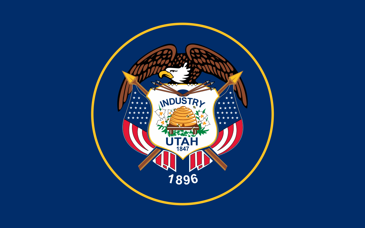
I previously made a proposed flag of Utah in 2009 but I wanted to revisit this with my new skills. These new designs were created in early 2021 with consultation with NAVA members as part of their Design Gauntlet. Thanks to everyone who gave feedback!
Updates
2022-09-26: My designs 2b and 2c were finalists for Utah’s official state design effort!
I am proud to be a finalist for the flag of Long Beach, California! The city council is busy dealing with Covid so the flag project has been put on hold for now. I’ll update this post if there is any news.
I was proud to be a finalist for the official flag of Galveston, Texas! Thanks to everyone who supported and voted for my design.
On Reddit, this design received over 8100 upvotes, nine awards and near unanimous praise from other vexillologists. Locals said it felt like a festive, beach-themed version of the Texan flag – exactly what I was going for. We all want the best for Galveston!
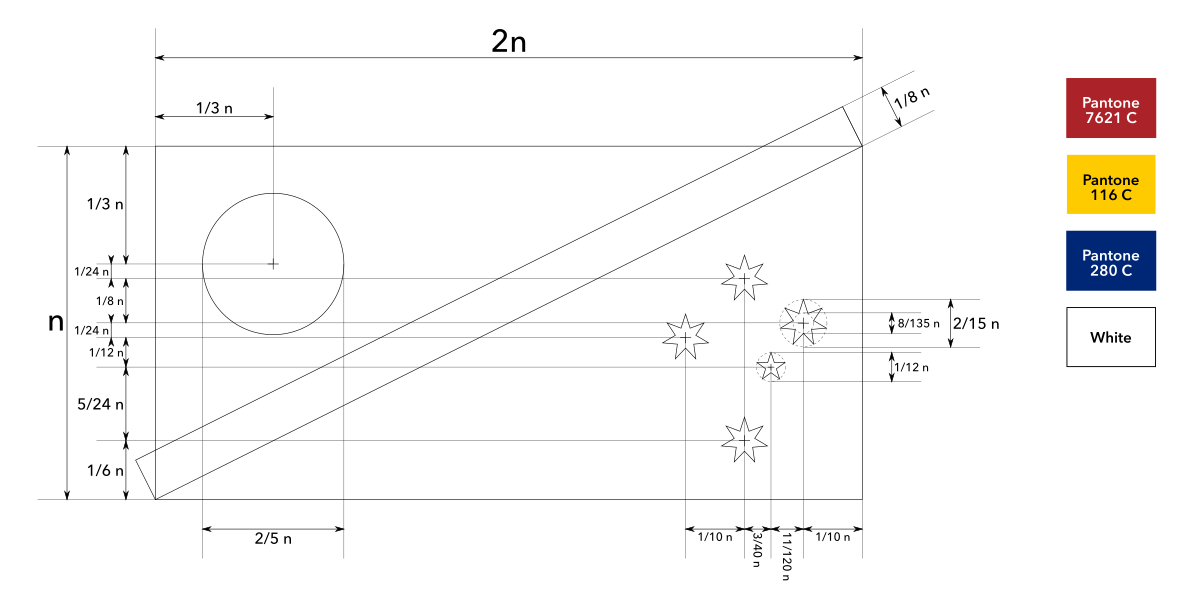
Proposed flag of Galveston, Texas
Here is my proposal for the flag of Galveston, Texas. It is simple enough to be remembered by a child but distinctive enough to be recognised at a distance.
The overall layout represents the geography of Galveston, a diagonal island. The two blue sections represent the ocean and shipping industry as Galveston was one of America’s biggest ports. The two golden stripes represent the beaches that attract many visitors. One shore faces the mainland and the other faces the wider world, representing how the port acts as a gateway to America. The red represents the life and energy of Galveston’s people. The star represents the pride of Galveston as it punches above its weight.
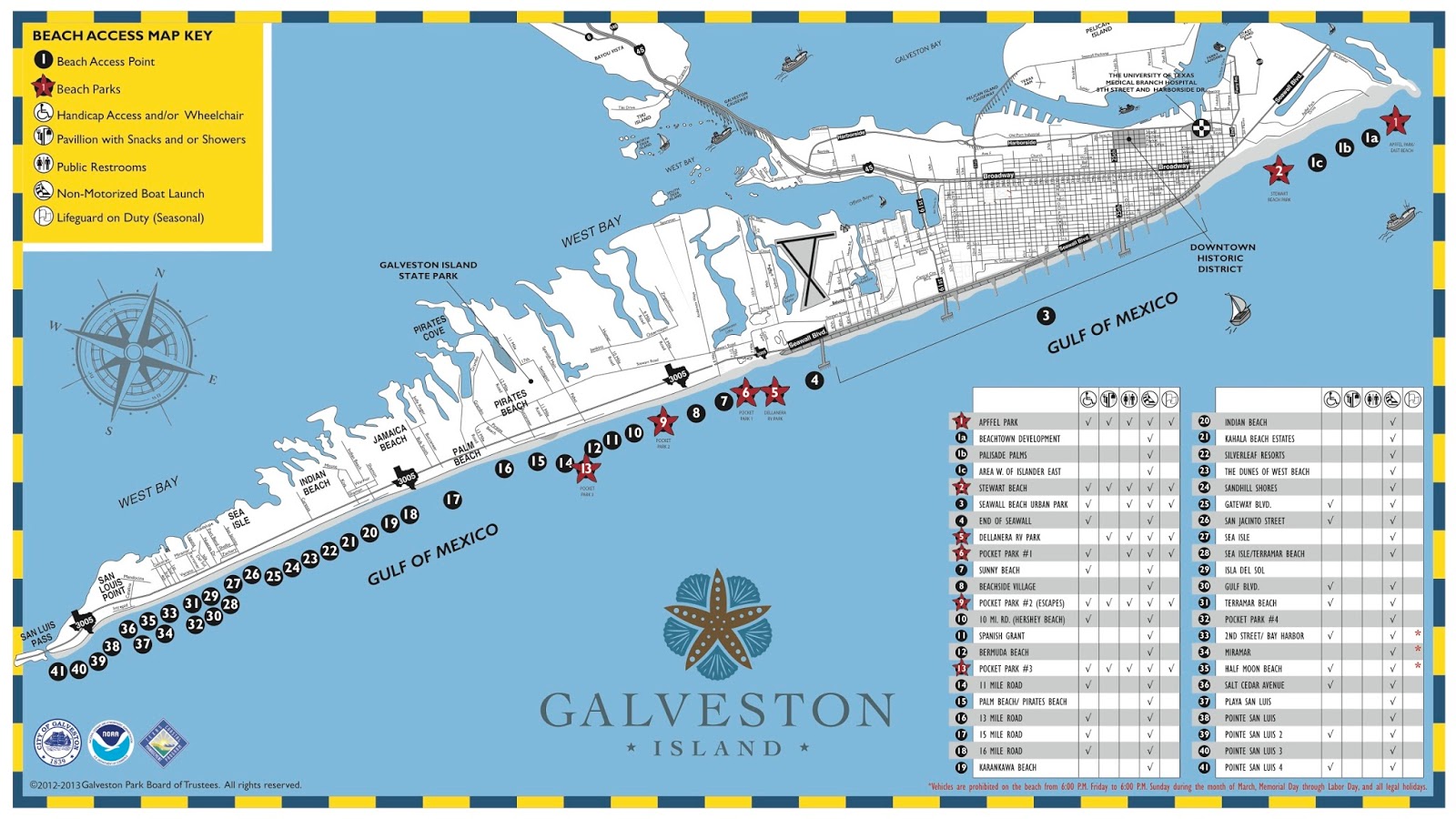
Here is a map of the island of Galveston to understand what I was going for with the layout:
Map of Galveston, Texas showing the diagonal island geography
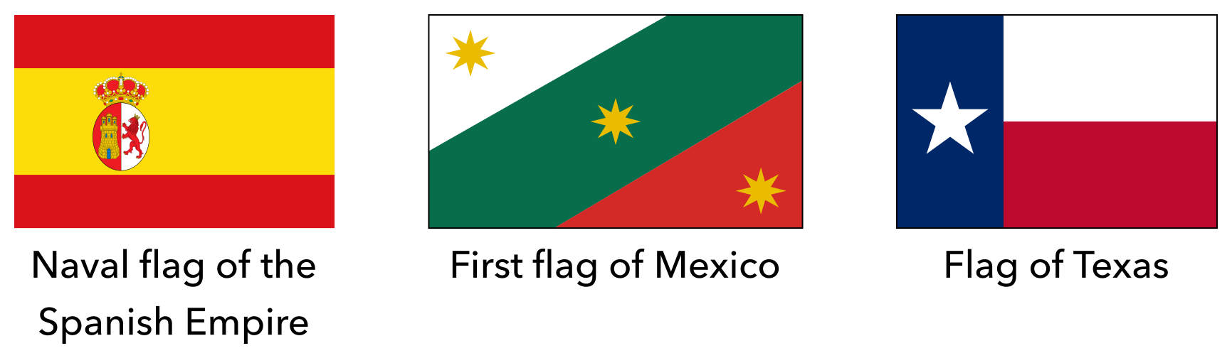
The flag also references the history of Galveston. Red and gold are borrowed from the naval flag of the Spanish Empire. The diagonal layout is borrowed from the first flag of Mexico. The red, white, blue and star are borrowed from the flags of Texas and America.
Historical flags of Galveston, Texas
Construction sheet of the proposed flag of Galveston, Texas
The current situation / Η τρέχουσα κατάσταση / Mevcut durum
Proposed flag of Cyprus from the 2004 Annan Plan / Προτεινόμενη σημαία της Κύπρου από το Σχέδιο Ανάν του 2004 / 2004 Annan Planı’ndan önerilen Kıbrıs bayrağı
The island of Cyprus is split between Northern Cyprus and the Republic of Cyprus as a result of an ongoing dispute. There are constant talks of reuniting the island and this scenario would require a new flag. In 2004, the United Nations sponsored the “Annan Plan” for reunification which failed when put to a referendum. This scheme had a proposed flag design for United Cyprus but there are several problems with this flag. Firstly, it is too plain and uninspiring. Secondly, it uses blue all the way on one side to represent Greeks and red all the way on the other side to represent Turks, which emphasises division and separation. It may be true in real life that these populations are divided, but a flag representing unity should be optimistic and remind people of harmony rather than conflict. Thirdly, the layout puts one population on top of the other which could suggest a hierarchy to some. Therefore, here is my proposal.
Το νησί της Κύπρου χωρίζεται μεταξύ της Βόρειας Κύπρου και της Κυπριακής Δημοκρατίας ως αποτέλεσμα μιας συνεχιζόμενης διαμάχης. Υπάρχουν συνεχείς συνομιλίες για την επανένωση του νησιού και αυτό το σενάριο θα απαιτούσε νέα σημαία. Το 2004, τα Ηνωμένα Έθνη χρηματοδότησαν το «Σχέδιο Ανάν» για επανένωση που απέτυχε όταν τέθηκε σε δημοψήφισμα. Αυτό το σχέδιο είχε έναν προτεινόμενο σχεδιασμό σημαίας για την United Cyprus, αλλά υπάρχουν πολλά προβλήματα με αυτήν τη σημαία. Πρώτον, είναι πολύ απλό και δεν εμπνέει. Δεύτερον, χρησιμοποιεί το μπλε από τη μια πλευρά για να εκπροσωπήσει τους Έλληνες και το κόκκινο από την άλλη πλευρά για να εκπροσωπήσει τους Τούρκους, το οποίο δίνει έμφαση στη διαίρεση και τον χωρισμό. Μπορεί να ισχύει στην πραγματική ζωή ότι αυτοί οι πληθυσμοί είναι χωρισμένοι, αλλά μια σημαία που αντιπροσωπεύει την ενότητα πρέπει να είναι αισιόδοξη και να υπενθυμίζει στους ανθρώπους την αρμονία και όχι τις συγκρούσεις. Τρίτον, η διάταξη βάζει έναν πληθυσμό πάνω από τον άλλο, ο οποίος θα μπορούσε να προτείνει κάποια ιεραρχία σε ορισμένους. Επομένως, εδώ είναι η πρότασή μου.
Kıbrıs adası, devam eden bir anlaşmazlık nedeniyle Kuzey Kıbrıs ile Kıbrıs Cumhuriyeti arasında bölünmüştür. Adayı yeniden birleştirme konusunda sürekli görüşmeler yapılıyor ve bu senaryo yeni bir bayrak gerektiriyor. 2004’te Birleşmiş Milletler, referanduma sunulduğunda başarısız olan yeniden birleşme için “Annan Planı” na sponsor oldu. Bu şema Birleşik Kıbrıs için önerilen bir bayrak tasarımına sahipti, ancak bu bayrakla ilgili birkaç sorun var. Çok sade ve sönük. Bir yanda Yunanlıları temsil etmek için mavi, diğer yanda Türkleri temsil etmek için kırmızıyı kullanır, bu da bölünmeyi ve ayrılığı vurgular. Gerçek hayatta bu nüfusların bölündüğü doğru olabilir, ancak birliği temsil eden bir bayrak iyimser olmalı ve insanlara çatışmadan ziyade uyumu hatırlatmalıdır. Düzen, bazılarına bir hiyerarşi önerebilecek bir popülasyonu diğerinin üzerine koyar. Bu nedenle, işte benim teklifim.
Note: My choice of designs do not reflect my political opinions.
Σημείωση: Η επιλογή των σχεδίων μου δεν αντικατοπτρίζει τις πολιτικές μου απόψεις.
Not: Tasarım tercihlerim politik görüşlerimi yansıtmıyor.
My proposal / Η πρότασή μου / Benim önerim
Proposed flag of United Cyprus / Προτεινόμενη σημαία της Ενωμένης Κύπρου / Birleşik Kıbrıs’ın Önerilen Bayrağı
This design is part of my 2009 flag proposal series (the flag designs from my old site with the most hits and ratings).
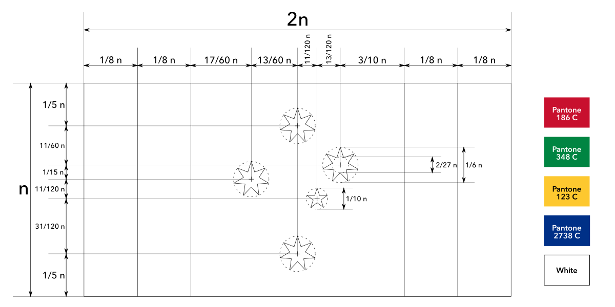
The current design
Current flag of Massachusetts
The current flag of Massachusetts is a typical American-style seal-on-a-bedsheet design, and as a result it is convoluted, unmemorable and uninspiring. In 2020, the flag came under intense scrutiny because the design seems to imply colonial violence: There is a sword hanging above a Native American figure, the beginning of the motto translates to “by the sword we seek peace” and the artistic rendering was directly based on figures and artifacts involved with killings of Native Americans. There is ongoing pressure with many groups and towns endorsing a redesign of the flag. As of 2021, the state senate and governor have officially decided to redesign the state seal and flag. Therefore, here is my proposal.
We need an official flag of Earth. We live in an unprecedented times where all the people of the world are connected together and aware of global issues, but are at risk of being divided. The planet itself under threat from destructive forces. Ecosystems around the world are dying, collapsing and on fire. We have a flag for every single place, except for the place that is most important of all. We have a flag for every single homeland, except for the land that is home to every human being. We have a flag for every single cause, except for the single largest cause in the history of our whole species. We have no consistent symbol for our entire home, yet we clearly need to express that right now.
When we want to represent global co-operation, what flag do we use? When we protest the planet’s environmental issues, what flag do we fly? When we celebrate events like Earth Day, what flag emoji do we use in our message?
There are a few options but they do not cut it. The most famous global flag is the flag of the United Nations but that represents the organisation and not the whole planet. Some people use a photograph of the planet Earth but that is not appropriate for a flag. There are other proposals but they are messy or unintuitive. We need a good, simple, catchy flag to represent our planet.
Here are all the Australian flag designs I made (or co-designed) over the years. Australia has not had an official flag competition or referendum yet but I’ll be ready once it happens!
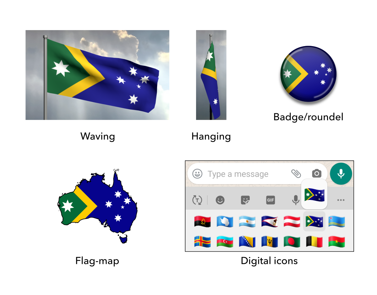
Like all good flags, these designs are simple enough to be remembered by a child and distinct enough to be recognised at a distance. Just as I did for my New Zealand flag proposals, I put in a lot of effort researching and designing these proposals. Instead of making something that looks nice to me personally, I consulted real evidence for what appealed to people and aimed for maximum resonance. The concepts are roughly in order from most to least feasible, based on my research and popularity on Facebook and Reddit.
For a quick summary, the gallery of designs is below. For an extensive read, scroll down and expand each section to see a compilation of our design methodology and details for each flag, including high-resolution graphics, commentary, mock-ups, construction sheets and vector file downloads.
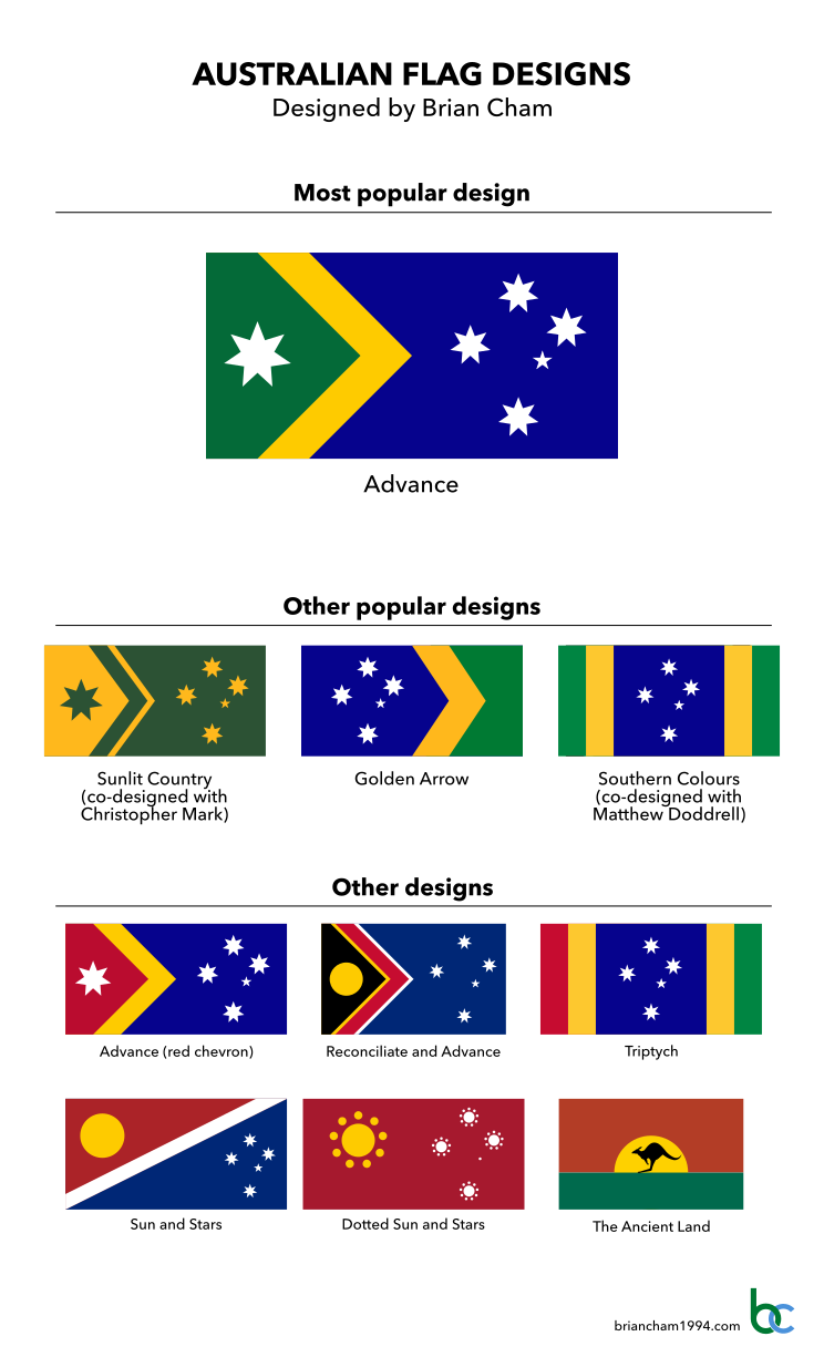
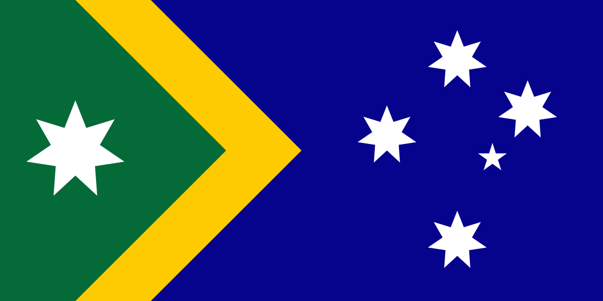
Advance is the most popular design and was voted third best out of all Australian flag redesigns in public polling on the Change the Aussie Flag Facebook group. I will leave it up to the reader to decide which designs resonate the best with them personally.
The reason why a lot of other Australian flag proposals suck is because they didn’t have a proper design methodology. I aimed to transcend this tendency and design the new Australian flag, not a new Australian flag.
Instead of just making something that looks nice and symbolic to me personally, I aimed for maximum feasibility of resonating with the public, based on real evidence and research. In other words, I activated the sympathy part of my brain alongside the aesthetic part.
This research included studying as many existing Australian flag proposals as I could to note common features and feedback, analysing why some designs were more popular than others. I also looked at Australian themed insignia, logos and graphics. Finally, I consulted surveys and campaigns.
For Aotearoa New Zealand, I collated the commentary around existing proposals with a colleague, so that we could uncover the common themes and transcend the common mistakes. Many of these “deal-breakers” apply to Australian flag concepts as well. You can read more about these in the main article The Six Little-Known Deal-Breakers of Bad Flag Design which was presented at NAVA 55 and won their Driver Award. In summary:
Generally bad flag design – Too complicated, too many colours or elements, irrelevant symbolism and so on.
Looks like a logo, not a flag – By far the most common. A flag should actually look like a flag, not a corporate logo stuck into a rectangle.
Cheesy souvenir – Flags relying on informal elements can look like souvenirs.
Mystery symbolism – Roger Ebert once declared, “If you have to ask what it symbolizes, it didn’t.”
Designing for yourself – A lot of designers only included the themes of national identity that appealed to them, not the general public.
Too radical – Making a completely revolutionary design is self-sabotage. A lot of people are intimately attached to established symbolism.
It’s boring, but it works – Trying to satisfy everybody will end up satisfying nobody.
What are the themes of national identity? I identified four of them.
Established symbolism – Elements from the current flag. The red, white and blue colour scheme, the commonwealth star and the southern cross. To some these are familiar and formal but to others these are too safe and boring.
Colloquial symbolism – Elements from local, informal culture. The green and gold colour scheme and the kangaroo. To some these are unique and authentic but to others these are too cheesy and offbeat.
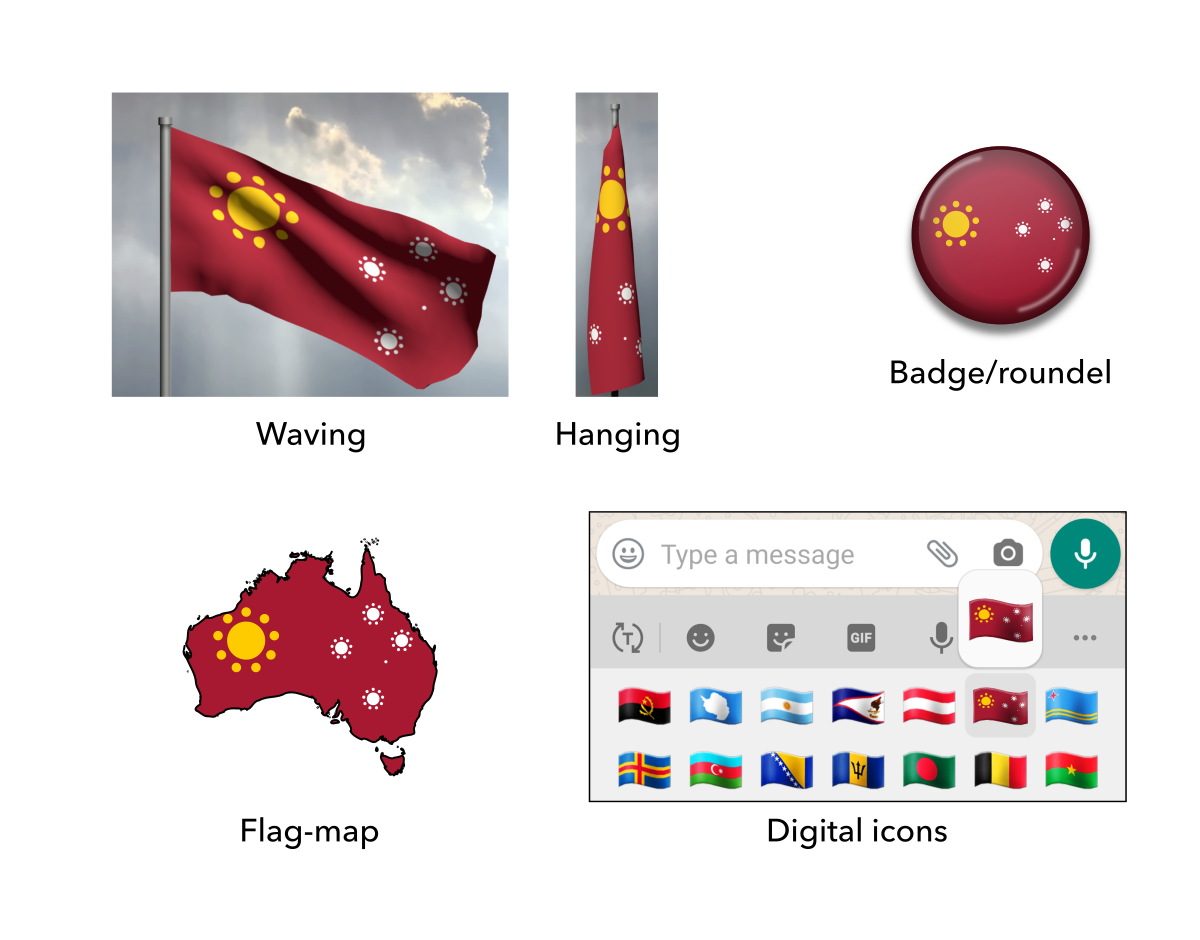
Aboriginal symbolism – Elements from indigenous cultures. The red/ochre, white and black colour scheme, the colour red/ochre by itself, the sun, dotted patterns and the boomerang. To some these are culturally significant but to others these are too sectarian.
Environmental symbolism – Elements from nature. The colour green, landscapes, the sun and the kangaroo. To some these are positive and fresh but to others these are too trendy and informal.
By clarifying these, I can make designs that harmoniously appeal to multiple themes, which will resonate with more people. The “established symbolism” has the most appeal so an effective design will have to focus on this.
The themes are summarised in the Euler diagram below.
The four symbolic themes of Australian graphical identity.
Flag proposals have sometimes competed in head-to-head in ranked competitions or discussions. I used a statistical technique called “regression analysis” to identify which colours and symbols were most associated with success (public resonance). These successful elements were the colours red, white, blue and gold, and the southern cross in its current form (i.e. white on blue).
However, some of these competitions and surveys were from years ago, so the conclusions could be oudated. By today’s standards, the strong preference for red, white and blue is obviously quite conservative. Newer surveys tend to reveal preferences for green and gold instead (see the section below).
A 2016 University of Western Sydney survey asked the Australian public what they wanted in a new flag (Jones, 2016). Results:
The most common requests were “simplicity”, “Southern Cross”, and “Green and Gold”.
Respondents were split between those who wanted recognition of indigenous cultures and those who wanted a culturally neutral design.
When presented with a few examples, respondents preferred designs that were similar to the current flag in layout.
Some have also asked about indigenous viewpoints and consultation. A 1994 survey asked indigenous groups across the country what they wanted in a new flag (Mee, 2018). These were universal responses:
They though the issue was quite pressing.
They did not want the Union Jack.
They wanted it to feature indigenous cultures in some way.
They did not want the Aboriginal flag included in its entirety.
However, opinions varied on how exactly they wanted their cultures to be represented visually.
A 1998 museum exhibition of national flag proposals included some designs featuring indigenous symbols like the Aboriginal colours (black, gold and red), dot patterns, a golden sun and the stripe layout of the Aboriginal flag. These proposals were specifically praised in a speech by Dr. Lowitja O’Donoghue, who at the time was the Chairperson of the Aboriginal and Torres Strait Islander Commission, the highest national indigenous representative body. She made the following comment (O’Donoghue, 1998):
“[Overseas visitors] appreciate the unique aspects of our country including the contribution that Australia’s indigenous people make to our national identity. I’m pleased to see that many of the designs on display here today include a reference to indigenous culture, or the colours of the indigenous flags. But the most important thing is that our new flag should he acceptable to all of us.”
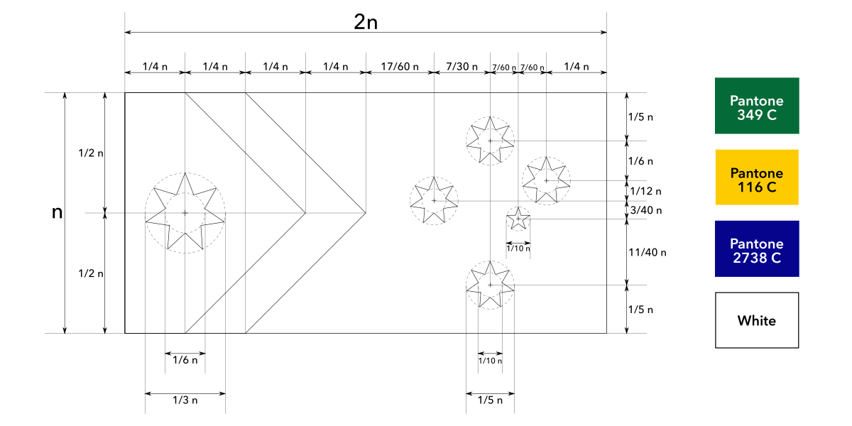
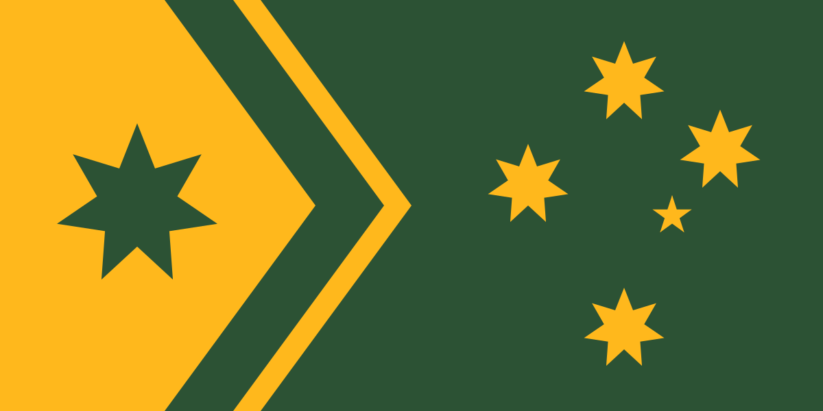
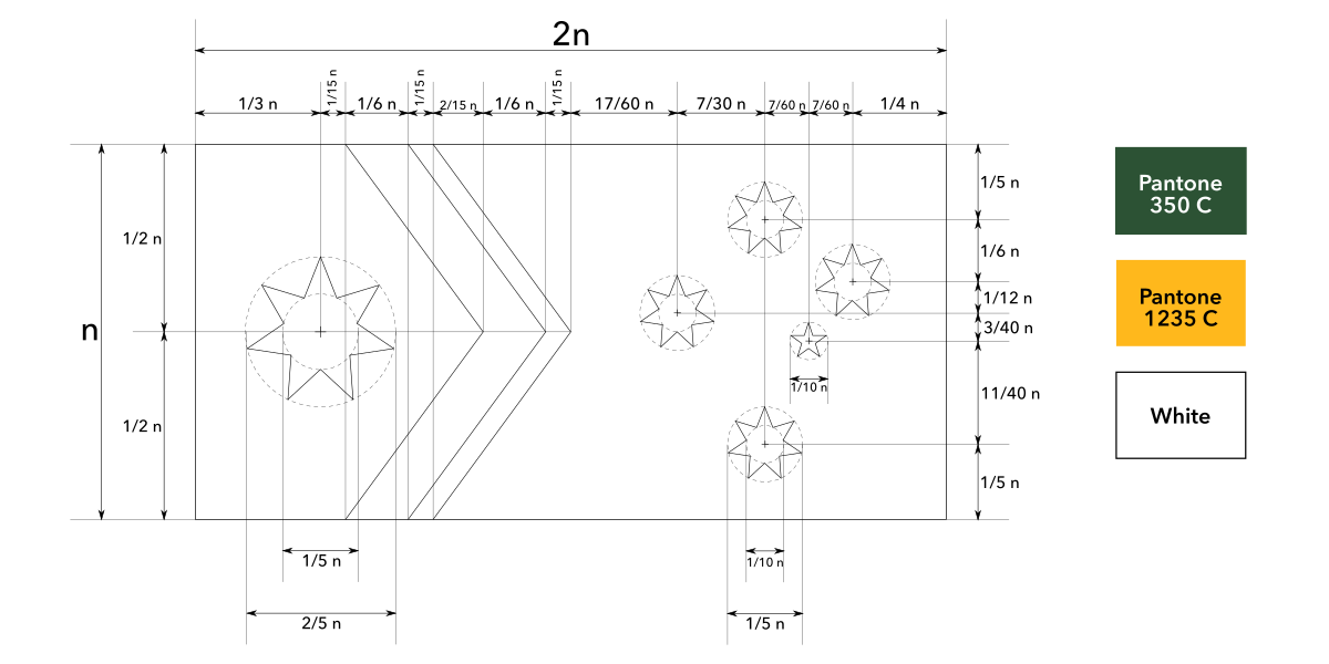
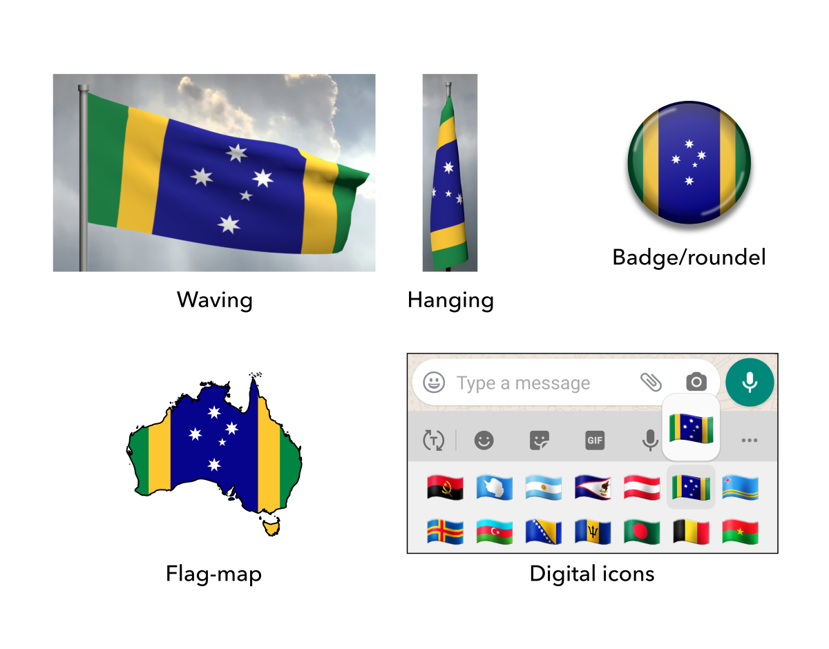
Advance is based on the same layout as the current flag, aiding recognition and establishing continuity. The hoist features a chevron representing unity and advancement, reflecting the country’s motto “Advance Australia”. It also subtly resembles a boomerang, representing the country’s milennia of indigenous history. Within the chevron is the Commonwealth Star, where the points represent the states and territories of Australia. The fly features the southern cross in the same form as the current flag, representing the country’s location in the Southern Hemisphere and shared history.
Green represents the lush nature, gold represents the beaches, mineral wealth and golden wattle, blue represents the boundless ocean and white represents peace. Green and gold are the official national colours, while the blue field is retained from the current flag.
Commentary
In 2022, Advance was voted the third best of all Australian flag designs in public polling conducted by the Facebook group “Change the Aussie flag”. As of 2026, it remains on their banner of top polling flag designs.
Sunlit Country is based on the same layout as the current flag, aiding recognition and establishing continuity. The hoist features a chevron representing unity and advancement, reflecting the country’s motto “Advance Australia”. It also subtly resembles a boomerang, representing the country’s milennia of indigenous history.Within the chevron is the Commonwealth Star, where the points represent the states and territories of Australia. The fly features the southern cross, representing the country’s location in the Southern Hemisphere and shared history.
Green and gold are the official national colours. Green represents the lush nature and gold represents the beaches, mineral wealth and golden wattle.
Commentary
Co-designed with Christopher Mark. From 2022 to 2026, it was on the banner of the Facebook group “Change the Aussie flag”, marking one of the top polling designs out of all Australian flag proposals.
Golden Arrow is based on the southern cross on blue field, representing the country’s location in the Southern Hemisphere and shared history. It is in the same form as the current flag to aid recognition and establish continuity.
The fly features a chevron representing unity and advancement, reflecting the country’s motto “Advance Australia”. It also subtly resembles a boomerang, representing the country’s milennia of indigenous history.
Green represents the lush nature, gold represents the beaches, mineral wealth and golden wattle, blue represents the boundless ocean and white represents peace. Green and gold are the official national colours, while the blue field is retained from the current flag.
Commentary
This design is a simplified version of Advance, using the Southern Cross as the main focus.
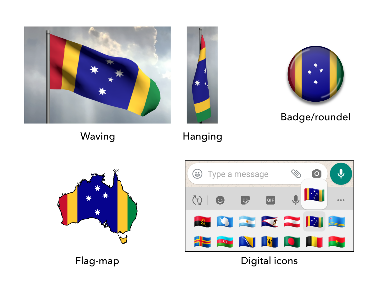
Southern Colours is based on the southern cross on blue field, representing the country’s location in the Southern Hemisphere and shared history. It is in the same form as the current flag to aid recognition and establish continuity.
The stripes on the sides represent the country’s coasts on the Indian Ocean and Pacific Ocean.
Green represents the lush nature, gold represents the beaches, mineral wealth and golden wattle, blue represents the boundless ocean and white represents peace. Green and gold are the official national colours, while the blue field is retained from the current flag.
Commentary
I designed this one with Matthew Doddrell. We both independently came up with a similar idea, and then we collaborated to make a compromise design with the best proportions and colours. He came up with the poetic name.
Advance (red chevron) is based on the same layout as the current flag, aiding recognition and establishing continuity. The hoist features a chevron representing unity and advancement, reflecting the country’s motto “Advance Australia”. It also subtly resembles a boomerang, representing the country’s milennia of indigenous history. Within the chevron is the Commonwealth Star, where the points represent the states and territories of Australia. The fly features the southern cross in the same form as the current flag, representing the country’s location in the Southern Hemisphere and shared history.
Red represents the land, gold represents the beaches, mineral wealth and golden wattle, blue represents the boundless ocean and white represents peace. The blue field is retained from the current flag.
Commentary
If this design seems annoyingly familiar, you are probably thinking of Captain Marvel.
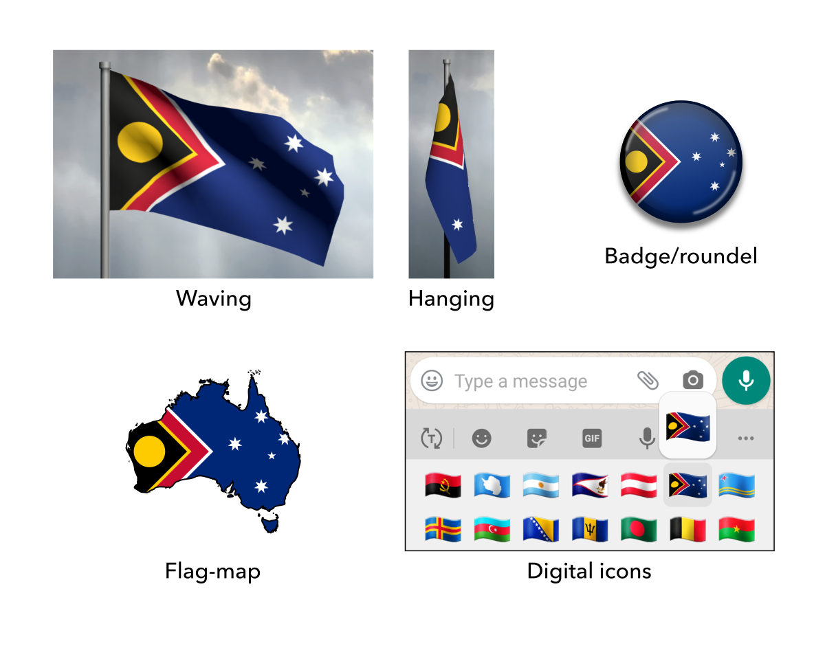
Reconciliate and Advance combines features of the Aboriginal flag and current national flag.
The hoist features the black, gold and red colour scheme from the Aboriginal flag, as well as the sun representing energy, life and the country’s climate. The fly features the red, white and blue colour scheme from the current flag, as well as the southern cross representing the country’s location in the Southern Hemisphere.
Red is at the meeting point of both parts of the flag because red is shared between both colour schemes. It takes the form of a chevron, representing unity and advancement.
Commentary
This design was the most popular on Reddit and Facebook. It was actually the precursor to Advance (above). It has more explicit Aboriginal symbolism but has more colours.
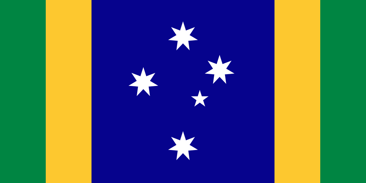
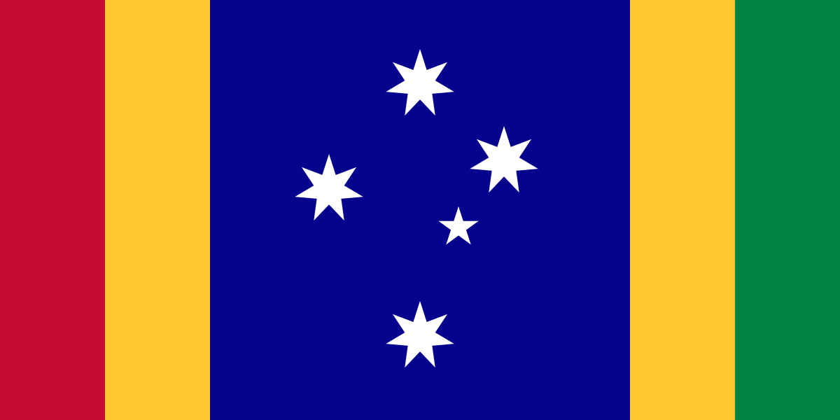
Triptych is based on the southern cross on blue field, representing the country’s location in the Southern Hemisphere and shared history. It is in the same form as the current flag to aid recognition and establish continuity.
The stripes on the sides represent the country’s coasts on the Indian Ocean and Pacific Ocean.
Red represents the land, green represents the lush flora, gold represents the beaches, mineral wealth and golden wattle, blue represents the boundless ocean and white represents peace. Green and gold are the official national colours, while the blue field is retained from the current flag.
Commentary
This design has the most colours of all my designs, but that’s deliberate.
Sun and Stars combines simplified features of the Aboriginal flag and current national flag.
The hoist features the sun and red field from the Aboriginal flag, representing energy, life and the country’s climate. The fly features the the southern cross and blue field from the current flag, representing the country’s location in the Southern Hemisphere.
A white stripe is at the meeting point of both parts of the flag to represent peace between all people.
Commentary
This one is also nice and simple. However, for some, it suffers from a lack of a single focus.
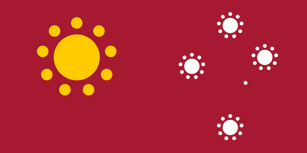
Dotted Sun and Stars portrays elements of the current national flag using stylised Aboriginal dot art.
The red field represents the land. The canton features the golden sun, representing energy, life and the country’s climate. The fly features the southern cross, representing the country’s location in the Southern Hemisphere. The nine dots around the sun and stars represent the constituent parts of Australia: Eight points for the mainland states and territories, and one last point for external territories and allies together.
Commentary
This design is the direct counterpart to my New Zealand flag proposal Flourishing Together.
This one was inspired by an Australian Aboriginal art exhibition in Vancouver. It incorporates that cultural influence without using the Aboriginal flag itself like many other concepts try to do. This one was said to be “too Aboriginal” to be accepted by Australia as a whole, which is probably true, but it looks too cool to not show it here.
Here I intended to combine the Commonwealth Star and the Aboriginal sun design in an elegant way. The current Commonwealth Star has seven points which I find to be clunky – currently, six points stand for the six original states and the seventh point stands for all territories and future states. Since this design did not need to appear conventional, I took the opportunity to update it to nine, which I feel is more appropriate and timeless: Eight points for the mainland states and territories and one point for external territories and allies. This makes more sense geographically and is future-proofed against the strong possibility of Northern Territory becoming a state.
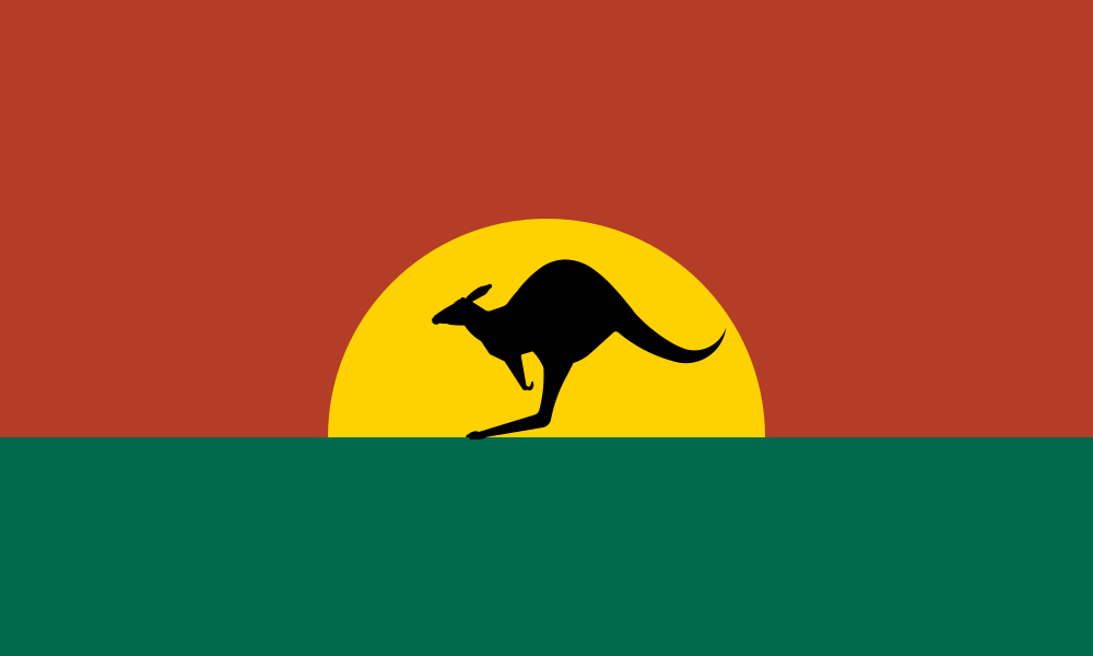
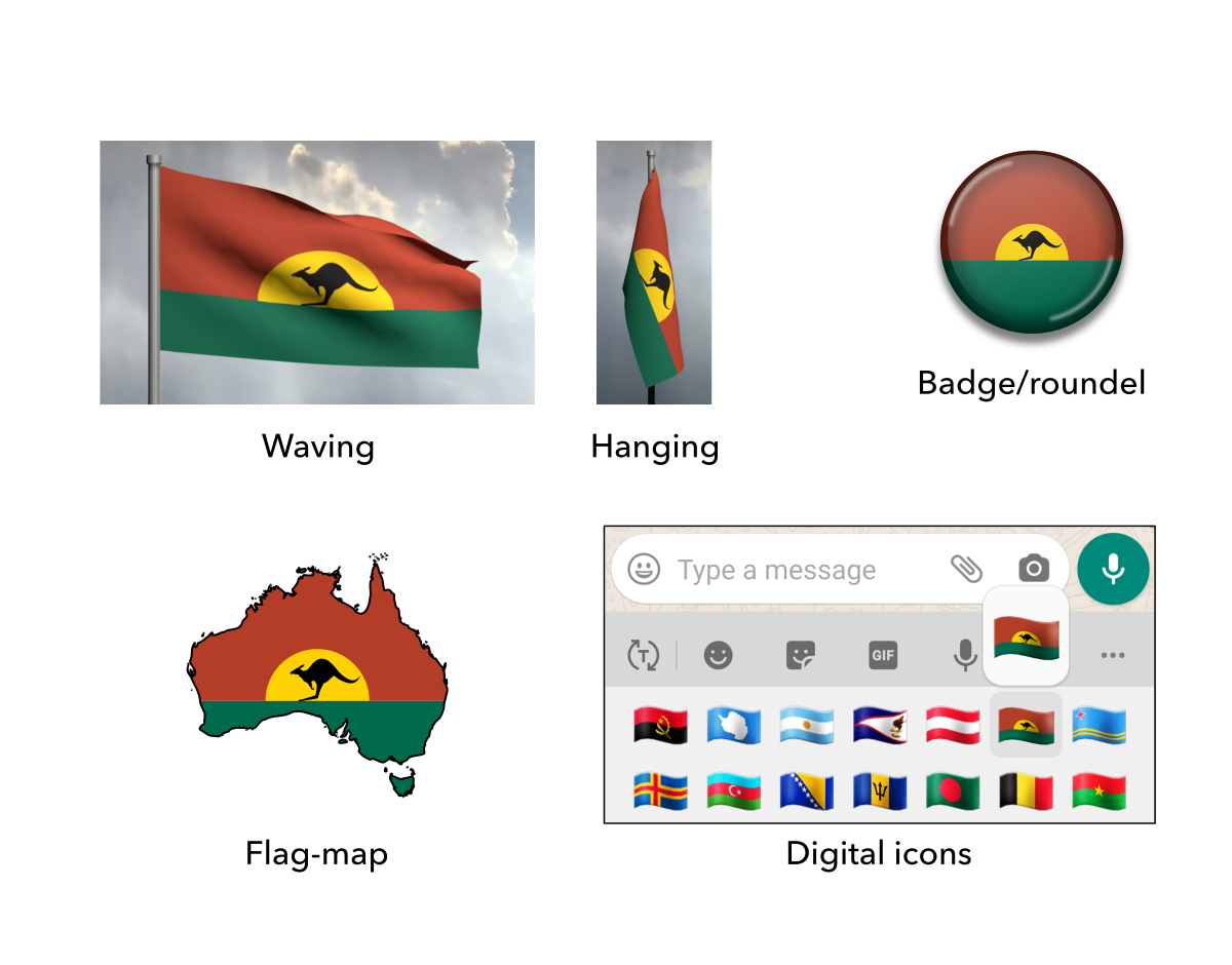
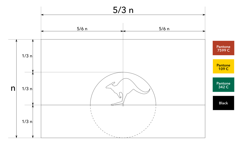
The Ancient Land eschews any symbolism from the current flag in favour of a totally unique landscape depiction. The big sunset at the top and the flat land at the bottom frame the kangaroo in the centre, a well known symbol of Australia. It includes green and gold, the official national colours.
Commentary
Although I predicted that this design would be too radical of a change, it was modestly popular on Reddit and Facebook. When designing this flag, I deliberately ignored my analysis and the symbolism on the current flag. Instead, I allowed myself to be more eccentric and boundless.
I aimed for a flag that is intuitive, timeless and naturalistic. It peels back the layers and purely captures the distilled essence of what makes the Australian continent what it is. It represents Australia in an intuitive way that just hits you at first glance even without an explanation. Even if I sent this to the distant past or distant future, it would still be totally understandable at first glance. It emphasises the natural world which is neutral and can connect with all Australians.
Also, I specifically aimed aimed to use the kangaroo in a way that feels justified and not just gratuitously slapping it inside a rectangle out of obligation like some others’ proposals do.
Unfortunately, the result falls into the “cheesy souvenir” trap by virtue of including the kangaroo, but it is unique and has its own charm.
Flag of the Kuomintang (Chinese Nationalist Party) / 國民黨的旗幟
The current flag of Taiwan is a historical relic inherited from the Republic of China, which ruled mainland China over seventy years ago. Now it is confined to the island of Taiwan and the country is simply known as Taiwan to everybody. Moreover, it is based on the flag of a single political party, the Kuomintang (Chinese Nationalist Party). This may have made sense when Taiwan was a one-party state, but not when Taiwan is now a multi-party democracy in which the Kuomintang is just one of many political parties.
In recent years, Taiwan has shifted towards a strong, local, independent identity, especially the younger generations. For example, a poll by National Chengchi University shows that the majority of the population now identify as “Taiwanese” rather than “Chinese”, and this is constantly rising. Also, in July 2020, the Taiwanese passport was officially redesigned to emphasise the name “Taiwan” instead of “Republic of China”. There have been many such changes from the 2000s onwards.
In light of these developments and more, some have called for a flag for the island of Taiwan itself and some have even proposed designs. However, those designs have significant flaws and none are popular. Therefore, here is my proposal.


 Proposed flag of Massachusetts (2009)


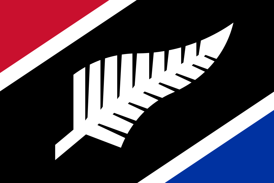 Proposed Flags of Aotearoa New Zealand